To discuss a photo, sign up as a BetterPhoto member or log in.
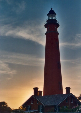
Ponce lighthouse at sunset
|
|||||||||||
|
|
|||||||||||
|
Jim Collier |
Nice shot. Only drawback I see is the haloing effect between light & dark areas--presumably from the application of a contrast mask, or Photoshop's "Shadow/Highlight" tool (which is a form of contrast masking), for the purposes of darkening the sky while pulling out details in the dark areas (or at least not making them darker). The halo effect results from too low a radius value being specified for the Gaussian Blur stage of the contrast mask, or the Radius setting on Shadow/Highlight tool. I realize this may be an intentional effect, and if so, it IS pretty cool for this photo! But intentional or not, and correctly or incorrectly, unfortunately it does shout out "Contrast Mask!". I would suggest trying it with a much larger Radius setting (at least 4 times what you're using here). Here's something else you can try too, that is similar to a Contrast Mask or Shadow/Highlight, but completely eliminates any halo effect. It give a different look though, maybe better, maybe worse: • Open original. Hope this helps!
|
||||||||||
|
|
|||||||||||
|
Jennie M. Stout |
Wow. That is way more than I know about photoshop. Thank you! However, I didn't edit this image at all. I merely scanned the print that came from Kodak PerfectTouch processing. I assumed it was because I used a different film, Portra 400 NC, as a test roll. I thought the effect was kind of cool looking, but when I had reprints made, they could not reproduce the effect. It came out looking much darker, with the lighthouse nearly black and the sky not nearly as dramatic. Oh well. Thanks again for the tip.
|
||||||||||
|
|
|||||||||||
|
Jim Collier |
Interesting. I bet your scanner software does contrast masking by default. It's a pretty unmistakable (sp?) effect. If you have Photoshop CS, you can see what I mean by applying "Shadow/Highlight" to an image that has a distinct boundary between large areas of very bright and very dark, like your shot. I really like contrast masking myself, and use it to varying degrees on about half of my shots. Getting the blur Radius right is somewhat of a black art though. If you want to do a "pure" contrast mask, rather than using Shadow/Highlight (or you don't have CS), do this in Photoshop: • Open original. This is alot like the steps I outlined earlier, because the earlier one is based on these steps (and improved in many ways). Anyway hope this helps.
|
||||||||||
|
|
|||||||||||
| Log in or sign up to respond or interact. | |||||||||||