
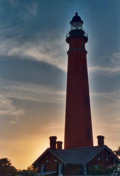
Ponce lighthouse at sunset
Uploaded: June 15, 2004
f/5.6, underexposed one stop, 85mm, New Smyrna Beach, Ponce Inlet Lighthouse, Sunset
Jim Collier June 16, 2004
Nice shot. Only drawback I see is the haloing effect between light & dark areas--presumably from the application of a contrast mask, or Photoshop's "Shadow/Highlight" tool (which is a form of contrast masking), for the purposes of darkening the sky while pulling out details in the dark areas (or at least not making them darker). The halo effect results from too low a radius value being specified for the Gaussian Blur stage of the contrast mask, or the Radius setting on Shadow/Highlight tool. I realize this may be an intentional effect, and if so, it IS pretty cool for this photo! But intentional or not, and correctly or incorrectly, unfortunately it does shout out "Contrast Mask!". I would suggest trying it with a much larger Radius setting (at least 4 times what you're using here).Here's something else you can try too, that is similar to a Contrast Mask or Shadow/Highlight, but completely eliminates any halo effect. It give a different look though, maybe better, maybe worse:
• Open original.
• Perform an "Auto-Contrast".
• Copy background layer.
• Copy background layer again (for three total layers).
• Select top layer.
• Desaturate colors of this layer to B&W.
• Invert colors (for a negative image).
• Set layer type to "SOFT LIGHT".
• Set layer opacity to 75%, or whatever looks best (don't worry about too much color saturation yet).
• Flatten top layer into layer below (not all layers).
• Set new top layer property to "Luminosity".
• Flatten into the bottom layer.
• There may be too much color saturation. Back it off a bit.
Hope this helps! #138568
Jennie M. Stout June 16, 2004
Wow. That is way more than I know about photoshop. Thank you! However, I didn't edit this image at all. I merely scanned the print that came from Kodak PerfectTouch processing. I assumed it was because I used a different film, Portra 400 NC, as a test roll. I thought the effect was kind of cool looking, but when I had reprints made, they could not reproduce the effect. It came out looking much darker, with the lighthouse nearly black and the sky not nearly as dramatic. Oh well. Thanks again for the tip. #600317Jim Collier June 16, 2004
Interesting. I bet your scanner software does contrast masking by default. It's a pretty unmistakable (sp?) effect. If you have Photoshop CS, you can see what I mean by applying "Shadow/Highlight" to an image that has a distinct boundary between large areas of very bright and very dark, like your shot. I really like contrast masking myself, and use it to varying degrees on about half of my shots. Getting the blur Radius right is somewhat of a black art though.If you want to do a "pure" contrast mask, rather than using Shadow/Highlight (or you don't have CS), do this in Photoshop:
• Open original.
• Perform an "Auto-Contrast".
• Copy background layer.
• Copy background layer again (for three total layers).
• Select top layer.
• Desaturate colors of this layer to B&W.
• Invert colors (for a negative image).
• Set layer type to "Overlay".
• Open Gaussian Blur dialog, set Radius to an amount that works well. Start at 90, and try higher & lower. Hit OK.
• Flatten top layer into layer below.
• Set new top layer property to "Luminosity".
• Flatten into the bottom layer.
• There may be too much color saturation, is so back it off a bit with the Hue/Saturation adjustment.
This is alot like the steps I outlined earlier, because the earlier one is based on these steps (and improved in many ways).
Anyway hope this helps. #600363
Sign up for an interactive online photography course to get critiques on your photos.
Discussions by Category: You can view photo discussions on various themes in the Community > Photo Discussions section of the site.
BetterPhoto Websites: If you see an orange website link directly under the photographer's name, it's totally okay. It's not spam. The reason: BetterPhoto is the one that offers these personal photography websites. We are supporting our clients with those links.
Unavailable EXIF: If there is no other information but 'Unavailable' in the EXIF (meaning no EXIF data exists with the photo), the 'Unavailable' blurb is not displayed. If there is any info, it shows. Many photos have the EXIF stripped out when people modify the image and resave it, before uploading.
The following truth is one of the core philosophies of BetterPhoto:
I hear, I forget.
I see, I remember.
I do, I understand.
You learn by doing. Take your next online photography class.

Copyright for this photo belongs solely to Jennie M. Stout.
Images may not be copied, downloaded, or used in any way without the expressed, written permission of the photographer.
Log in to follow or message this photographer or report this photo.
I already have an account!