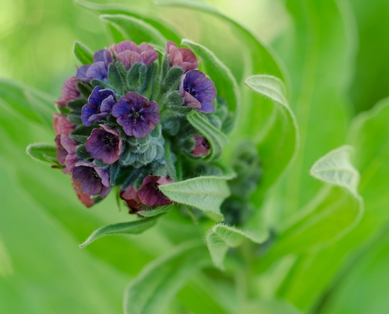
Utah Wildflower

© Elaine Hessler

Utah Wildflower

Uploaded: June 17, 2013

Description

ISO 200, 60mm, f/9, 1/40sec.

Exif: F Number: 9, Exposure Bias Value: 0.00, ExposureTime: 1/40 seconds, Flash: did not fire., ISO: 200, White balance: Manual white balance, FocalLength: 60.00 mm, Model: NIKON D5100

Comments

Elaine Hessler June 17, 2013

I used my macro lens on a tripod and Dale was kind enough to hold his diffuser above the flower since the sun was right above us.

I am not sure about the crop. I used Viveza to tone down the hot spots and moved the mid tones on the levels down a bit. #1532725

Susan Williams June 17, 2013

This is a beautiful floral, Elaine. The greens are unusual and play nicely with the colors of the flower. I like the way the leaves curl to the inside and the gentle curves. I can't see a better composition. Nice work. #10736567

Stephen Shoff June 17, 2013

That's a great angle for that shot, Elaine. Well done. #10736621

Rita K. Connell level-classic June 17, 2013

this is one of thoses WOW ones, I like the two tones of the green and purple together. I also like the curl of the leaves. very nice team work! #10736662

Jeff E Jensen June 18, 2013

Yeah, I think the crop and angle works well. Is it just me, or is the white balance off a tad? #10737139

Elaine Hessler June 18, 2013

Could be-I was having trouble with that. More blue or more yellow? I'm having a hard time seeing which way it is off. #10737152

Beth Spencer June 18, 2013

I really like the curves and angles, I like the way the lines lead into the flower. You have great focus throughout. The light was tough but you nailed it. Not sure what to tell you about the white balance. #10737673

Stephen Shoff June 18, 2013

Is the white balance off or are the colors just desaturated due to the diffuser? We normally expect the colors to be a lot darker due to high contrast. That tends to overpower the subtleties color that Elaine captured so well. #10737720

Jeff E Jensen June 18, 2013

Yeah, that may be the case, Stephen. #10737751

Elaine Hessler June 19, 2013

I am getting the feeling this still needs to be tweaked-any other thoughts? Also, does anyone know what type of flower this is?

BTW, those EPs are still very slow to come in... #10738051

Dale Hardin June 19, 2013

Looks great Elaine. Haven't had time to see my take one this yet. Hope it's half as good as your result.

Agree that you could tweak this a bit. A simple levels or curves adjustment should be all that is needed. #10738162

Elaine Hessler June 19, 2013

Better? #10738347

Dale Hardin June 19, 2013

Like the first one better. This version is even darker. On the levels would suggest settings of about 0 - 1.20 - 230 depending on your monitor calibration. #10738756

Susan Williams June 19, 2013

I wonder if you could adjust the luminence of the flowers in the second one. I like the slightly darkened background better but the flowers look dull when they actually have pretty colors. #10738778

Michael Kelly level-classic June 20, 2013

Very pretty shot. Like the others I like the composition a lot. The curve of the leaves cradling the grouping of flowers is excellent.

I don’t think there is a WB problem with the shot. You could go a couple points either way for taste (warmer or cooler) but it looks like you are good as shown. The pale green is mostly caused by an oversaturation of yellow in the shot. If you want to correct that use the hue/saturation adjustment tool and drop the yellow channel saturation to taste (my guess would be in the - 40 to -50 range), but go to whatever level looks good to you. I might also open up the shadows slightly.

These suggestions are if you want to play a bit as the shot looks good to me as shown. When there is no reference to original color anything that is pleasing is OK and this is definitely pleasing.
#10739613

Stephen Shoff June 20, 2013

I have no idea how Mike reached an oversaturated yellow conclusion, but I like his idea. If you try that on the original, I would expect that to affect the greens and have very little effect on the flowers themselves.

In your darkened version, I like the greens better but I would have masked the flower #10740341

Beth Spencer June 21, 2013

I am interested to see what dropping the yellow would do. I like the original and I think the difference between the green that is in the area of the flower on the blooms (if that makes sense) and the green of the leaves on the outer edge may be causing a conflict. But either way I really like the way you composed this picture and the the overall look of it. #10740457

Jeff E Jensen June 21, 2013

Yup, an interesting thought on the yellow. I'm interested to see the results. #10740623

Elaine Hessler June 21, 2013

Here's the edit. I redid the levels masked the flowers, keeping them lighter. I also lowered the yellows a bit in hue/saturation. I still feel like I am struggling a bit. #10740897

Michael Kelly level-classic June 23, 2013

With a photo like this a lot has to do with personal preference. Is there anything you would like to look different from the versions shown? If there is let us know and we will try to give you a solution. Otherwise, as I said your original post is fine as are all of the edits shown.

Stephen, I play a lot with color correction and discoverd in my shots when you get the kind of green shown in the original post it has a large yellow component. To get a darker green you simply desat the yellow in most casses. Depending on the subject you may have to do it selectivly and sometimes play with the green channel also. I am not sure what causes the original problem though I suspect it is an exposure related issue. #10742821


To discuss, first log in or sign up (buttons are at top center of page).

Get Constructive Critiques

Sign up for an interactive online photography course to get critiques on your photos.


Did You Know?

Discussions by Category: You can view photo discussions on various themes in the Community > Photo Discussions section of the site.

BetterPhoto Websites: If you see an orange website link directly under the photographer's name, it's totally okay. It's not spam. The reason: BetterPhoto is the one that offers these personal photography websites. We are supporting our clients with those links.

Unavailable EXIF: If there is no other information but 'Unavailable' in the EXIF (meaning no EXIF data exists with the photo), the 'Unavailable' blurb is not displayed. If there is any info, it shows. Many photos have the EXIF stripped out when people modify the image and resave it, before uploading.


The following truth is one of the core philosophies of BetterPhoto:

I hear, I forget.
I see, I remember.
I do, I understand.

You learn by doing. Take your next online photography class.


Copyright for this photo belongs solely to Elaine Hessler.
Images may not be copied, downloaded, or used in any way without the expressed, written permission of the photographer.
Log in to follow or message this photographer or report this photo.