
Spring is Near!
Uploaded: February 23, 2013
Exif: F Number: 8, Exposure Bias Value: 0.00, ExposureTime: 1/15 seconds, Flash: did not fire., ISO: 100, FocalLength: 60.00 mm, Model: NIKON D5100
Elaine Hessler February 23, 2013
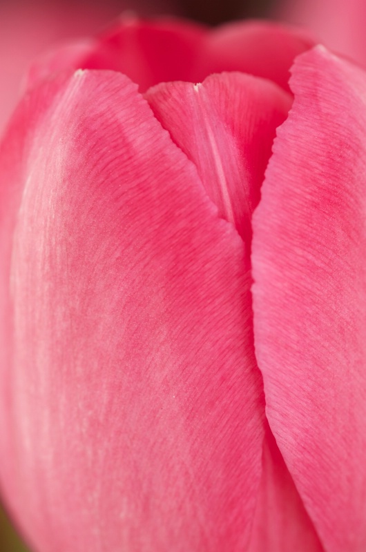
Hi everyone! I know when I see tulips (my favorite flower) in the grocery stores in Feb., spring is right around the corner. This was taken from a bouquet my husband got me for Valentine's day:)ISO 100, 60mm, f/8, 1/15sec.
I did no processing-this is RAW right out of the camera. And it was the first of many I took. I tried to play around with backlighting with a flashlight, but it just wasn't happening....
Critiques appreciated-not a wow-er, but the best of what I have right now, which isn't a lot. #1516134
Stephen Shoff February 23, 2013
This is pretty nice and some potential in post-processing. It has a very nice primary element in the form of the "y" between the 2 main leaves. The shadows look really good for separating them.You'll probably want to do some cropping to eliminate the green bottom left corner. Don't know what you might want to do with the dark area at the top.
I'd suggest rotating this a bit counter-clockwise to get it a little less vertical. A high-key interpretation might work very well here -- fairly strong color along the leaf edges and the center petal behind them with color fading to [near] white and reducing texture as you move to the left in the frame. Post-processing would have the goal of emphasizing the lines. Selective sharpening should focus on those petal edges. #10580358
Jeff E Jensen February 23, 2013
Yeah, this is pretty solid as it is, but with a little work, would be outstanding. (I actually thought this was one of Teresa's when I first saw it).I agree that the biggest strength will come from emphasizing the "Y". Stephen has given you some good suggestions, Can't wait to see what you come up with. #10580415
Elaine Hessler February 23, 2013
Cool and thanks. I'll try to work on it this weekend. #10580495Anthony L. Mancuso February 23, 2013
Nice one Elaine and thanks for the reminder that spring will be here soon, I'm gettin sick of the cold weather..I thought this was Teresa's when I first saw it too! I agree with a crop and would go with a vertical 4x5 or maybe square to accentuate that Y patterns Stephen alluded to.. #10580560
Elaine Hessler February 23, 2013
Hi-I actually got to it faster than I thought. I feel a little lost here. I have never made a high key picture on purpose, so I played with the levels in PSE, selectively sharpened the edges of the petals (not sure I can see a difference). Then rotated and cropped just a bit to get rid of the dark at the top. I did try to clone out the dark area to keep the back edge of the petals, but I couldn't get it to look right.I don't think I have what you suggested cause it just still doesn't wow me. ???? #10580565
Brandi K. Mills February 23, 2013
Very pretty! I like the darker colors of the first. I'm am anxious for spring too! #10580601Stephen Shoff February 23, 2013
You did very well at understanding and attempting what I was describing Elaine. I'm hoping someone else will jump in and provide assistance on what tools to use. Or challenge the concept altogether.I made the suggestion in the context of your original remarks -- "not a wow-er". Since the image, as nice as it is, doesn't stand on its own, I was thinking this is an opportunity to be creative and try something different -- see if there is an interpretation that can make this image more interesting. The result doesn't need to become a favorite, just something to add to your portfolio.
#10580635
Aimee C. Eisaman February 23, 2013
Nice focus on the petal edges! I favor the rich colors over the edited version. I think if you go back to edit this again with Stephens suggestions in mind you might want to focus most on creative composition and selective sharpening. :) #10580827Aimee C. Eisaman February 23, 2013
Nice focus on the petal edges! I favor the rich colors over the edited version. I think if you go back to edit this again with Stephens suggestions in mind you might want to focus most on creative composition and selective sharpening. :) #10580828Dale Hardin February 23, 2013
I much prefer the colors on the original to the edited version. But then, I do tend to favor more rich coloring. I agree that some cropping and just a touch of cloning would benefit this comp.If you want to really bring out that "Y" in the petals and also the grain of them, give these settings a try.
First crop using an 8x10 vertical format with the left bottom corner starting just at the tip of that triangle in the bottom left. This will crop that area and also to top, but will leave just a touch of dark area top center which can either be cloned out or just touched with the content aware healing brush.
To really bring out the "Y" and the grain (with no sharpening needed) open the levels adjust and click the auto adjust. It will look terrible, but not to worry.
Now add another levels adjust layer and blend using a 40% to 60% multiply blend to suit your eye. Magic happens to that awful auto adjustment. The "Y" becomes very sharp and the grain stands out and the colors get richer. Let me know if you like. #10580963
Elaine Hessler February 24, 2013
Thanks-I'll give it another try. This is good for me:) #10581176Debbie E. Payne February 24, 2013
Elaine - This is lovely. I am also seeing tulips in the grocery stores and am getting "antsy" for spring. I like your vivid colors in the original but totally agree with focusing on making that "Y" critical to the shot. I would rotate so the "Y" goes on the diagonal, not the vertical plane. I think it will be a "Wow-er" after you decide what to do to it! #10581884Beth Spencer February 24, 2013
I prefer the original colors on this one. I think you are going to end up with a WOW one once you finish the edits. I will wait and see what you come up with. #10582172Peter W. Marks February 25, 2013
What can I say Elaine? My two mostest favorite things in the whole wide world-Elaine Hessler March 03, 2013
Ok guys-I lost momentum on this, but had to give it one more try. I started from scratch, cropped, and tried to rotate it more to give a more diagonal look to it. In PSE, I selectively sharpened the edges of the petals as used a multiply blend of 40%. I cloned out the notch in the top of the petal (white) cause it bugged me. I think it is better, but can't get it to a "wow". I think I understand the recommendations, but can't visualize them and am a bit limited in my knowledge here.Oh I almost forgot-I flipped this to see if it would be better, and it did not look good at all. Very weird.
Thanks everyone for the comments-it was fun to try new things.
And Peter, there is more where this one came from. And if you are really nice, I'll post a picture of a waterfall, with an extra long exposure just for you! #10595185
Peter W. Marks March 03, 2013
Oh Elaine! What can I say? I quiver with anticipation!But, about those tulips, I seem to recall that American writer Bill Maher
said something like-
"Tulips aren't flowers. the're some kind of gay onion." #10595274
Dale Hardin March 03, 2013
That's close enough to WoW for me, Elaine. Good job. I'm impressed with your tenacity. #10595344Sign up for an interactive online photography course to get critiques on your photos.
Discussions by Category: You can view photo discussions on various themes in the Community > Photo Discussions section of the site.
BetterPhoto Websites: If you see an orange website link directly under the photographer's name, it's totally okay. It's not spam. The reason: BetterPhoto is the one that offers these personal photography websites. We are supporting our clients with those links.
Unavailable EXIF: If there is no other information but 'Unavailable' in the EXIF (meaning no EXIF data exists with the photo), the 'Unavailable' blurb is not displayed. If there is any info, it shows. Many photos have the EXIF stripped out when people modify the image and resave it, before uploading.
The following truth is one of the core philosophies of BetterPhoto:
I hear, I forget.
I see, I remember.
I do, I understand.
You learn by doing. Take your next online photography class.
Copyright for this photo belongs solely to Elaine Hessler.
Images may not be copied, downloaded, or used in any way without the expressed, written permission of the photographer.
Log in to follow or message this photographer or report this photo.
I already have an account!