Untitled
Uploaded: November 20, 2012
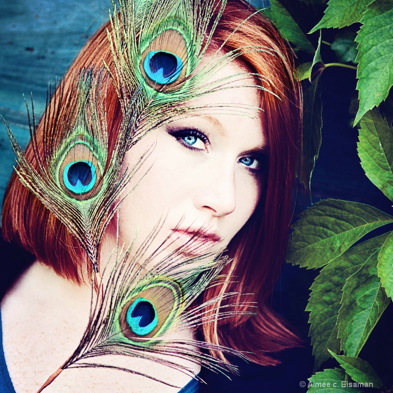
Exif: F Number: 2.8, Exposure Bias Value: 0.00, ExposureTime: 1/250 seconds, Flash: did not fire., ISO: 125, White balance: Auto white balance, FocalLength: 105.00 mm, Model: NIKON D700
Michael Kelly November 20, 2012
Aimee this is an interesting composite. I love the feathers and the model. What does not work for me is the green leaves on the right. They are just to well focused with a strong rich color which pulls my attention very hard to the right edge of the shot.I am not sure what to suggest. I would at least blur them slightly and tone down the color, but it might be better to just have the plain BG like in the upper left. I am just not sure without seeing what would work the best. #1499417
Aimee C. Eisaman November 20, 2012
Hmmmm.....I'll see what I can do to lessen the leaves. This is not a composite so I can't take them out completely. Thanks for your thoughts Mike! #10427004Jeff E Jensen November 20, 2012
I agree with Mike on the leaves. Otherwise, I love the rich colors. #10427364Debbie E. Payne November 22, 2012
LIkewise...or..."What the boys said"! As always, your portraits are knock-outs. Love them all. #10429295Teresa H. Hunt November 22, 2012
I love your peacock feather's :) I love the rich colors here. And I think the pose is fantastic.I was thinking the photo looked a little over sharpened, but since no one else has mentioned it feel free to ignore me. LOL! #10429419
Teresa H. Hunt November 22, 2012
Humm . . . now that I'm looking at it again I don't think it's oversharpened. But I do think the tiny spots under her eye (in the shadow area) are what was really bothering me. #10429423Peter W. Marks November 23, 2012
Ah Aimee, for me life is far simpler. I just see a pretty young lady What leaves! #10430003Beth Spencer November 24, 2012
Aimee, I love your creativity! You always come up with really unique shots. I really love the feathers and the pose, but I also think the green leaves are a bit distracting. #10431957Elaine Hessler November 25, 2012
I love the exotic look to this. The colors are fabulous and are placed perfectly. The leaves don't bother me too much, but I wonder what it would look like if they were toned down slightly. I don't really find them bothersome because my eyes are glued to all those fabulous colors and those eyes! #10433067Aimee C. Eisaman November 29, 2012
Okay so sorry I was offline for awhile...was sick. But now I'm back and have put all of your thoughts in mind when taking this one back into PS. Let me know what you think. Thanks! :~) #10438589Elaine Hessler November 29, 2012
I like this a lot with the toned down leaves. But, my eye keeps going to the edge of the leaf by her right eye. I don't know why it looks funny to me-it didn't bother me in the original.I still love the colors and the comp:)
Hope you feel better! #10438608
Aimee C. Eisaman November 29, 2012
Thanks for keeping tabs on this one Elaine. Here is a fix for that...let me know if it is better for you. :~) I'm feeling better today and hope to be 100% by the weekend. #10438659Elaine Hessler November 29, 2012
Gorgeous! #10438784Michael Kelly November 29, 2012
The tone down worked great for me Aimee. Now the right side does not pull on my eye. I think the last version looks great! #10439109Jeff E Jensen November 29, 2012
Yup, the last version works! #10439421Aimee C. Eisaman November 30, 2012
Thank you for coming back and letting me know Elaine, Mike, and Jeff! :~) #10442076Teresa H. Hunt November 30, 2012
Love it!! #10443527Aimee C. Eisaman November 30, 2012
Thanks Teresa and I was with you that it was too sharp. :~) #10443784lisa anderson December 01, 2012
Hope you're feeling better now, AimeeBeth Spencer December 02, 2012
Looks great! Hope u are feeling better! #10446147Sign up for an interactive online photography course to get critiques on your photos.
Discussions by Category: You can view photo discussions on various themes in the Community > Photo Discussions section of the site.
BetterPhoto Websites: If you see an orange website link directly under the photographer's name, it's totally okay. It's not spam. The reason: BetterPhoto is the one that offers these personal photography websites. We are supporting our clients with those links.
Unavailable EXIF: If there is no other information but 'Unavailable' in the EXIF (meaning no EXIF data exists with the photo), the 'Unavailable' blurb is not displayed. If there is any info, it shows. Many photos have the EXIF stripped out when people modify the image and resave it, before uploading.
The following truth is one of the core philosophies of BetterPhoto:
I hear, I forget.
I see, I remember.
I do, I understand.
You learn by doing. Take your next online photography class.
Copyright for this photo belongs solely to Aimee C. Eisaman.
Images may not be copied, downloaded, or used in any way without the expressed, written permission of the photographer.
Log in to follow or message this photographer or report this photo.
I already have an account!