Untitled

Uploaded: September 27, 2009

Description

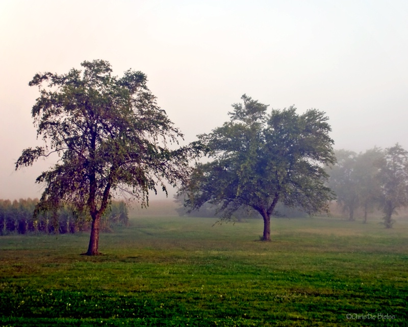
Got out early this morning to capture some of the beautiful fog we woke up to.

Exif: F Number: 4.2, Exposure Bias Value: 0.00, ExposureTime: 1/60 seconds, Flash: did not fire., ISO: 100, White balance: Auto white balance, FocalLength: 32.00 mm, Model: NIKON D80

Comments

Aimee C. Eisaman September 27, 2009

I had already told you I like this one. The purple tint to the whole image really works well for me. Don't forget to throw a stroke around the whole image. Cool progression of very little fog on the foreground tree to medium on the next one and heavy in the back! :~) #1185403

Christie R. Bielss September 27, 2009

Thanks Aimee! I threw this up here at the same time as on FB this a.m.. Ok, give me the low-down on the usage of the stroke, i.e. when, how much, etc.. I threw one around this and did a 1px at 50% opacity.

Wish I could take credit for the progression of the fog - but that was all God's doing.......and it was really cool to see in person! I was like a kid in a candy shop this a.m.! #7988558

Anthony L. Mancuso September 27, 2009

Nice comp and the fog looks great Christie..there is a lot of white goin on in that sky and I would consider cropping from the top to almost the top of the taller tree to reduce some of the dead space.. #7989110

Jodi M. Walsh September 27, 2009

excellent job of capturing the fog...

that said, I have to admit I think the coloring is a little weird to me. I don't care for the pinkish-purple on the left and overall it seems a little over saturated to me.

i think I might just prefer the muted colors that you find out there #7989280

Jeff E Jensen September 27, 2009

I think I'm with Jodi on this one. I like the overall feel of this, but the colors seem a bit off to me. I would love to see it toned down a bit. Tony's crop suggestion isn't a bad idea either. #7989292

Christie R. Bielss September 28, 2009

I actually do like the pinkish hue as that was the natural early morning fog color we had, which is not something we normally have here. Dull, grey and dreary is our normal fog! LOL! Anyway, this areas colors are very vibrant and I've had to do a WHOLE lot of desaturation to get you a more muted tone. So here it is with each slider (including the master) desat just above the b&w level. #7990169

Christie R. Bielss September 28, 2009

Flippin' stroke - won't stay on on all 4 sides.......argh! Oh, and I just found out that the pink sky was b/c of all the corn dust in the area......which would explain why I'm itching and sneezing to high heaven! #7990188

Rita K. Connell level-classic September 28, 2009

I really like your new post, it is much better I am in totally agreement I thought the first was to heavy in saturation. I like the pink in the sky and I do think if you can get a good crop with a little less sky might work better #7990388

Aimee C. Eisaman September 28, 2009

I still like the first version better with the stroke on all 4 sides of course! LOL And I usually do a 1px stroke at 100%. Don't think there are any rules about how to do one unless you are putting them on a website that states no borders over 1px. :~) #7990786

Rita K. Connell level-classic September 28, 2009

what does stroke mean? #7990936

Jodi M. Walsh September 28, 2009

i like #3 and think that there's still that hint of pink. really pretty!

i no nothing about borders so I can't help you there. hope the allergies fade :-) #7991075

Debbie E. Payne September 28, 2009

Christie - Love the colors and feel to this shot but I would have to agree that the it needed the desaturation, mostly with the greens. Otherwisee, great. #7991385

Christie R. Bielss September 28, 2009

Thanks to all of you. I'm with Aimee and still like the original b/c it does accurately depict the morning, kind of had a surreal feeling being out there in it.......with the corn dust blowing in my eyes! :) I do like the desat'd one, but it loses what I experienced yesterday morning. And, I still haven't quite been able to figure out how to disassociate my feelings from an image yet. Probably why my basement has a bunch of junk that I just haven't gotten rid of yet!

Rita, a stroke is the black line all the way around the image. Look at the original and you can't tell where the photo ends and the BP page begins. Look at #2 and you can see the whole photo is outlined with a black line - clearly defining its boundaries. Look at #3 and you can clearly see how I can completely screw up a stroke and not know how to fix it! LOL! If you have PSE, it is under "Edit", "Stroke/Outline". Anything else and I have no clue. ;) #7991522

Christie R. Bielss September 28, 2009

Oh, and I did crop 1/2 way down on the sky on #3. Can't crop it anymore or it won't print right - but the bright side is, the sky is pretty much gone once I go to print! :) #7991527

Teresa H. Hunt September 28, 2009

Christie, I really like the 3rd version because the colors look a little more realistic. But if you want to keep the pink in the sky, you could bring that slider up just a bit. Maybe . . .

Great job capturing the fog. :) #7991630

Ellen H. Robertson level-classic September 28, 2009

I like the first one with the stroke. I like the colors and almost sur-real feeling about it. Which is how I feel when I am in the fog, real fog I mean. #7991887

Rita K. Connell level-classic September 28, 2009

Christie thank you for explaining what the stroke is. I am sorry I realize after I had posted that you had taken some of the sky off I should have responded again. Christie you should look at all of the pictures you have done and go to the one that most looks like what you saw, none of us had that vision so we are are trying to do the EP thing to it, and we may be taking you down a path that your heart won't let you. They all are beautiful pictures each in their own way. #7991944

Michael Kelly level-classic September 28, 2009

Rita in CS stroke is the bottom entry under fx at the bottom of the layers palate - once you open it it is self explanatory.

Christie while I like the more natural colors of your later post I think any of your posts work fine and if the color you saw is captured in the first one go for it. Like was said sometimes we over guess a photo to make it conform to much to the norm. I think you did a great job capturing the essence of a foggy mourning with the transition that you show in the various trees. #7992433

Jeff E Jensen September 28, 2009

Jeeze Christie - now I can't decide. I like them both, can I vote for both of them? #7992540

To discuss, first log in or sign up (buttons are at top center of page).

Get Constructive Critiques

Sign up for an interactive online photography course to get critiques on your photos.


Did You Know?

Discussions by Category: You can view photo discussions on various themes in the Community > Photo Discussions section of the site.

BetterPhoto Websites: If you see an orange website link directly under the photographer's name, it's totally okay. It's not spam. The reason: BetterPhoto is the one that offers these personal photography websites. We are supporting our clients with those links.

Unavailable EXIF: If there is no other information but 'Unavailable' in the EXIF (meaning no EXIF data exists with the photo), the 'Unavailable' blurb is not displayed. If there is any info, it shows. Many photos have the EXIF stripped out when people modify the image and resave it, before uploading.


The following truth is one of the core philosophies of BetterPhoto:

I hear, I forget.
I see, I remember.
I do, I understand.

You learn by doing. Take your next online photography class.


Copyright for this photo belongs solely to Christie R. Bielss.
Images may not be copied, downloaded, or used in any way without the expressed, written permission of the photographer.
Log in to follow or message this photographer or report this photo.