Pink

Uploaded: July 31, 2009
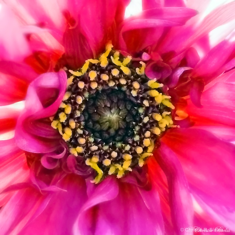
Was going for a soft shot, but with some detail. Loved the pink in this flower.
Exif: F Number: 2.8, Exposure Bias Value: 0.00, ExposureTime: 1/50 seconds, Flash: did not fire., ISO: 100, White balance: Auto white balance, FocalLength: 50.00 mm, Model: NIKON D80
Christie R. Bielss July 31, 2009
I'm thinking I might should back off on the crop a bit as it looks funky on the yellow thing-a-ma-jigs. What say you?I did have approval to go out and take a few shots. Do still have some issues with the shakey arm, but was happy to get some images with some clarity to them today. #1161784
Christie R. Bielss July 31, 2009
Oh, and a redhead in a giant flower garden without a hat - yes, I was chased numerous times by the bumblebees. Sorry little buggers! #7801074Dale Hardin July 31, 2009
Christie, I think you accomplished your goal. The pink colors are gorgeous and you have nice detail as well. The center weighted comp gives it an almost kaleidescope feel.If you have access, by all means go out and get some more shots and with the bees as well. They won't bother you. And take a tripod with a remote cable or use the timer until you get back in shape.
As far as backing off on the comp, that would be OK as long as you can do so without having spaces between the petals. Otherwise you need to use a different criteria for your composition. #7801538
Dale Hardin July 31, 2009
By the way Christie, if you'd like to try to take this shot to a different level and want to play around with your PSE6, you might try this.Crop the image tighter using a square crop and crop up close to the soft pink petals that surround the center yellow ring. That would be about 1/3 the way in from the edges of the current image.
Then selectively sharpen the center area using the 'enhance/adjust sharpness' tool. Use a radius of o.5 and adjust the amount to suit. Probably about 1/2 the max. Make the center sharper at 100% opacity, and the outer area where the yellow is, at about 50% opacity.
This will create a mask where you have applied the sharpening. Then click on the original background image and apply a blur. Use the SMART BLUR with settings of about 10 for the radius and about 15 to 20 for the threshold.
This should give it a whole new look that you may like. #7801575
Anthony L. Mancuso July 31, 2009
I was thinking the crop was a bit tight too Christie, but I'm very interested to see what Dales suggestions do... #7801915
Michael Kelly
 July 31, 2009
Rita K. Connell
 July 31, 2009
Ellen H. Robertson
 August 01, 2009
Christie R. Bielss August 01, 2009
Here's to hoping I got Dale's suggestions right. What do ya think? #7805042Christie R. Bielss August 01, 2009
why does this look softer on BP than it does in PSE6 on my screen? Weird. #7805088
Michael Kelly
 August 01, 2009
There does seem to be a change to shots on BP from what we have on our own screens. I think that may have to do with how they size the shots for display. #7805695
Dale Hardin August 01, 2009
You did a good job Christie and I hope you had fun with the mask and varied opacity workout.Not as much difference as I thought there would be but it does seem more intense and I like the way the smart blur looked compared to a Gaussian blur. The crop is a little tighter than I'd envisioned also. Didn't want to clip the soft pink petals on the left.
I like this shot and it certainly gets your attention especially the second post. #7805717
Anthony L. Mancuso August 02, 2009
I think Mike is right about the way BP dislpays the images, they usually look bigger to me on the BP page than in my PS window...I think you lose too much resolution with this tighter crop and prefer the original..great colors in both though... #7807416Sign up for an interactive online photography course to get critiques on your photos.
Discussions by Category: You can view photo discussions on various themes in the Community > Photo Discussions section of the site.
BetterPhoto Websites: If you see an orange website link directly under the photographer's name, it's totally okay. It's not spam. The reason: BetterPhoto is the one that offers these personal photography websites. We are supporting our clients with those links.
Unavailable EXIF: If there is no other information but 'Unavailable' in the EXIF (meaning no EXIF data exists with the photo), the 'Unavailable' blurb is not displayed. If there is any info, it shows. Many photos have the EXIF stripped out when people modify the image and resave it, before uploading.
The following truth is one of the core philosophies of BetterPhoto:
I hear, I forget.
I see, I remember.
I do, I understand.
You learn by doing. Take your next online photography class.
Copyright for this photo belongs solely to Christie R. Bielss.
Images may not be copied, downloaded, or used in any way without the expressed, written permission of the photographer.
Log in to follow or message this photographer or report this photo.

I already have an account!
