
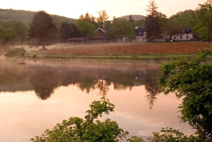
Kendridge w/ Saturation & Contrast
Uploaded: June 04, 2007
As suggested I bumped up the saturation to 18 and increased the contrast somewhat.
Dave Winchell June 04, 2007
Hi Dave, You have asked for CC's so I thought I would just let you have my opinion. I like this one Dave, as it is a little brighter and has more contrast than most of your other images in your gallery. I like the composition and reflections, but IMHO I feel that this could be improved by increasing the contrast and saturation just a twitch. I hope it helps you a little. Bill J.member since: 1/22/2007 Bill, thanks for your comments. I appreciate your insight. I often feel that once I start playing with the saturation I end up increasing it to much. Thanks again. Dave
6/3/2007 12:31:42 PM
Bill Johnson
Contact Bill
Bill's Premium Gallery
member since: 12/20/2005 Hi Dave, I know what you mean about over saturation. It does tend to be a personal choice doesn't it. I am often guilty of it myselfe. Bill J.
6/4/2007 3:11:39 AM
David Pratt
Contact David
David 's Premium Gallery
member since: 4/25/2006 Very nice Dave! I think this is a wonderful shot. The reflections and the mod set with it is very nice. I would not play with the saturation at all.
6/4/2007 8:47:19 AM
Mick Burkey
Contact Mick
Mick's Premium Gallery
member since: 9/19/2005 I agree with Bill that it could use some saturation and contrast. But the general feel is very nice and I especially like the fog and mist. Nicely done!
6/4/2007 9:23:34 AM
Steve M. Harrington
Contact Steve
Steve's Premium Gallery
member since: 1/28/2005 Hi Dave. If you are going to error, I would say do it on the side of saturation. But then some people think I border on the maniacal with it. :) I think that if you added about +18 saturation and left the contrast alone, you would get a better feeling of depth yet retain the early morning mist feel.
Steve
Thank you all for your comments and your interest. I am not sure which image I like better but this one has the increased saturation and some added contrast. Thoughts? Dave
#668267
Sign up for an interactive online photography course to get critiques on your photos.
Discussions by Category: You can view photo discussions on various themes in the Community > Photo Discussions section of the site.
BetterPhoto Websites: If you see an orange website link directly under the photographer's name, it's totally okay. It's not spam. The reason: BetterPhoto is the one that offers these personal photography websites. We are supporting our clients with those links.
Unavailable EXIF: If there is no other information but 'Unavailable' in the EXIF (meaning no EXIF data exists with the photo), the 'Unavailable' blurb is not displayed. If there is any info, it shows. Many photos have the EXIF stripped out when people modify the image and resave it, before uploading.
The following truth is one of the core philosophies of BetterPhoto:
I hear, I forget.
I see, I remember.
I do, I understand.
You learn by doing. Take your next online photography class.
Copyright for this photo belongs solely to Dave Winchell.
Images may not be copied, downloaded, or used in any way without the expressed, written permission of the photographer.
Log in to follow or message this photographer or report this photo.
I already have an account!