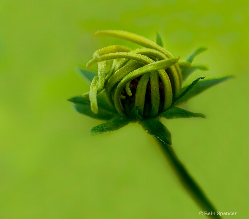
Waiting To Open

Uploaded: August 13, 2013
Canon 7d, Canon 100mm 2.8, IS macro Lens,f/3.5, 1/250, ISO 400, Edited in LR 4, and Viveza
Exif: F Number: 3.5, Exposure Bias Value: -0.33, ExposureTime: 1/250 seconds, Flash: did not fire, compulsory flash mode, ISO: 400, White balance: Manual white balance, FocalLength: 100.00 mm, Model: Canon EOS 7D
Beth Spencer August 13, 2013
I also edited this with color Effex Pro 4 and applied a couple filters, here is the other one.Kristin Duff August 13, 2013
love the first image Beth...never met a shade of green I didn't like...the second image looks a little too 'worked' for my taste... #10807218Jeff E Jensen August 13, 2013
This is really nice, Beth! I also prefer the first version., though I'm not sure I'm in love with the crop. It feels like it needs to move to the left a bit. #10807250Stephen Shoff August 14, 2013
To me, Beth, a picture like this is about contours and texture, and maybe a suggestion of "opening". While the greens are wonderful, I'm not sure they contribute much to the message of the image. How well do you think this image communicates as a B&W?Since I think texture is important in this, and it looks to me like your ColorEfex edit increased "structure", it may be that your edit is a slightly stronger image. #10807957
Peter W. Marks August 15, 2013
I too prefer the first image Beth. But am not quite understanding Jeffs comment. #10808735
Rita K. Connell
 August 15, 2013
Elaine Hessler August 16, 2013
Hi Beth-sorry I am late to this one! I think I prefer the first one too. Question-were the petals this green? Is it possible to put a little more yellow into the petals and take a little yellow out of the background to separate it better? I do love the texture on the first and the leaves around the flower are really pretty. #10810201Kalena Randall August 17, 2013
It's a full house! The first one! I really like the depth of the details of the flower to the bokeh in the background. #10811319Beth Spencer August 17, 2013
Sorry it has taken so long to get back to this. I got the color edits done and plan on doing a black and white tomorrow.Beth Spencer August 18, 2013
I did 2 different black and white ones. One is high key and the other is a darker version. #10812068
Rita K. Connell
 August 18, 2013
Stephen Shoff August 18, 2013
Lots of work there, Beth, with all those versions.Edit 4 looks pretty good to me with Jeff's crop suggestion.
Between the color and B&W, it will be personal preference and artist's intent. I find them both about equally compelling. #10812782
Elaine Hessler August 19, 2013
Love the color edits, recropped-beautiful job Beth!!! #10813885lisa anderson August 20, 2013
My favourite is the first edit with the yellow also. But going back and looking at the origianl post is so relaxing...the greens are great too #10814912Beth Spencer August 20, 2013
Thanks everyone for stopping back... also thanks for the suggestions. I am liking the Edit one the best. #10815258Sign up for an interactive online photography course to get critiques on your photos.
Discussions by Category: You can view photo discussions on various themes in the Community > Photo Discussions section of the site.
BetterPhoto Websites: If you see an orange website link directly under the photographer's name, it's totally okay. It's not spam. The reason: BetterPhoto is the one that offers these personal photography websites. We are supporting our clients with those links.
Unavailable EXIF: If there is no other information but 'Unavailable' in the EXIF (meaning no EXIF data exists with the photo), the 'Unavailable' blurb is not displayed. If there is any info, it shows. Many photos have the EXIF stripped out when people modify the image and resave it, before uploading.
The following truth is one of the core philosophies of BetterPhoto:
I hear, I forget.
I see, I remember.
I do, I understand.
You learn by doing. Take your next online photography class.
Copyright for this photo belongs solely to Beth Spencer.
Images may not be copied, downloaded, or used in any way without the expressed, written permission of the photographer.
Log in to follow or message this photographer or report this photo.

I already have an account!
