
Uploaded: September 21, 2010 21:46:20
Zen & Emotion Theme
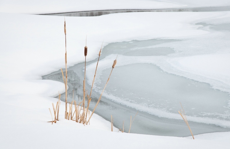
Exif: F Number: 10, Exposure Bias Value: 1.33, ExposureTime: 1/250 seconds, Flash: did not fire., ISO: 200, White balance: Auto white balance, FocalLength: 70.00 mm, Model: NIKON D300S
Greg Bowerman November 24, 2010
Congratulations, Steven! I voted you number one, BTW. This #5 Meadow image is outstanding! I must of missed it during the course. #1330118Steven R. Hill November 24, 2010
Greg, thanks for this and your other comments during the class.I also voted for you -- putting myself aside, I voting reflected my views. I shot with Maywalt and we crtique each other's photos. I thought he made great progress and had some very nice work.
I really liked your portfolio, both for the quality and the theme -- as I told you I did a trip to High Sierras in Sept.
I am interested in how you get the sharpness and color quality in your photos? A brief explanation of what you are doing in camera and in processing would be of interest to both Dave and I. #9061456
Greg Bowerman November 24, 2010
Steven,Thank you!
About workflow, in camera, I generally go for depth of field with an aperture of f/16 or f/11. I'll take f/11 over f/16 if there are no foreground elements close to the camera. Most of my images use a 45mm lens, Tilt/Shift. I don't tilt, but I like the shift. The moderately wide-angle allows for better DOF when I have foreground subject material relatively close to the camera. I use Live View to focus with aperture wide open, always focusing manually about 1/3 the way into the scene (not always easy to figure the 1/3 part, but it gets easier for me with practice). After foucusing, I sometimes forget to reset the aperture! Focusing wide open lets in more light better focusing. I shoot WB for the light, I never use Auto WB. Generally Aperture priority for exposure, but Manual is better and the more I use Manual, the more I like it. I'm always on a tripod unless on-trail and moving without time to set up. I use a bubble for accurate leveling with visible horizons and lake shores. I will take an image of Xrite's color checker and use their software in Lightroom if I'm having trouble with Hue, but I find the D700 does a remarkably good job rendering accurate color as long as I stay away from HDR.
That covers the in-camera, I'll start a new post for post-processing to stay within the character count. #9061527
Greg Bowerman November 24, 2010
I use Lightroom for RAW conversion. I set the Blacks at zero and will only use the Recovery slider if needed. I usually bracket exposures and if the light is good, I will not need to recover any blown channels. I find the D700 provides very accurate WB and generally don't change what the camera provides, but now is the time to adjust WB if desired. I will use the ColorChecker Passport software if I'm concerned about color rendition, but mostly I find this useful in red-rock landscapes or with other extremely vibrant colors, neither of which come much into play in the fall season in the Sierra. I'll check to make sure I have level horizons, correct any chromatic aberration using the lens profile adjustment in LR3 (prime lenses reduce CA to near zero incidence). BTW, I don't correct for distortion, as I like the wide-angle distortion and consider it a valuable compositional element. I'll clean up any dust and I'm ready for PS. Although I understand it is better to do more editing in LR before exporting to PS, I prefer to keep my heavy lifting in PS almost exclusively using adjustment layers. I first set the white point, then black point, then do "color correction" to rid of any unwanted color cast. I use "color samplers" to monitor blacks and whites. I'll consider cloning out any distractions sooner than later. Next, I'll play with contrast, vibrance, HSL, vignettes, and selective color adjustment layers. I use lots of masking with adjustment layers, too. I'm careful to avoid over-saturation, blowing highlights, or blocking shadows. When satisfied with all the above, I apply a "Reverse Unsharp Mask" for midtone contrast enhancement (Unsharp mask with Amount at 20%, 70 pixel radius, and zero threshold), same effect as the Clarity slider in LR.Last but not least, I use a ColorEfex Tonal Contrast filter, it makes the image really pop. The plugin required is available from Niksoftware, Color Efex Pro 3.0. It contains some 52 filters, and the only one I find useful is the Tonal Contrast filter. Most all the rest of their filters can be mimicked in Photoshop, or so that is my opinion.
There you have it, my workflow in a nutshell. #9061573
Steven R. Hill November 25, 2010
thank you. certainly delivers impressive images. #9063163Sign up for an interactive online photography course to get critiques on your photos.
Discussions by Category: You can view photo discussions on various themes in the Community > Photo Discussions section of the site.
BetterPhoto Websites: If you see an orange website link directly under the photographer's name, it's totally okay. It's not spam. The reason: BetterPhoto is the one that offers these personal photography websites. We are supporting our clients with those links.
Unavailable EXIF: If there is no other information but 'Unavailable' in the EXIF (meaning no EXIF data exists with the photo), the 'Unavailable' blurb is not displayed. If there is any info, it shows. Many photos have the EXIF stripped out when people modify the image and resave it, before uploading.
The following truth is one of the core philosophies of BetterPhoto:
I hear, I forget.
I see, I remember.
I do, I understand.
You learn by doing. Take your next online photography class.
Copyright for this photo belongs solely to Steven R. Hill.
Images may not be copied, downloaded, or used in any way without the expressed, written permission of the photographer.
Log in to follow or message this photographer or report this photo.
I already have an account!