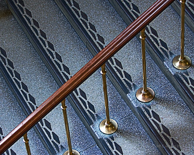
Diagonals

© Jeff E Jensen

Diagonals

Uploaded: March 15, 2010

Description


1/60 Sec - f/2.8 - ISO 640 - 70mm

Exif: F Number: 2.8, Exposure Bias Value: 0.00, ExposureTime: 1/60 seconds, Flash: did not fire, compulsory flash mode, ISO: 640, White balance: Auto white balance, FocalLength: 70.00 mm, Model: Canon EOS 40D

Comments

Aimee C. Eisaman March 15, 2010

Such strong lines in this image and I like how this place took the time to give the steps tred a design instead of just a black strip. I'm thinking this must be an older building because most modern buidlings don't contain small details such as this. Also looks like there is so much wear. Have you tried this in monotone? I like the color, but would like to see what it would look like in bw or speia, or any color mono that you find works well. :~) #1248773

Jeff E Jensen March 15, 2010

Here you go. . . . #8458225

Aimee C. Eisaman March 15, 2010

It's nice, but if I had to choose I'd go with the color version. What do you think? Thanks for showing me. :~) #8458349

Jeff E Jensen March 15, 2010

I also prefer the color, but you never know unless you try, right? #8458372

Rita K. Connell level-classic March 15, 2010

I like the pov on this Jeff, I like that the railing is in color and I love the brass also. there really isn't anything I would change about this one another great shot. #8458418

Dale Hardin March 15, 2010

Patterns are a favorite of mine Jeff and this is very cool. I really like the diagonal and the color. Knowing how you shoot, I can bet you don't have more to this image (not cropped)

While I love patterns, I also like symmetry and probably would have set the rail corner to corner had it been in my viewfinder. :o) #8458491

Jeanine M. Bailey March 16, 2010

Great shot Jeff!! I love these types of shots but don't think out of the box enough to find them!

I much prefer the color version! #8458867

Jeff E Jensen March 16, 2010

Thanks all! These kind of things just kind of jump out at me.

Dale - I did have a bit more room to play with so here is your suggestion. #8459111

Peter W. Marks March 16, 2010

Jeff, which B&W conversion did you use? #8459525

Dale Hardin March 16, 2010

I think the latest post is a bit better Jeff. Thanks. Either way it was an excellent catch. You have a great eye. #8459553

Michael Kelly level-classic March 16, 2010

Jeff another great architectural detail shot. You are the master at these.

I actually prefer the first post the best. I like the bit of off the direct diagonal which provides a bit of tension and the color with the blue tone rather than the more brown of the last post. #8459648

Joan E. Hoffman March 16, 2010

Love it as well Jeff! The last one in particularly. I need to start watching for things like this as well. I love patterns, but for some reason never think to photograph them. #8459762

Rita K. Connell level-classic March 16, 2010

I like the first one post I like seeing more of the brass cones and the tone of the first also thanks for all the other options. #8459864

Debbie E. Payne March 16, 2010

I knew this was yours even before I saw your name on it! Great POV and lines. This one we will see again. I prefer the first one as well. #8460203

Jeff E Jensen March 16, 2010

Thanks all! I am torn between the two. I don't think that the diagonal going from corner to corner makes too big of an improvement. I agree with Rita that I like seeing more of the brass in the original.

Peter - I used the convert to black and white in PSE7 and I believe I used the infrared setting. #8460211

Ellen H. Robertson level-classic March 16, 2010

I too like the first one better. I like the contrast of the old wood, brass and I assume marble. I agree with Mike, you are the master of these. #8460266

Susan M. Reynolds level-addict March 16, 2010

I'll agree on liking the first post best too with the coloring and detail, though that last post is corner to corner, to me it just doesn't jump out like the first one did....love your POV. You always come up with interesting ones! #8460481

Debbra Bailey March 16, 2010

I am with the first post :) Enjoy the composition more with more railing showing. Very cool line image! One thing - on the color version in the upper left corner there is a brownish spot on the stair. Not a huge deal, but it does draw attention. It doesn't seem to be in the BW image... but I agree this is stronger in color :) #8460511

Aimee C. Eisaman March 17, 2010

My vote is still with the first post! :~) #8461074

Dale Hardin March 17, 2010

Jeff, I prefer the first post also but not because of the comp. It's because for some reason you changed the color. #8461615

Jeff E Jensen March 17, 2010

Yeah, I had to go back to the original file and start over to get the crop for the second image. When I get a minute, I'll work on the color. #8461634

Aimee C. Eisaman April 16, 2010

Well I'm glad they were paying attention this month. It's a great shot...congrats on the EP! :~) #8539185

Ellen H. Robertson level-classic April 16, 2010

Congrats!!!! Fabulous shot. #8540222

Jeff E Jensen April 16, 2010

Thank you ladies! #8540518

To discuss, first log in or sign up (buttons are at top center of page).

Get Constructive Critiques

Sign up for an interactive online photography course to get critiques on your photos.


Did You Know?

Discussions by Category: You can view photo discussions on various themes in the Community > Photo Discussions section of the site.

BetterPhoto Websites: If you see an orange website link directly under the photographer's name, it's totally okay. It's not spam. The reason: BetterPhoto is the one that offers these personal photography websites. We are supporting our clients with those links.

Unavailable EXIF: If there is no other information but 'Unavailable' in the EXIF (meaning no EXIF data exists with the photo), the 'Unavailable' blurb is not displayed. If there is any info, it shows. Many photos have the EXIF stripped out when people modify the image and resave it, before uploading.


The following truth is one of the core philosophies of BetterPhoto:

I hear, I forget.
I see, I remember.
I do, I understand.

You learn by doing. Take your next online photography class.


BetterPhoto.com Editor's Pick


Copyright for this photo belongs solely to Jeff E Jensen.
Images may not be copied, downloaded, or used in any way without the expressed, written permission of the photographer.
Log in to follow or message this photographer or report this photo.