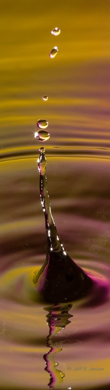
Leaning Tower
Uploaded: November 14, 2009
Exif: F Number: 16, Exposure Bias Value: 0.00, ExposureTime: 1/250 seconds, Flash: fired, compulsory flash mode, ISO: 200, White balance: Auto white balance, FocalLength: 100.00 mm, Model: Canon EOS 40D
Ellen H. Robertson November 21, 2009
Jeff I like this one. You have reflection, ripples and a really cool tower and a star. I like the purple at the bottom of the tower.There is a distraction to the right of the tower and on the bottom left. Do not know what they are but it is splotchy. #1207762
Anthony L. Mancuso November 21, 2009
This one is cool jeff, very original crop...I think there are too components at once and I see two different crops...to include the reflection crop just above the large drops on top of the main "tower", to focus more on the drops I would crop where the reflection turns from dark to light.. #8149997Dale Hardin November 21, 2009
Super stop action shot Jeff. Agree with Tony that both his crop suggestions would be worth considering.Since the POV is so narrow I'd suggest stepping up the impact just a bit. Try softening the shadows first with the shadows/highlight tool and then blending using the soft-light blend. Probably will have to reduce to about 50%. (if you do it without reducing the shadows first it won't work)
Then apply use a bit of noise reduction followed by some sharpening using the regular sharpening tools. #8150396
Teresa H. Hunt November 21, 2009
Very cool shot Jeff. You and your buddies sure had a good time. I love the crop on this one. I did see the distration that Ellen pointed out. However there's more than one of whatever it is. It kinda looks like the water is dirty. There's another one to the right of the reflection and one at the base of the tower. :)By the way my son thinks this picture is pretty. :) #8150406
Aimee C. Eisaman November 21, 2009
I'm not sure I like this one....yes the crop is original and it's a cool capture, but if you were trying to narrow them down I'd put this at the back of the pack. It just doesn't have the impact that the others do. Who knows...maybe a few tweaks and it will. :~) #8151508Joan E. Hoffman November 21, 2009
Actually I think this one is my favourite, love the colour, the "Tower") and the verticle "Panorama"! #8151653Jeff E Jensen November 22, 2009
Here's a few variations on the crop.I have applied Dale's suggestions prior to the crops. #8152425
Aimee C. Eisaman November 22, 2009
I'm liking the crop D! :~) #8152458Jeff E Jensen November 22, 2009
Somehow I knew you would prefer the square crop Aimee! #8152506Aimee C. Eisaman November 22, 2009
Am I really that predictable? LOL! I do love a good square crop. I think the added color really helped too! :~) #8152538Teresa H. Hunt November 22, 2009
I love the color in this one. I think the wider crops are better. #8152801Anthony L. Mancuso November 22, 2009
I think they are all pretty good but I vote for crop B...there is some schmutz in the water in a few places, most noticeably to the right of the base of the tower..Do you know what that is and have you considered editing it out? #8153369Jeff E Jensen November 22, 2009
The schmutz is tiny bubbles stuck on the texture on the bottom of the paint tray. I played with cloning them, but didn't like the results. I need to go back and try again. #8153440Michael Kelly November 24, 2009
As was mentioned awesome color and another very cool capture of the water drops. All of the crops work, but I have to go with Tony on this and say that B seemed to grab me the most. I wish I could give you a logical technical explanation, but I have no idea why that one appeals to me the most.I do think this is a great shot and would spend the time to try and clean up the rough areas caused by the bubbles so there are no distractions. I think this one has a good possibility of a lot more recognition and it will be worth the effort. #8165272
Susan M. Reynolds November 25, 2009
These are always so cool looking Jeff, It'd be a toss-up between B & C for me...can't decide just yet! #8165584Jeff E Jensen November 25, 2009
Thanks all! I agree that B is my favorite as well. We've been up to our eyeballs remodeling our kitchen, so I haven't had much time for editing. When things settle down, I will revisit this one. #8166194Sign up for an interactive online photography course to get critiques on your photos.
Discussions by Category: You can view photo discussions on various themes in the Community > Photo Discussions section of the site.
BetterPhoto Websites: If you see an orange website link directly under the photographer's name, it's totally okay. It's not spam. The reason: BetterPhoto is the one that offers these personal photography websites. We are supporting our clients with those links.
Unavailable EXIF: If there is no other information but 'Unavailable' in the EXIF (meaning no EXIF data exists with the photo), the 'Unavailable' blurb is not displayed. If there is any info, it shows. Many photos have the EXIF stripped out when people modify the image and resave it, before uploading.
The following truth is one of the core philosophies of BetterPhoto:
I hear, I forget.
I see, I remember.
I do, I understand.
You learn by doing. Take your next online photography class.
Copyright for this photo belongs solely to Jeff E Jensen.
Images may not be copied, downloaded, or used in any way without the expressed, written permission of the photographer.
Log in to follow or message this photographer or report this photo.
I already have an account!