SHADES OF CRESTED BUTTE

© Debbie E. Payne

SHADES OF CRESTED BUTTE

Uploaded: March 26, 2009

Description

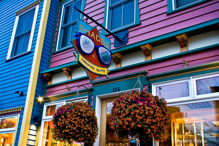
Outside of this being the name of a store selling sunglasses, these are truly the colors of Crested Butte itself: a charming, electic collection of colors amd quirky architecture. It is always a treat just to sit on one of the benches made from old skis and watch life go by on this amazing street. This colorful mountain town of Colorado gets lots of snow in the winter and boasts some of the best wildflowers in the state of Colorado.

Exif: F Number: 8, Exposure Bias Value: 0.00, ExposureTime: 1/5 seconds, Flash: did not fire, compulsory flash mode, ISO: 800, White balance: Auto white balance, FocalLength: 24.00 mm, Model: Canon EOS 40D

Comments

Debbie E. Payne July 11, 2009

No wiggle room here, Phellos : what you see is what you get! I so like the colors in this one and the title and the sign. But our judges passed it by. If any of you have ideas on how I can make this better I'd love to hear them. #1152878

Christie R. Bielss July 11, 2009

The colors are to die for, Debbie! And what is up with all the butte's in the Phello's gallery?! Mercy - it's like being at a plumber's convention!

While I like the tilt, it's a bit much for my vertigo. I think it could use a bit of straightening so the angle isn't quite so severe. The only other thing is the security camera on the blue building could use cloning. I'm surpised this got passed up - but if they get motion sick, then the depth of angle might be the reason why. #7729588

Debbie E. Payne July 11, 2009

Christie - I totally missed the security camera and when I get my computer back from the "hospital" I will corrected that and see I I can straighten it just a bit. But my guess is that the security camera was certainly one issue.

I feel like I am going through "computer withdrawal". Just getting on the site isn't enough. I need to be doing some editing! #7729613

Ellen H. Robertson level-classic July 11, 2009

Love the colors, love this shot. Other than the camera, I see no reason for the judges pass. Resubmit!!! #7729745

Ellen H. Robertson level-classic July 11, 2009

OK Christie, I commented on 6 photos before I got "being at a plumbers convention"LOL:)) #7729819

Jodi M. Walsh July 11, 2009

great colors! and a fun shot. that angle on the left side is a bit much and keeps playing tricks on my eyes. I also missed the camera but definitely think that should go. best of luck and hope your 'puter is back in good health soon. #7729863

Jeanine M. Bailey July 11, 2009

Awesome colors Debbie!!! :) I agree that the tilt is a little weird but then again...I have TONS of trouble with these types of shots!! Can't wait to see what you come up with once your computer is back up and running!! !:) #7729864

Christie R. Bielss July 12, 2009

LOL Ellen!

Honestly, if I didn't have motion sickness, this shot wouldn't have bothered me in the least. Even with the camera, I'm still really surprised this got passed up the first time. #7730778

Debbie E. Payne July 12, 2009

Took me a couple of seconds to figure out the "plumber's convention" thing and what it had to do with Crested Butte (Bewt, rhymes with newt) and butts. But one does have to visit a lot of threads to catch some of the double entendres we all throw into the mix. Keeps things fun around here! And probably keeps the "censors" at BP busy. Words like "butt" probably does come up on their radar. #7730813

Michael Kelly level-classic July 12, 2009

Debbie while I agree with cloning out the camera I don't think that would have prevented an EP. The colors are rich and intense and I like the detail, POV and Comp. The angle might have caused some hesitation, but it works on the shot and honestly if this is the full frame any adjustment to the angle is going to cause a crop. I think I would clone the camera and resubmit. #7730921

Anthony L. Mancuso July 12, 2009

I like all the colors Deb but there is a lot going on here..I know there is not much wiggle room but I think cropping out as much of the blue building on the left as you can could help...i don't really think it adds anything to the image, and doing that will put the sign more to the left upper rot spot and it would get rid of the camera as an added bonus ;-) #7731019

Dale Hardin July 12, 2009

Debbie, this shot reminds me so much of the "Painted Ladies" of San Francisco with it's vibrant colors.

I don't feel the camera had anything to do with losing the EP. It's a striking shot and sometimes it's just the luck of the draw.

The severe angle, while very artsie most of the time, could have had an influence but doubt it. If concerned about it you do have room to play.

Use the 'filter/camera lens correction' feature and correct to make the area straight at the left end of the main wall. Do not make the vertical yellow board on the corner of the building straight, as this will add different distortion. Set the edge extension scale to no more than 110. Now use an 8 x 10 crop starting in the lower right corner.

what you'll end up with is a tighter crop with Tony's suggestion about putting the sign in the upper ROT spot. Then re-submit both versions and see what happens. #7731744

Debbie E. Payne July 12, 2009

You know, Dale, I have never tried the lens distortion filter or whatever it is called in PS3 - Guess it is time to try to figure that out. Will do, if and when my computer comes home healthy anytime soon. Am going through editing withdrawal right now. I do think there is hope for this shot because I am beginning to like it more and more. What kind of place is Painted Ladies? Sounds really interesting. #7731749

Dale Hardin July 12, 2009

Painted Ladies is the name they give old Victorian type row homes that have been painted using multiply colors. Here is a link to many, many examples.

http://images.google.com/images?hl=en&q=painted+ladies+houses&um=1&ie=UTF-8&ei=fE5aStGmAYTosQPl0ZGDCw&sa=X&oi=image_result_group&ct=title&resnum=4 #7732070

Debbie E. Payne July 12, 2009

Awesome sight. Kind of like the towns of Leadville and Georgetown, not far from here. I see there is a whole neighborhood of them in Cincinnati - I don't know how far that is from Cleveland. Just one more thing to put in my cache of things that need photographing. Thanks for the link, Dale! #7732100

Sharon Lohrmann July 12, 2009

the colors are very rich in this image debbie. I think for me though, there is just too much going on - tony's crop suggestion might help with that. I don't really like the tilt (as already mentioned) but between the sign, the flower baskets, the reflection in the window, the actual stuff inside the store, etc.....my eye doesn't know what to do.

my only suggestion would be to consider a much tighter crop on the sign.

but I agree with dale, I think you should re-submit both versions and see what happens.
#7732716

Debbie E. Payne July 12, 2009

If I ever get my computer back I will be working on this, Sharon. But I suspect that by straightening the image I will lose the quirkiness of the shot and with that quirkiness goes the message behind the severe angle - the message about how colorful, quirky, fun, non-conformist and ecletic this crazy mountain town is. #7732965

Rita K. Connell level-classic July 13, 2009

what wonderful colors in this picture, I agree with everyone else about the angle looking forward to seeing the adjustments. These shots are hard to get I always wish I had a ladder to climb on. #7735671

Debbie E. Payne July 15, 2009

I did make two different crops in an attempt to accomodate the extreme angles that seemed to alienate most of you judging from the response I got to this image. Can you tell me if I am on the right track with these two? I don't think they are quite as extreme up near the side which is what is most important but the building faces themselves are way off now and the flowers are cropped. Any more thoughts or should I scrap this one? #7741990

Michael Kelly level-classic July 15, 2009

I don't think you should scrap it as it is a beautifully colored and detailed shot. I still like the original, but of these the vertical crop would be my preference and it does get rid of the angle problem. #7742021

Dale Hardin July 15, 2009

As I mentioned in my initial response I don't think the angle had anything to do with the EP selective decision but that it could be changed with room to play.

I see of your two new shots that the first follows the suggestion I made. However, like Michael, I favor the composition of the vertical crop. Bottom line is, I still think the original post was just fine. #7742804

Debbie E. Payne July 15, 2009

I didn't mean anything bad, I do welcome your responses. Just concerned and a little frustrated that the horizontal version pretty much fixed one axis but basically just changed to extreme angle to a different place. Then I "saw" the vertical and think that might be the most judicious way to go. I find it really interesting that certain suggestions lead to another totally different "fix". I still like the first image but feel that the vertical might fill the bill as well. #7742827

To discuss, first log in or sign up (buttons are at top center of page).

Get Constructive Critiques

Sign up for an interactive online photography course to get critiques on your photos.


Did You Know?

Discussions by Category: You can view photo discussions on various themes in the Community > Photo Discussions section of the site.

BetterPhoto Websites: If you see an orange website link directly under the photographer's name, it's totally okay. It's not spam. The reason: BetterPhoto is the one that offers these personal photography websites. We are supporting our clients with those links.

Unavailable EXIF: If there is no other information but 'Unavailable' in the EXIF (meaning no EXIF data exists with the photo), the 'Unavailable' blurb is not displayed. If there is any info, it shows. Many photos have the EXIF stripped out when people modify the image and resave it, before uploading.


The following truth is one of the core philosophies of BetterPhoto:

I hear, I forget.
I see, I remember.
I do, I understand.

You learn by doing. Take your next online photography class.


BetterPhoto.com Editor's Pick


Copyright for this photo belongs solely to Debbie E. Payne.
Images may not be copied, downloaded, or used in any way without the expressed, written permission of the photographer.
Log in to follow or message this photographer or report this photo.