
rememberance
Uploaded: March 12, 2013
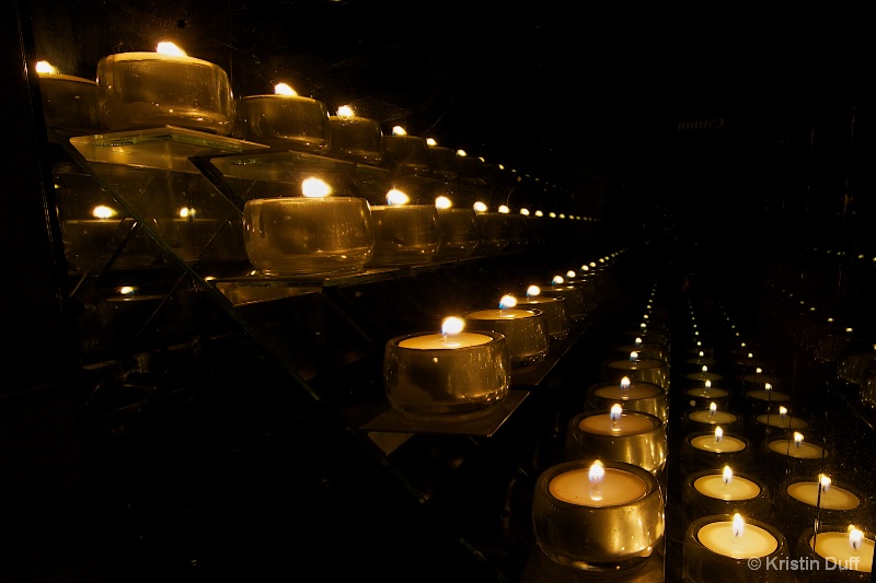
Exif: Exposure Bias Value: 0.00, ExposureTime: 30/1 seconds, Flash: did not fire, compulsory flash mode, ISO: 100, FocalLength: 12.00 mm, Model: Canon EOS 7D
Stephen Shoff March 12, 2013
That is really nice, Kristin. Lots of emotion in it. #1518871Stephen Shoff March 13, 2013
I'm looking at this on a brighter monitor, Kristin, and I can see the reflection of the Canon logo exceedingly well placed in the center of the the black background. I think you ought to bring that out and send it to Canon for advertising.[Seriously] Or clone it out. There are also a couple of bright specks in the lower left that should be cloned out as well. #10607700
Kristin Duff March 13, 2013
First of all this was supposed to have been titled Rememberance...no s in there! And Stephen how can you see the Canon label? My screen is black. Is there anything I can do on my monitor to be able to see this? Under Preferences?Jeff E Jensen March 13, 2013
This is fantastic, Kristin! I love that the rows of lights lead you right into the dark shadows, allowing your mind to ponder on what is, or was, there. #10607924Stephen Shoff March 13, 2013
Kristin -- if no one else sees it, then it isn't anything to worry about. I only saw it [initially] on one of my large monitors at home that I know is much brighter than I'd like.Just now, at work, if I look at your image on my external 24-inch HP monitor, the background is nice, rich blacks and there is no hint of a reflection. However if I grab the browser window and slide it over to my Thinkpad laptop built-in monitor, colors shift from copper to brass, contrast decreases and the reflection starts to show up.
So I guess for you to see it, you would need to decrease contrast and brightness on your monitor.
The real question for us as an internet community expecting critical photographic interpretations becomes what what and how well color-managed are the monitors our fellow Phellos are using to critique our images, and perhaps more importantly, how are the monitors the BP judges are using affecting the appearance of our images. We can't know the answers to either of those questions. #10608164
Jeff E Jensen March 13, 2013
I'm back at my home computer and if I adjust my brightness all the way up, I can see a faint Canon logo. Otherwise, I don't see it at all.Stephen, you are right, color management and calibration will be an issue for the next forever. In addition to the monitor variances, browsers handle color differently as well. Perhaps we should add a print competition to our annual trip? #10608218
Dale Hardin March 13, 2013
I like what you've done Kristin. It is simple, powerful, and leaves space for any written word that is needed when printed for the project.I would suggest a few changes however. Just to clean it up. I would suggest cloning out all the bright spots that are not the actual candles and holders. This would include the points of light on the right that do mot show the holders, the spots and reflections in the lower left area and upper right.
Also would suggest cloning out the areas on the brass shelving where the candles are reflecting in the upper left. I know that is natural but for sake of composition and distraction, it is the only place it occurs in the image and draws the eye. Also the bottom of the shelving where it is limited to one area.
Then apply a 4x6 crop starting in the lower right just at the bottom of your signature and have the upper left corner just clear the top most candle. this will create a nice diagonal composition that is clean.
I know this suggestion is a bit hard to follow, so will post a completed sample if you wish. #10608491
Beth Spencer March 13, 2013
This is full of emotion! I really like it. I can see the logo if I view the picture full screen but not if it is smaller. I look forward to seeing Dale's suggestions.. #10608576Elaine Hessler March 14, 2013
Can't see the logo either. This is very beautiful. Love the rows of candles leading my eye into the picture! #10609144Brandi K. Mills March 14, 2013
This is gorgeous! I really like the angle! #10609983Peter W. Marks March 16, 2013
The logo is barely visible on my monitor Kristin but now I am intrigued as to what it is reflecting off but that is hardly the point of this very thought-provoking image.Debbie E. Payne March 16, 2013
Fascinating discussion and great food for thought Kristin. Not to mention the lovely image you have captured. I am sorry for not keeping up like I should be. I seem to recall an image I posted that everyone else saw as "brown" when I thought it was black. I had to view the image on my husband's computer before I could understand what everyone else was seeing.Is ther any way too find out what Bp's color profile parameters are so we could all be on the same page? #10612557
Kristin Duff March 17, 2013
Will attempt to do some of Dales clean up issues tomorrow...off flying in the morning! Cheers everyone and have a good week! #10613777Kristin Duff March 18, 2013
Dale's suggestions... #10615006Dale Hardin March 18, 2013
I like it Kristin but you left off the crop. With the other parts gone, you need that to tighten up the comp. #10615026Kristin Duff March 18, 2013
Dale when I do the 4x6 crop it turned out as above. I cropped it again with no constraints and this is what I could come up with. #10615038Beth Spencer March 18, 2013
I like your crop! The edit looks great! #10615081Dale Hardin March 18, 2013
Thanks Kristin, that's what I had in mind. #10615094Kristin Duff March 18, 2013
THANK YOU coach! #10615105Sign up for an interactive online photography course to get critiques on your photos.
Discussions by Category: You can view photo discussions on various themes in the Community > Photo Discussions section of the site.
BetterPhoto Websites: If you see an orange website link directly under the photographer's name, it's totally okay. It's not spam. The reason: BetterPhoto is the one that offers these personal photography websites. We are supporting our clients with those links.
Unavailable EXIF: If there is no other information but 'Unavailable' in the EXIF (meaning no EXIF data exists with the photo), the 'Unavailable' blurb is not displayed. If there is any info, it shows. Many photos have the EXIF stripped out when people modify the image and resave it, before uploading.
The following truth is one of the core philosophies of BetterPhoto:
I hear, I forget.
I see, I remember.
I do, I understand.
You learn by doing. Take your next online photography class.
Copyright for this photo belongs solely to Kristin Duff.
Images may not be copied, downloaded, or used in any way without the expressed, written permission of the photographer.
Log in to follow or message this photographer or report this photo.
I already have an account!