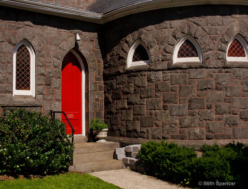
Prince of Peace, Episcopal church, Gettysburg, Pa.

Uploaded: June 11, 2012 03:10:27
Canon 40D, tamron 18-270mm lens, f/16, 1/320, ISO 400
Carla Capra Anderson June 11, 2012 0
Boy that red door sure pops against the stones. I like how the shape of the top of the door repeats in those windows. Great find, Beth. #1468477
Rita K. Connell
 June 11, 2012
0
Michael Kelly
 June 11, 2012
0
I find that in spite of the bright red door the shot has an overall dark and moody feel. Lightening it up and opening the shadows would help that. I also selectively reduced the red channel on the door. Here is a quick example of what I have in mind. #10176328
Beth Spencer June 12, 2012 0
Thank you Carla and Rita. Mike I wasn't sure about the red channel, but think I got it. I selected it, then did an adjustment layer with levels and did the red channel. It is lighter now. Thanks #10176848Anthony L. Mancuso June 12, 2012 0
Nice comp and colors Beth...I do think the original needed to be lightened a bit, but I think the edit went to far with that and you lost too much of the texture and contrast in the stonework. #10177336Teresa H. Hunt June 12, 2012 0
Oh I love the red door! I like the moody feel of the original. I do agree with Tony I think you lightened it a bit to much. :) #10177681Wendy M. Hansen-Penman June 13, 2012 0
Funny, I have some photos of an episcopal church and it too has a bright red door? Is that a thing? I think this is a perfect exposure. I like the color and contrast, and of course, the composition. #10178119Aimee C. Eisaman June 13, 2012 0
Congrats on the EP! :~) I don't like the changes on this one...they make it feel to washed out for me and bring out that green too much. I think this would be a great one to try some selective coloring on! #10178481Debbie E. Payne June 13, 2012 0
Love the shot, B9th - you are a bit underexposed and Michael's is a bit overexposed/lost contrast. So I would suggest somewhere in the middle. But the judges loved it and we do too! And the door is right in the sweet spot as well. #10178795Beth Spencer June 14, 2012 0
Thanks guys, I will give the edits a try either tomorrow after work or on Friday. #10179411
Rita K. Connell
 June 15, 2012
0
Beth Spencer June 17, 2012 0
I finally got some edits done. I was trying to figure out how to do the SC in Viveza and finally found it. It is my first attempt so hopefully I will keep at it.Aimee C. Eisaman June 17, 2012 0
I really like the last one with the SC....an interesting version of this image. I can't say I like it better than the all color version....they are both good! :~) #10183222Sign up for an interactive online photography course to get critiques on your photos.
Discussions by Category: You can view photo discussions on various themes in the Community > Photo Discussions section of the site.
BetterPhoto Websites: If you see an orange website link directly under the photographer's name, it's totally okay. It's not spam. The reason: BetterPhoto is the one that offers these personal photography websites. We are supporting our clients with those links.
Unavailable EXIF: If there is no other information but 'Unavailable' in the EXIF (meaning no EXIF data exists with the photo), the 'Unavailable' blurb is not displayed. If there is any info, it shows. Many photos have the EXIF stripped out when people modify the image and resave it, before uploading.
The following truth is one of the core philosophies of BetterPhoto:
I hear, I forget.
I see, I remember.
I do, I understand.
You learn by doing. Take your next online photography class.
Copyright for this photo belongs solely to Beth Spencer.
Images may not be copied, downloaded, or used in any way without the expressed, written permission of the photographer.
Log in to follow or message this photographer or report this photo.

I already have an account!

