The greenhouse.
Uploaded: August 05, 2010
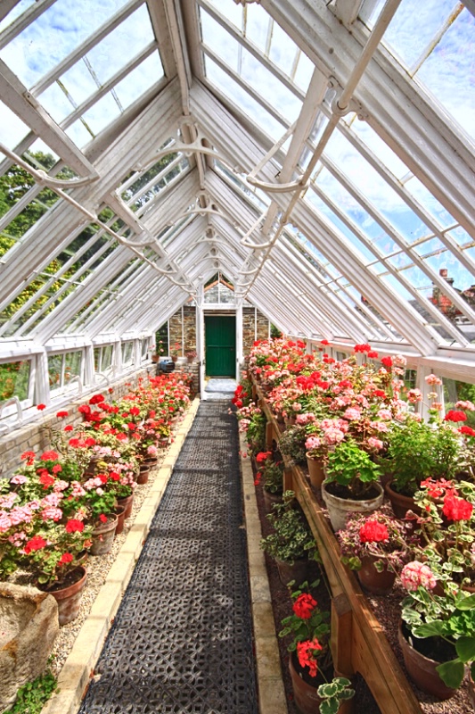
One of the restored greenhouses at "The Lost gardens of Heligan" Cornwall
1/100sec; f9; ISO 200; 11mm fl.
Exif: F Number: 9, Exposure Bias Value: 0.00, ExposureTime: 1/100 seconds, Flash: did not fire, compulsory flash mode, ISO: 200, White balance: Manual white balance, FocalLength: 11.00 mm, Model: Canon EOS 50D
Aimee C. Eisaman August 06, 2010
I think this is beautiful. I do wish the door at the end was on some sort of compositional point like a third. It doesn't even seem to be exactly center and I think it could have more impace if on a key point in the frame. The colors here are lovely and a pretty sky too. It all seems a bit soft so maybe give it the old high pass? :~) #1295424Rita K. Connell August 06, 2010
what a lovely picture of a green house. I love all the colors. the only thing I see it needs is a new crop. taking off some of the top and then the door will be where it needs to be. #8809598Peter W. Marks August 06, 2010
Thanks Rita and Aimee. I am not sure where you are going with your thoughts about a crop and 'the door being where it needs to be', what does that mean Rita?. My vision for this image was to show as many of the diagonal roof frames and muntins as possible so used my shortest 11mm fl lens from the entrance-way to the glass- house. All the leading lines do lead to the green door but I mean that to be only to give a sense of scale not the main subject of the image. I understand what you are saying about the 'thirds' but would suggest that this is a 'rule' that can be broken here, especially as I have included ten leading lines that kind of trumps a 'third' lolCarla Capra Anderson August 06, 2010
Lovely!Teresa H. Hunt August 06, 2010
Wonderful shot Peter. The first thing I noticed was the ceiling, so you accomplished your goal of showing off the roof. :)I think what Aimee and Rita are talking about with the crop suggestions is the fact that the crop feels akward. The center of your shot (the peak of the roof and the door) are not centered or on the rule of thirds. Yes it's a rule that can be broken, but here it creates a bit of an akward feel. I think I'd try shaving a bit off the left. You'll still keep the roof as the focus and move the perspective over a bit. Give it a try, if you don't like it you can always put it back. :)
I would LOVE to see a mono version of this photo. I bet it'll look Awsome!! :) #8810033
Dale Hardin August 06, 2010
Peter, that fact that you were able to get this shot at all with all those other tourists that were inconsiderate of your needs, is amazing. :o) This is a difficult shot with the lighting being so bright and still you managed to keep the sky a viable part of the image. Well done.It is a bit bright however, so you might try simply applying the highlights tool to drop the glare. Since you've invited us to "have at" this shot I've posted not only the highlights change but a few examples of what the others have suggested concerning a crop.
My personal preference is to leave it as it is because in this case, the content seems to over ride the composition for interest. And that is coming from a guy who considers composition the key issue in a photo. #8810103
Dale Hardin August 06, 2010
OK! OK! I lied. After seeing them all together, I like crop #1. The reason is that it retains the feel of the original with the skylight as the main point of interest, without loosing the importance of the flowers.Just can't get out of my compositional way of looking at things. :-) #8810111
Teresa H. Hunt August 06, 2010
I like all of Dale's crops, however if your focus was the roof . . . I like crop 3 the best :) #8810128Peter W. Marks August 06, 2010
You are a good man Mr Dale :0)Crop #1 Like #3 is too tight and loses rhe long narrow feel.
Crop # 2 This one loses the whole point of the image and using the 'rule of thirds' is the problem. That rule should be used to draw the eye to the most important part of the image and here it woud appear to be the door and the door was definitely NOT intended to be that. Also this image now appears to be off balance and so loses the sense of symmetry of the roof features.
Highlights reduced version.- nothing wrong with this one but doesn't portray what I saw when I stood there. Hey guys, we get lots of grey skies in Cornwall so when the sun shines brightly as it did on this day you are getting the whole bright scene as I saw it, no compromise!!
Just a thought; whereas 90% of folk here seem to wear sunglasses but I don't, I am wondering because of the number of times in critiques that 'blown highlights' are mentioned on forums whether perhaps the average person just plain doesn't like bright white? I would submit that in strong, directly lit, sunlight, there just isn't any perceivable detail in say a freshly painted white surface so why try to make one? Now, if we are tallking about someone's face or the like then I'm with you so we won't need to disagree there.
Thanks again Dale for your time. #8810171
Dale Hardin August 06, 2010
Peter, I always enjoy your thought processes. It really helps when critiquing to know what one is thinking. I totally see your point with all the crops (that's the reason I was wishy washy about my preference)However, must disagree with you on the highlights issue. What you have captured on film is not what you saw even though you insist it is.
Unlike the aperture on a camera your eye automatically adjusts itself so that you don't overload the optic nerves. That is, unless it is so bright that you hurt your eyes and must close them or wear sun glasses.
Since the camera can't do that you sometimes end up with blown highlights and a little tweaking is needed to mimic the image you saw. I agree that in either case there may not be any detail and reducing the highlights won't put some where none exists.
#8810714
Aimee C. Eisaman August 07, 2010
I personally like Dales crop #1 best for this and agree with the highlight issue although I could see it best applied to only the roof and sky in this image. I like the soft glow that is on the flowers due to brighter highlights. :~) #8811657Rita K. Connell August 07, 2010
personally if I were to crop I would take it from the bottom to top of the first big v I know you loose some of the sky but you don't loose any of the flower on the long path. I think you would be surprised. #8811801Jeff E Jensen August 07, 2010
Hmm, I thought I had commented on this one. . . .I'm gonna stick with the original crop with the highlights reduced a bit.
Lovely image Peter.
The first time I read Rita's first comment about needing a new crop, I thought "why do they need a new crop, these flowers look just fine" :o) #8812644
Michael Kelly August 07, 2010
A pleasing shot Peter, but I agree the original is awkward and a reduction of the highlights only improves the image. I also favor Crop 1 of Dale's of all the posts. It gives symmetry to the shot which enhances the visible structure. Good eye for a remarkable place.#8812676
Susan M. Reynolds August 07, 2010
A cheer for even getting off the shot with a crowd of tourists at your back!Unlike most of the folks here in the USA that wear sunglasses, I don't and never have, too expensive to get another set of prescription sunglasses. So the bright whites don't usually bother me unless they are glaring and the detail is completely lost, which I don't see here, but the highlight adjustment did seem to improve it a wee bit.
Nice capture Peter.
#8812693
Debbie E. Payne August 07, 2010
Peter, I know this will come as a surprise to you, but I would pretty much leave this image alone if I were you. Your original accomplishes what you intended, the leading lines of the NICE LONG walkway lead you in and although the darker door at the end of the walkway stop your eye for a second, the lines attached to the door leading up to ceiling do great job of seeing to it that you continue up to view it all.Michal's idea of a highlight adjustment would be a good idea if you decide to change anything. #8812778
Peter W. Marks August 08, 2010
"new crop..." You're a comedian young Jeff and no one likes a laugh better than I, so thank you friend. And thanks to all of you who have spent time on this image, way more time than the 15secs or so I took to compose and shoot it!Sign up for an interactive online photography course to get critiques on your photos.
Discussions by Category: You can view photo discussions on various themes in the Community > Photo Discussions section of the site.
BetterPhoto Websites: If you see an orange website link directly under the photographer's name, it's totally okay. It's not spam. The reason: BetterPhoto is the one that offers these personal photography websites. We are supporting our clients with those links.
Unavailable EXIF: If there is no other information but 'Unavailable' in the EXIF (meaning no EXIF data exists with the photo), the 'Unavailable' blurb is not displayed. If there is any info, it shows. Many photos have the EXIF stripped out when people modify the image and resave it, before uploading.
The following truth is one of the core philosophies of BetterPhoto:
I hear, I forget.
I see, I remember.
I do, I understand.
You learn by doing. Take your next online photography class.
Copyright for this photo belongs solely to Peter W. Marks.
Images may not be copied, downloaded, or used in any way without the expressed, written permission of the photographer.
Log in to follow or message this photographer or report this photo.
I already have an account!