|
Di Kerpan |
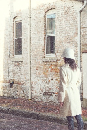
Please critique!!
Thx!! ~Di
|
||||||||||
|
|
|||||||||||
|
Lynn R. Powers |
I am suprised that there hasn't been a reply to date. I can't do these things so I didn't reply earlier. I is snowing so there aren't any shadows since it is daytime. Her proportions look as if the photo was taken with a lens between 35-50mm on a full frame camera and are fine. I didn't notice the light in the upper left until you mentioned it. But you may be downgraded by an instructor if this is for a class. I am happy with what I see so have no suggestions. For that matter I thought it was as taken when I first saw it.
|
||||||||||
|
|
|||||||||||
- Carolyn M. Fletcher  Contact Carolyn M. Fletcher Carolyn M. Fletcher's Gallery |
I love it, myself..If the light on the upper left bothers you, couldn't you clone in some extra building in the darker color? I doubt if anybody could even tell you did that if you are careful. I did notice the light, and it probably will bother some people more than it does me (and Lynn).
|
||||||||||
|
|
|||||||||||
|
Kay Beausoleil |
Di, you have a pleasing concept going, and the proportions look OK to me. Two things catch my eye: (1) the light on the building is flat but isn't flat on her, and there's nothing in the frame to explain this. Bringing down the bright white on her coat might make this less obvious. And (2) since it's snowing, how come she isn't wearing gloves? (Painting the hand black, perhaps?) Kay, from the Great White North
|
||||||||||
|
|
|||||||||||
|
Di Kerpan |
Thank you Kay, Carolyn, and Lynn! I so appreciate the helpful feedback. Lighting (and gloves) :) I'm on it.....
|
||||||||||
|
|
|||||||||||
- Irene Colling Contact Irene Colling Irene Colling's Gallery |
I don't think that gloves are really necessary. I go outside without gloves all of the time and we have real winter here. The composition of the photo is fine and you did a good job combining the elements. You wondered about the overexposed upper left corner. To me that is distracting. If I cover the top part of the photo my eye focuses the girl and then travels to the building. But when looking at the whole picture my eye skims past the girl and goes to the light corner. If this were my picture I'd try to correct the distraction. I might crop the top or more likely I'd darken that corner. On another layer drag a dark gradient, then try the various blend functions to see which one works best with this image. (Probably multiply.) Lower the opaciticy of the blend layer until you get the look you like. After blending I often experiment with the hue/saturation sliders to adjust the color if necessary. Good luck Di.
|
||||||||||
|
|
|||||||||||
chrisbudny.com - Chris Budny Contact Chris Budny Chris Budny's Gallery |
I think this is a pretty good blending/compositing job, actually. My main observation is that she is strongly lit from somewhere behind her right shoulder, out of frame. (So the left side of her body/coat/hat is clearly darker.) Yet that lighting direction on her, seems to conflict with the sun hitting the building, which appears to be coming from above and somewhat in front of her. Maybe she's walking in front of a virtual car's headlights, and thus this lighting combination would be logical... it just struck me a little "off" somehow; I'd expect her overall lighting to more or less match the "shaded" face of the building, if she's in an alley or between buildings; she's too low to probably get direct sunlight, judging by the light hitting the building above the 1st floor windows. The only other comment is that her pose/capture seems somewhat stiff, if you were going for a mid-stride/walking image? But I think overall, blending wise, this is a pretty good job of making it not feel "obviously" composited!
|
||||||||||
|
|
|||||||||||
|
Di Kerpan |
Christopher and Irene, your input is so helpful!! The woman's posture is definitely "off" for this image....not really walking, not really standing... I have other shots that could work better. And the PS steps for correcting lighting are priceless to me, Irene, Thank you both. I'm learning a lot!!
|
||||||||||
|
|
|||||||||||
|
This old forum is now archived. Use improved Forum here
Report this Thread |
|||||||||||