To discuss a photo, sign up as a BetterPhoto member or log in.
Hands
|
|||||||||||
|
|
|||||||||||
|
Rob Ryan |
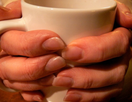
The first thing about it is the emotional impact: everyone knows this gesture, holding onto a welcome, warm cup of coffee or tea. It’s familiar and universal. Your focus and depth of field could not be better. The texture contrast between cup and hands is vivid. There is so much detail in the hands and nails I get an impression of the person attached to them. To me, they speak of emotional strength, life challenges and a tenacity that will not yield to fate. The picture seemed flooded with orange to me, perhaps tungsten light, and it gave the hands an unwelcome aspect. I’ve uploaded my color balanced image in which I also darkened the negative space for your consideration. Congratulations again on seeing and capturing this image. –R.
|
||||||||||
|
|
|||||||||||
- Roxie Guilhamet Contact Roxie Guilhamet Roxie Guilhamet's Gallery |
I also agree with Rob that the glowing orange fingers don’t look natural and I like Rob’s adjustment better. I tried it myself and found that it’s tricky to make them look natural without going too blue—and in severe need of a warm cup! One reason it’s difficult is that the left side is slightly overexposed, which pegged the red channel (hold down option/alt in Levels, as you would do when adjusting your black and white points, and you’ll see the red patches.) You’ll also see your histogram goes all the way to the right edge. That’s why there’s an unnatural red glow. Richard, what color is the coffee cup really—white or beige? That will give you a clue when you color correct. I clicked on it to color correct which turned it white, but the fingers look right; if it’s really beige, it’s easy to mask out the color correction on the cup. I also took the saturation down a notch. The negative space in the top left corner right along the thumb is a bit distracting; if you darken it, be sure to blend it well so that it’s not obvious. The other corners don’t bother me. I’d leave them alone, especially the bottom left so that you can still see the mug handle. Visual tension is good for some things, but for a warm, comforting pose your hands need room to breathe. You can back off a tad next time to fit in the rest of the thumbs, pinkies and back rim of the cup.
|
||||||||||
|
|
|||||||||||
|
- Roxie Guilhamet Contact Roxie Guilhamet Roxie Guilhamet's Gallery |
Here's an interesting discovery: the photos I just posted look glowing orange when viewed directly on the website, while on my monitor they look natural. Guess it's time to calibrate my monitor. How do they look to you?
|
||||||||||
|
|
|||||||||||
|
Judi Jensen |
I agree that the original needs some color correction. With my monitor, none of the corrections look much better, though I do agree with Robert's comment about darkening the negative space, the background area. If the model would have been wearing a dark color, even black, that space would have filled in better than the correction could do, and there would have been a nice contrast. And, just to put in my two cents, I think the image overall looks better with a beige cup. Much easier on the eyes. jj
|
||||||||||
|
|
|||||||||||
|
Richard L. Hawley |
What, you all don't like orange fingers?!! The 2 corrections done by Robert and Roxie (white cup) look better than the original ... on my monitor on the web site. I would like to talk to you both about how you accomplished the corrections. First, I shot in tungsten light with WB=tungsten. Second, I tried to color balance in levels and found BOTH a neutral white and a neutral black. white was RGB=255 and black was RGB=0. So no correction was indicated, I thought. Third, when I clicked on the mug, in many different places, the image was changed radically blue. (The mug is off white, but not beige.) I see in levels the red pegged on the right, is that supposed to override color correction? We need to talk more in person. I appreciate all your comments.
|
||||||||||
|
|
|||||||||||
|
- Roxie Guilhamet Contact Roxie Guilhamet Roxie Guilhamet's Gallery |
Hi Richard, Sorry for my confusing explanation. Let me try it again: 1. It’s good that you thought about WB, that helps a lot; but, not all tungsten lights are the same so you often still need to tweak it in the PS darkroom. 2. The best test for whether an image needs color correction or not is how it looks. White and black can be fine, but what about middle gray? 3. Pick a place that *should* be middle gray and click on it with the middle eye-dropper (I got all sorts of colors too—try clicking around the shadow inside the rim on the cup’s upper left). Click around until you find a spot that makes the colors look close to natural, then tweak it using the layer’s opacity slider.
|
||||||||||
|
|
|||||||||||
|
Donald Barsell |
After viewing all four images full screen on my monitor, I am going to have to go with Rob's version as showing the best skin tone with the most flattering color choice of cup.
|
||||||||||
|
|
|||||||||||
| Log in or sign up to respond or interact. | |||||||||||