To discuss a photo, sign up as a BetterPhoto member or log in.
PLEASE HELP!!!
|
|||||||||||
|
|
|||||||||||
|
Colette M. Metcalf |
This is gorgoues, David!!! I think she will just love and cherish the work you do!!!!
|
||||||||||
|
|
|||||||||||
|
David G. Ziegert |
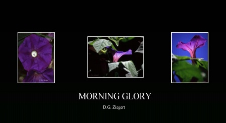
Thanks, Colette! I am considering increasing the size of the pix, but I also like the big negative spaces. I am also thinking about putting subtle color in the borders and text, but I'm not sure....
|
||||||||||
|
|
|||||||||||
|
clifton Mair |
The borders & the text look fine to me David. Have you tried another background colour apart from black? Perhaps dark grey? The photo's are great!
|
||||||||||
|
|
|||||||||||
|
David G. Ziegert |
Thanks for the imput, Clifton! The effect I really want is the matte black border that you see on Bob Talbot posters. Do you think the dark grey might get that effect for me?
|
||||||||||
|
|
|||||||||||
|
clifton Mair |
I've no idea, don't know who he is, just a personnel thing, I wouldn't want too much black on my walls :)
|
||||||||||
|
|
|||||||||||
|
America B |
The font doesn't seem to suit the layout IMHO, maybe play around with that. I think it will be the best gift! Your sis is a very lucky lady that you care so much to give her a gift so beautiful. Great work, David!
|
||||||||||
|
|
|||||||||||
|
David G. Ziegert |
Thank you for the feedback, America!! Any suggestions on the font? Of course, this question is open to all.
|
||||||||||
|
|
|||||||||||
|
America B |
I envision something a bit delicate, whispy, cursive, simple. I like the white on Black. What I usually do, altho a bit time consuming, is try the actual phrase in the finished product with a hundred different fonts before I choose one. And it never fails I choose one I hadn't originally thought of. Good luck!
|
||||||||||
|
|
|||||||||||
|
Donna J. Eaton |
I think this is beautiful & creative and your sister will love it! I agree that the font should be softer and maybe increase the size of the pics slightly. You could also pick up some color from the flowers and add to your borders.
|
||||||||||
|
|
|||||||||||
|
David G. Ziegert |
Thanks so much, Donna! RE: Border color... I was thinking of a pale purple, very pastel. Do you think that would work, or something a bit bolder? I'm just gonna have to do what America suggested and work through the fonts until one jumps out at me...
|
||||||||||
|
|
|||||||||||
|
Murry Grigsby |
David, you might try Pristina. I use it quite a bit in PS7 and really think it's classy. Your panel looks very good and your Sis will surely love it.
|
||||||||||
|
|
|||||||||||
|
David G. Ziegert |
Thanks, Murry! I'll definitely mock this up with Pristina. I just checked it out in MS Word and I think it'll prolly make the final cut!
|
||||||||||
|
|
|||||||||||
|
Paula Showen |
Fantastic David!!! It looks great! I love the black background with white font. The black helps the photos stand out better. Maybe a softer font and increased photo size, but all in all, it's great and she'll LOVE it! Nice work!
|
||||||||||
|
|
|||||||||||
|
David G. Ziegert |
Thanks for the vote of confidence, Paula!!
|
||||||||||
|
|
|||||||||||
| Log in or sign up to respond or interact. | |||||||||||