To discuss a photo, sign up as a BetterPhoto member or log in.
Reflections
|
|||||||||||
|
|
|||||||||||
|
Larissa M. |
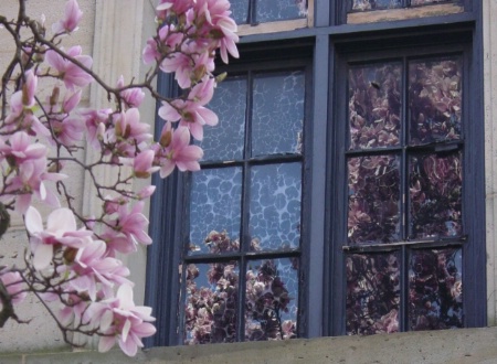
Hi, Does anyone have any advice for me on this picture? Thank you for your time,
|
||||||||||
|
|
|||||||||||
|
Darleen A. Stry |
Is the house supposed to be white? If so try and take the color correct tool and click on the house to get it white. Right now it looks a little yellowy. For fun you may want to crop off some of the left side of the image and only keep the windows and their reflection. That's really where the picture is-the white house behind the flowers destracts. Then you could try to clone ver the some of the window frame to eliminate the flowers that are covering the window frame. Then our eye would only see "the reflection".
|
||||||||||
|
|
|||||||||||
|
Larissa M. |
Thanks for all your suggestions, Darleen! I took this picture at the Dayton Art Museum. The building is stone, so no, it's not supposed to be white. I think it would look kinda cool cropped from the window like you said! Thanks again for taking time to comment,
|
||||||||||
|
|
|||||||||||
|
BetterPhoto Member |
I like this one. I like it how you got the flowers and the reflection all in one picture. Good job!
|
||||||||||
|
|
|||||||||||
|
Larissa M. |
Thanks, Jake! I like it, too! : ) ~Lue...
|
||||||||||
|
|
|||||||||||
|
Katrina McMeans |
Hey Lue...this is great! I agree with Darleen though, it does need a crop. ~K
|
||||||||||
|
|
|||||||||||
|
Ray Clarke |
Lovely framing and colours Lue (ac)
|
||||||||||
|
|
|||||||||||
|
Ray Clarke |
Lovely framing and colours Lue (ac)
|
||||||||||
|
|
|||||||||||
|
BetterPhoto Member |
this is a very nice idea. If you are using digital you might want to turn up the saturation a bit and sharpen a bit also
|
||||||||||
|
|
|||||||||||
|
Laura Kubasiewicz |
I really like the subtle colours in this photo, well done lue!
|
||||||||||
|
|
|||||||||||
|
Larissa M. |
Thanks so much for your comments, Audrey, Harrison, and Laura! ~Lue...
|
||||||||||
|
|
|||||||||||
johnvroscich.com - John V. Roscich Contact John V. Roscich John V. Roscich's Gallery |
NICE COMPOSITION. LIKE THE REFLECTION. LOOKS GOOD ASD IS.
|
||||||||||
|
|
|||||||||||
|
Larissa M. |
Thanks for your comment, John! ~Lue...
|
||||||||||
|
|
|||||||||||
|
Rachel E. Slepekis |
I really like this shot! Very pretty. The colors are really nice, and lot's texture to this. Also, nice comp. If it were me there is two things I might consider doing with it. 1. Sharpening the whole thing. 2. Cropping like was said, leaving just the window. But either way, I don't think you can go wrong with this image. It's very creative, and pretty. Good work.
|
||||||||||
|
|
|||||||||||
|
Larissa M. |
If I can, I'll try to include a cropped version of this in my comment box. ~Lue...
|
||||||||||
|
|
|||||||||||
|
Larissa M. |
...sorry, I couldn't get it to work! I'll just upload the cropped version in my gallery. ~Lue...
|
||||||||||
|
|
|||||||||||
|
Carol Teal |
I really like the cropped version, although this one is nice too. In the cropped version, I can enjoy the reflections even better.
|
||||||||||
|
|
|||||||||||
|
Larissa M. |
Thanks a lot, Carol! Me, personaly, I also like the uncropped version best! ; ) ~Lue...
|
||||||||||
|
|
|||||||||||
|
BetterPhoto Member |
Nice image!! regards, Willard
|
||||||||||
|
|
|||||||||||
|
Larissa M. |
Thanks so much, Willard! ; ) ~Lue...
|
||||||||||
|
|
|||||||||||
- Jill Odice Contact Jill Odice Jill Odice's Gallery |
I love this just the way it is! You have the reflection but also what made the reflection which to me makes it more interesting! I am sure the cropped version probably is good too, but this is what you saw and wanted to catch:-)
|
||||||||||
|
|
|||||||||||
|
Larissa M. |
Thanks, Jill! I think I'm more partial to this image then I am to the cropped one ; ) ~Lue...
|
||||||||||
|
|
|||||||||||
|
Darleen A. Stry |
I like the cropped version a little better because you really see the texture in the windows especially the left side. The original is nice too but it just has a different mood.
|
||||||||||
|
|
|||||||||||
|
Larissa M. |
Thank you, Darleen! Your comments are always welcome! ; ) ~Lue...
|
||||||||||
|
|
|||||||||||
|
Peggy J. Maguire |
I think you have done a fantastic job with this shot Lue,Nice work....
|
||||||||||
|
|
|||||||||||
|
Larissa M. |
Thanks so much, Peggy! I've never been able to decide between this and the cropped version, as to which one I like better! ~Lue...
|
||||||||||
|
|
|||||||||||
|
BetterPhoto Member |
Love the picture. Its beautiful.
|
||||||||||
|
|
|||||||||||
|
Larissa M. |
Thanks a lot for stopping by and commenting, Jacie! ; )
|
||||||||||
|
|
|||||||||||
|
BetterPhoto Member |
I REALLY like this picture. The rest of your galleries strike me as well as excellent use of technique and light but this one.... it conveys something really strong. The mood of the picture is superb, this is a DIFFERENT shot and I mean it in a positive way. Excellent!
|
||||||||||
|
|
|||||||||||
|
Larissa M. |
Thanks so much for your lovely comment, Inaki! It's very appreciated!! : )
|
||||||||||
|
|
|||||||||||
- Mitch Spence Contact Mitch Spence Mitch Spence's Gallery |
Lue, this picture truly engages me. It's very soft and gentle and I think reflects what you saw and what you wanted to capture at the time. I think if I were going to change anything, I might experiment with seeing what straightening the window would do and cropping only as much as that straightening would dictate and then perhaps using a mask to selectively sharpen at least some areas of the foreground flowers. Then again, you might find this still remains the best. It's quite beautiful.
|
||||||||||
|
|
|||||||||||
|
Larissa M. |
Thanks so much for stopping by with a lovely comment and good suggestions, Mitch!! :)
|
||||||||||
|
|
|||||||||||
|
Steve M. Harrington |
Lue, I agree with Mitch. I would rotate the image to make the right side of the window parallel. Steve
|
||||||||||
|
|
|||||||||||
|
Larissa M. |
Thanks for stopping by with a suggestion, Steve!! When I get time, I'll try what you and Mitch have suggested. :)
|
||||||||||
|
|
|||||||||||
|
Hayden Cannon |
hey Lue great capture this is a great shot very nice composition also the colors and details are great magnificent capture
|
||||||||||
|
|
|||||||||||
|
Larissa M. |
Thanks again, Hayden, for your lovely comment!! :)
|
||||||||||
|
|
|||||||||||
|
Stan Kwasniowski |
Lue, wonderful
|
||||||||||
|
|
|||||||||||
|
Larissa M. |
Thank you so much, Stan!! :)
|
||||||||||
|
|
|||||||||||
| Log in or sign up to respond or interact. | |||||||||||