To discuss a photo, sign up as a BetterPhoto member or log in.
Industrial Tool (Still Life)
|
|||||||||||
|
|
|||||||||||
|
Grant Campbell |
Feel free to deconstruct my efforts and give your opinion on artistic or technical points.
|
||||||||||
|
|
|||||||||||
|
Pam M |
GRANT GRANT GRANT THIS IS WHAT B&W IS ALL ABOUT FOR ME ... OMG ... and my long post about it got ate!!! Shoot! Billy will be off any minute and we'll be outta here ... So frustrating ... I will write it back out in the car and as soon as I get near an internet connection, I'll post it. But Buddy! You've found my tender spot when it comes to B&W ... have fun,
|
||||||||||
|
|
|||||||||||
|
Pam M |
Grant will you please drop me a note to remind me to finish my critique? it'll be a week or more have fun,
|
||||||||||
|
|
|||||||||||
|
Pam M |
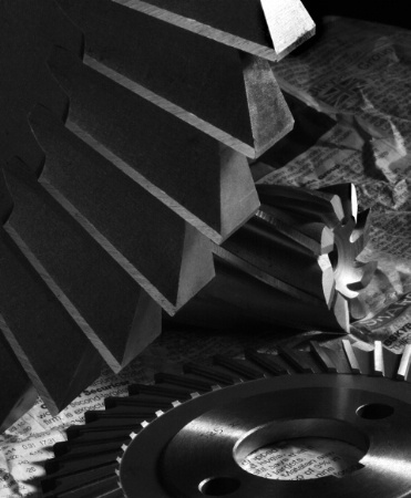
hmm ok ... first off ... this photo is my family photo ... litterally ... there's my grandfather, my dad and his brothers (my uncles), my brothers, my mother, me and my daughter. First there are the actual physical objects that you chose for the photo. My grandfather and his sons were all mechanics, machinists, and engineers. I don't mean the followers in the trades ... I mean they have been out on the cutting edge ... not inventing but the "early adopters" is what we call them now. All the same everything came back the family cars and the family homes ... even my brothers had to work on their own cars at home ... and after the left home ... well it was mmm not good times if they had to take a neglected car back to my dad for help. I have been around tools all my life that have had these pieces in them in some way. So just starting with the physical elements themselves ... obviously you picked them out for me. But ... where's my mom, my daughter, and me? ... were in the rest of this discussion ... We're the ones who can look at designs and say ... things like this:
|
||||||||||
|
|
|||||||||||
|
Pam M |
look at the Six Visual Elements: Shape: there's more to these than just being gears ... they are the basic shapes: Circle, cone, wedge (triangle), rectangle(ish), [aside for Bill: SHOOT I tried to change channels on my "radio" but the "gamers" sever is now telling me it's too busy to talk to me about streaming radio! ... The Nerve!] Color: This particular photo only uses Black and White for Color ... while some say this is not color ... mmm well you can't have color without them ... but ... we'll move on to ... Tone: If you can't find every shade of gray in this picture, ... well first if you're really trying ... think obsessive behavior ... but if you don't immediately see a wide range, visit the eye doctor immediately (or get a new monitor). Mass aka Volume: This is the need for different sizes ... which are here Line: Lines are very very important to design theory ... but right now notice that they are here and they do not argue with each other. As best as was possible Grant layed these pieces out so that lines Meet each other ... point to each other ... but they do not cross each other. Texture:There's smooth polished, there's the ground surfaces, and the sharp edges, and the background object (the almost unnoticed newspaper) adds a softer touch. on to the Design Principles ... tommorow! The Gamers are actually going to sleep!
|
||||||||||
|
|
|||||||||||
|
Pam M |
Gestalt Theories are way underdiscussed and uncomprehended. We are not the first people to hope for an unbiased system for judging the quality of an image. People have been creating standards all the way back to the early Greeks. So ... eventually some German and Austrian psychologists got together to try to figure out how the mind and eye actually perceive images. In doing so they created a set of theories that a good design can use in order to speak to the masses. The theories, in one form or another, have also come to be the basis of critique and judging contests --in all forms of art and design. BTW Gestalt is a German word meaning shape. Some people freak out to think that Art can be (and is) actually engineered. But every piece of art is engineered ... some are just engineered better than others. Some are engineered by mmm an inherited sense of the theories ... they've been observing the theories all their lives and so it is simply a natural, unthought process for them to continue on in artistic ways. Some artists have studied and applied the theories for so long that they "just do it." Many artists at this level have even forgotten how to explain how to do it. BUT that is not to say they have forgotten how to apply the theories. And then there are the artists who never lose sight of the theories ... the theories are the basis for all that they do. These are the people who can be extremely talented and they can teach other artists ... or they simply know how to encourage and coach the talents in others. Okay so how did Grant apply the Gestalt Theories?
|
||||||||||
|
|
|||||||||||
|
Pam M |
Balance/ Equalibrium: This is the theory that in everything we are constantly looking for balance not balance like a set of scales ... No ... Equalibrium ... a way to feel that we are not fall'n ;) The reason that the rule of thirds works is because it says that elements should line up on at least one axis. Right about here is a good place to mention that we humans are not balanced in our visual concept of where center is actually located. (No, we don't have time to discuss how humans basically have no clue of center in any aspect of life.) When we look at an image, our eyes do not actually immediately fall on the center of the image. Our eyes actually first gravitate toward the upper right intersection of the Rule of Thirds grid. We also look for a balance in weight, in repetitions, etc. But it's okay for an artist to break the rules in order to emphasize other aspects of the image such as tension or a mirrored effect. So ... let's see ... do we feel balance when we look at Grant's image? I say yes. The rule of thirds is well applied as is the visual center (where the large gear begins interaction with the other) There's balance of mass: two small objects to balance the biggy-wiggy. There's also another kind of balance in play ... the balance of positive and negative space ... more on that yet to come.
|
||||||||||
|
|
|||||||||||
|
Pam M |
Closure: The brain knows that it knows ... it does Not need to be shown (told) everything in order to comprehend and it is not really interested in having a complete image. The mind is much more entertained when the whole story is not presented because then it has a dream to dream. WHAT IN THE WORLD am I talking about? Very simply this: We humans perceive in completeness whether the complete image is available or not. We are actually bored by complete images because, generally there is nothing left to consider. So if you are going to keep a human being involved with your image ... you're gonna have to give their brain and mind something to do. Exception to the theory: Some images are very breathtaking presented completely inside the box. They are the images that immediately inspire emotion and thought. A heart, A flower in a vase, A piece of candy or any other food, a flag, a toy ball. We see these objects and wham we are involved. Basically, if we are presenting an image like the above, it's safe to present it in its entirety. ... there's more on this later. BUT Goodness how many people are really tied emotionally to gears!! (I know I'm an exception!) So Grant very wisely did not include any gear in its entirety. So the brain is left to complete the entire gear and i'd be willing to bet that few of us are completing the (or closing off) the cylder shaped gear at the same length. THAT's JUST the BEGINNING ... On we go ... You remember that I pointed out that Grant's lines point to each other? Well the other thing about the brain is that it closes down gaps in order to complete an image. Look closely ... you will see that Grant lined these gears up very very carefully. The lines (gear ridges) are lined up just so. Do you see it? Think about how gears work ... and then tell me what you see.
|
||||||||||
|
|
|||||||||||
|
Pam M |
Proximity: We humans are always saying things like "birds of feather flock together," or "he's sticking out like a sore thumb." We group things together. If they group together well, they are assumed to be a whole. If they don't group together well, they are assumed to not be alike. The brain visually perceives in the same way. BUT But becareful ... if it can group things together and make a story, it will! This is also how we get things "growing out of her head" ... things like tree branches or shelving or some other odd thing. In photography we use things like mmm the placement of elements to establish depth. If there are horses in a field, then big horse = near; small horse = far. The placement of elements to establish size. If a car and a man are pictured together and the car is only as tall as the man's waistline, then either the car is too short or the man is really tall. We use selective focus, DOF, and neutral backgrounds to group like subjects together. Ok what did Grant do? Yeah it has something to do with the lines pointing to each other ... and closure .... LOL, yes, like I said before, he carefully carefully placed them in near proximity. And this near proximity is very important so that closure can happen.
|
||||||||||
|
|
|||||||||||
|
Pam M |
Continuation aka Line of Sight: you must control your viewer's brain and mind through the eye in order to have a piece of art. It's a known fact that our eyes follow lines and line is one of the most primary ways of controling the eye. Continuation is the use of elements to create a line, a path through your image. Great use of continuation begins at the edge of the image's frame and takes the viewer's eye to the subject you want the person to see and the brain comprehends your story. Or the line ends in a place of mystery ... a place where the mind begins to dream a dream. If you can do both, you will have an exceptionally intriguing image. While Grant is using the theory of closure in order to immediately give the brain something to complete, he is using continuation to provide the eye a line/ path to both enter the image and become engaged in the story that the gears are telling. Have you come to understand the gears' story yet?
|
||||||||||
|
|
|||||||||||
|
Pam M |
Figure/Ground:This is all about sorting based on contrast (tones, hues, tints, etc.) It seems that we humans, in our never ending quest for equalibrium, are constantly groping for understanding .. no no grouping for understanding. This is where understanding your positive/ negative space and foreground/ background and use of colors comes in very handy. I suspect that this theory explains why we generally reject things that are over and under exposed as "wrong" ... they don't fit preceived concepts of the grouping. On the other hand it is this same theory that allows us to just be content with abstract art -- provided we can arrange the contrasts into something entertaining to us. Grant used very careful lighting technique to allow us to precisely understand the depth of the grooves, the height and width of the ridges and the luster of the pieces. Very pleasing to look at. AND he also used the very different contrast of the newspaper to keep the gears grouped together as the subject of the image. MOREOVER the harmony of the contrasts sets the tone for the gear's story. Please tell me you know what that story is by now.
|
||||||||||
|
|
|||||||||||
|
Pam M |
Isomorphic Correspondence: LOL it's just big, long words that mean we group according to meaning. Hearts=Love, Fireworks=Celebration, etc etc. Yes, these are those iconic things that always are tied to emotions because they have come to stand in our mind as meaning love, celebration, etc. A still life that creates the most relate-abilty will have iconic elements. An image that creates a story groups together things that have a meaning. A beach and a lounge chair with a hotel in the distance automatically means someone is traveling in a very restful way. Ok so very few people will look at Grant's gears and think of MY story. But this type of image is very unique to the industrial age. A lot of people will look at these tools and think of manufacturing. Do you look at these gears and think of motion? If you don't know what story these gears are telling by now, I'm not ever going to tell you ;) have fun,
|
||||||||||
|
|
|||||||||||
|
Grant Campbell |
Pammy, Pammy, Pammy!?! Calm down please ;-) But.. What more could I possibly add? Other than: these are not gears but milling (metal cutting) tools, I'm sure you knew that, but perhaps couldn't recall! By the way great essay on the fundamentals of artistic appreciation, I'm very flattered that you chose to expound such virtue on this image. Take care and...
|
||||||||||
|
|
|||||||||||
|
Pam M |
Grant! Geeze ... such a wild 6 weeks ... 8/4 seems like forever ago to me now ... all that to say: I apologize for taking forever to respond. Actually, no ... I really was thinking gears although I have to admit that the shape of the teeth on the large wheel did keep whispering something about cutting. Their shapes are so universal that they actually reminded me of everything from car parts to little micro pieces my dad use to bring home and show us that he used to create little micro pieces went up to the moon in seismographic equipment. All the same, it doesn't matter a bit what they are ... it's how you composed them together here that makes them have the feeling of belonging together in some sort of interaction with each other. The other thing I've noticed in reviewing this piece is ... I should never write long pieces when I'm sleep deprived ... there are gaping holes ... like drive a MAC truck through. Eventually I will write a whole lot more on this idea of engineering images. It seems to freak people out ... and well ... I've never minded shaking up a person's perspective (especially if it brings them closer to my point of view). I would still love to know what your instructor(s) had to say about this piece? have fun,
|
||||||||||
|
|
|||||||||||
| Log in or sign up to respond or interact. | |||||||||||