To discuss a photo, sign up as a BetterPhoto member or log in.
Dinner is Served
|
|||||||||||
|
|
|||||||||||
|
Gallamore Photography |
Any critique on this?
|
||||||||||
|
|
|||||||||||
|
Protacio Serna |
nope...no critique...I feel something is missing, or that it can be improved somehow...but I like it...a lot. I'll see it in the morning again. Ciao
|
||||||||||
|
|
|||||||||||
|
Pam M |
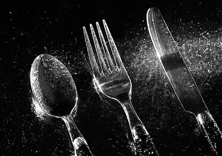
Hey Amanda, Good Morning! I agree with Protacio on all points ... at first it made me nuts when he would say ... "I'll see it again in the morning" (LOL or "i'm thinking"). Then in the past few days I've realized I have to have time to get past my fascination with the picture before I can actually see the "other stuff" ...more easily accomplished with other's pics than my own. so ... I looked again this morning at your image & said "ok now it's time to really look or you're no help at all!" Here's what I saw, presented in two parts. I love the look of crystals being strewn about. I'm betting these are not crystals at all but small little scrapes in the metal & glass. Why? because the crystal-look is lost on the knife because the knife does not have a lot of itty bitty scrapes. it mostly has long stroke type scratching. since the light is lined up exactly in front of the knife, the light travels straight down these strokes. Thus the knife has a different look. The difference is accentuated by the fact that the glass under it picked up more of the "crystallization" So I ended up feeling like something had happened & the knife had dumped it's crystals. I keep wondering what would happen if you took yet one more flashlight & used two lights to cross-light the knife. Perhaps someone else here knows what would happen ? While I was studying that situation, it dawned on me that there's a shadow across the mid-section of the blade. Is it the shadow that traditional flashlights have in the middle of the light? And about the extra space on the left of the image... The knife on the right is making a bold statement. It's bigger, it's different, it's slightly marred. It is where my eye is initially drawn...but then it kind of feels like the statement just slides off to the left. The empty space certainly doesn't lead the eye in from the left. I realize that mathematically you have the same amount of dark space to the side of the spoon & the knife...but...When my mom was trying to teach me (more yrs ago than we want to discuss) how to hand-draw lettering she said, "The brain is mathematical. The eye is not. You cannot let your brain say "here 1/4 inch between the sides of each letter" because that is not how the eye sees." (There followed a whole long dissertation & demonstration of the process which I will spare you...) and that's what's happening here. I'm sure there's a Gestalt theory that covers this concept. Maybe it's the balance of postitive and negative space.
|
||||||||||
|
|
|||||||||||
|
Pam M |
Now, you can leave that space on and put it the image in your wallpapers because most people's icons would eat up that bit of extra space on the left. But as a stand alone image, it needs less space and cropping right next to the spoon would certainly bring the eye into the image faster but it would also minimize the story. Here's what I suggest: Take a straight edge & line it up on three points. 1) run it down the middle of the spoon handle, then 2) line it up with the spot at the tip of the spoon bowl where the light & shadow meet. With the straight edge lined up on those two points, extend it out over the top edge of the image & wa-la... right where it crosses out of the image that is point 3. Point 3 is where I suggest you crop for two reasons: Sigh & speaking of shadow (ok technically it's a reflection in this image)...the knife's shadow seems to be lost in an over-exposure. If it was more visible in the original, there are ways to slightly apply a technique in one layer (to the point just before you lose the shadow), copy the layer to create a new layer, finish pulling the technique to the point you want (as it is currently) & then there is at least one way to fade the top layer back in the area of the knife's shadow so that the bottom layer shows through (with more of the shadow) That should be clear as mud! Hopefully someone with a current copy of PS & current skills to match can explain this Much better. And did anyone mention focus? something happened to the focus of the knife tip. My guess is aperture but I don't get aperture entirely yet so make sure Protacio or someone tells you what happened there. OK Now that you should feel totally beat-up, let me say this: I am very impressed that you took the gumption & initiative to use the tools at hand to take your understanding of light way on out there. In fact, you've taken my understanding a lot further than it was. I'd also like to know why you chose to treat the photo as you have in PS. Was it just "boring?" If it was originally slightly overexposed, you've accomplished a very interesting save with it. Keep having fun!
|
||||||||||
|
|
|||||||||||
|
Gallamore Photography |
Thanks Pam! That's the best critique I have ever gotten and has given me much to think over and diges! Actually after posting I went back and began reworking the image again, and removed the shadow in PS. I agree with the crop and will definitely experiement with it for sure. One thing I should have mentioned was that I sprayed water before the photo and then during the photo while the shutter was open. Then in PS I sharpened it a bit, and it actually gave it this scratched yet semi wet look. As for the overexposure that was done in PS. First I added a channel mixer layer, red@160, green @190, and blue @-200, checked monochrome and then moved the constant to my liking. This gave it the high amount of contrast which I really ended up liking. Thank you so much for your honest opinion. I don't feel beat up at all but rather inspired. I will definitely experiment more and trying adding different light sources and also crops in PS. Again thank you all both so much for your constructive criticism, this is exactly what I've been needing :)
|
||||||||||
|
|
|||||||||||
|
Pam M |
AH HA! So ... I should have listened to the spoon! Obviously there are scratches ... but the spoon tried to tell me "wet stuff" but the knife said "look at me, I'm not wet" ... then the table tried to tell me it was wet ... but the knife said no no ... lol and we all know this knife has an over-bearing influence on me =) The fork is the one that was perfectly balanced between the two ... and basically he seems pretty near perfect in all ways. anyway ... the effect is great! I think you just exposed yourself as a go to person for help in PS ;) You are very welcome to my honest opinion. I hand them out way too liberally ... my family will be happy to share with you! Have fun
|
||||||||||
|
|
|||||||||||
|
Protacio Serna |
Wonderful work...both the photograph and the critique. Now about the "speaking silverware"...LOL I love the fork, and the spoon. Their shapes are special, interesting, nice, balanced and dynamic at the same time. But the knife's shape is so static. Cover that part with your right hand and tell me how does it make you feel? I like square format and this one "speaks" to me that way...now I'm hearing voices...hehehe. Great shot...excellent technique. Take care. Pserna.com
|
||||||||||
|
|
|||||||||||
| Log in or sign up to respond or interact. | |||||||||||