To discuss a photo, sign up as a BetterPhoto member or log in.
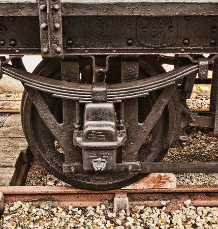
Wheel
|
||||||||||||||
|
|
||||||||||||||
|
Peter W. Marks |
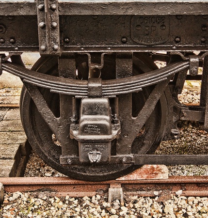
I uploaded the wrong version! This one had the distracting white above the springs on the wheel. As BP were quick off the mark and gave it an EFP I will leave it but add the adjusted version here.
|
|||||||||||||
|
|
||||||||||||||
|
Stephen Shoff |
Good to see you getting back on track, Peter! I think your two replacements could be done better. For the one on the right, it appears there was enough detail that you could have used the original content and just applied a localized multiply or overlay blend to bring out a little more detail and darken it. For the one on the left, it isn't clear that there was enough detail for the same solution as above but you could try it. The replacement you selected is large and detailed enough that it looks like an entire landscape all by itself. I think you might have done better to use the healing brush or clone tool to copy the gravel from just below and to the left of the spring to provide the alternate background.
|
|||||||||||||
|
|
||||||||||||||
|
lisa anderson |
Congrats on your EP, Peter! I like the tones in this shot.
|
|||||||||||||
|
|
||||||||||||||
|
Dale Hardin |
So glad to see you feeling better Peter, and ..... that you're taking a detailed look and action to get the best from your images. Well done old friend. That said, Stephen made some good points. The one on the right you can get away with, but the one on the left is very obvious, although an effort to be applauded, and one that you'll be more sensitive if the need arises again. Ain't learnin' fun?
|
|||||||||||||
|
|
||||||||||||||
|
Jeff E Jensen |
Well, I like it, Pete!
|
|||||||||||||
|
|
||||||||||||||
|
Beth Spencer |
Congratulations on your EP! I hope you are feeling better. Nice tones and texture along with a great subject!
|
|||||||||||||
|
|
||||||||||||||
- Michael Kelly Contact Michael Kelly Michael Kelly's Gallery |
Very nice Peter - you can almost feel the textures you captured here. I like it. I also think it is great that you recognized a small problem area and attempted to correct it. These type of fixes get easier with some experience so just keep working at them.
|
|||||||||||||
|
|
||||||||||||||
- Rita K. Connell Contact Rita K. Connell Rita K. Connell's Gallery |
congrat's on EP I love the textures in this one I think this one would look in black and white also. Hope you are feeling better. don't go outside today....I think you are having the same weather we are rain....! no more slipping or falling
|
|||||||||||||
|
|
||||||||||||||
|
Peter W. Marks |
Thank you friends for your welcome back and your comments. However, whilst I am coping with my cracked ribs I am not sure what the bump on the head has done for me! Stephen and Dale, as much as I have re-read your comments several times I am left in a state of some puzzlement. Your comments seem to be relating to my BP gallery rather than my Club images as you both refer to 'the one on the right and the one on the left" whereas on the Phellos club I submitted an image of just the wheel and labelled it as such ie 'Wheel'. Then as you acknowledge I spotted the white distraction and corrected that and added that version beneath the original. And, I did infact did use the clone tool to add some of the gravel from beneath the rails so can't follow why it is suggested I should use it when I had already done that So why am I puzzled? Well the image of the wheel on its own is not cropped from the image I made of the underside of the rail wagon complete with part of the chassis.(the one you refer to as 'the one on the right') Yes, it's the same wagon and yes the same wheel, but shot from a different position. So, if you are suggesting that this one could use some further work with blending etc I can agree but am not understanding what you are trying to say about the shot(s) of just the wheel on its own. Why are you saying there doesn't appear to be enough detail? I am seeing on my monitor detail right down to being able to read the embossed manufacturers stock no, user name, and parts of the steel casting id numbers, despite this wagon being around sixty years old and having its rust covered with some thick black preservative paint for the museum outside of which it now resides. And Dale, my old mate, I have not the slightest idea of what you mean when you say "the one on the right you can get away with but the one on the left is very obvious" Huh? Two nations divided by a common language if ever there was! Does anyone want to translate for me while I go put an ice pack on my head and ribs?
|
|||||||||||||
|
|
||||||||||||||
|
Dale Hardin |
It's very simple old one. :o) there is an area on the top right of your image that was corrected, and an area on the top left of your image that was corrected. Hence, the one on the right and the one on the left.
|
|||||||||||||
|
|
||||||||||||||
|
Stephen Shoff |
Yes, Peter, both Dale and I were referring to your original "Wheel" post and the comment you yourself made about bright spots above the springs...which you then posted a correction for. We are not referencing anything in your gallery. For the clone work you did on the right white area, there is some detail in the original "Wheel" image. You didn't need to have cloned it out. You could have just added a multiply layer that was masked so that only that one area was darkened. For the clone work you did on the left white area, there is some detail available in the original "Wheel" image but maybe not enough to use the same solution I suggested for the the right white area. If not, you'll have to find something to clone into there. What you picked doesn't seem like it works very well. Yes, your entire image has great detail. Our comments were limited to those two white areas that needed attention.
|
|||||||||||||
|
|
||||||||||||||
|
Peter W. Marks |
Dale and Stephen. I have learned something from your posts that perhaps would benefit most of us in the club. I have noticed in the past that there is sometimes confusion over which image we refer to when suggesting inprovements. This happens especially when we submit more than one version of the image we want suggestions for and show the pre-adjusted image beneath the improved image. What seems to happen then is that folk talk about "the original image" and we are left wondering if that means the 'improved' version that we submitted first for comment or does it mean the "original out of camera pre-adjusted version"? I hope that makes sense! In future I will label mine something along the lines of 'Dandelion v.1' and 'Dandelion v.2' and then my good friends here can say (and you know who you are! :0) "Peter,the tip of the petal at the top in V.1 has a tiny speck of brown on it and right at the left side, one of the clouds is slightly blown out". Then I can take another pain pill, sigh deeply, wish it was 6pm so that I might take a glass of wine without guilt and do my best to make all you lovely people happy! So after all that, let me say, that I wholeheartedly agree that my image of the wagon wheel needs the sort of TLC that you lovely folk would have lavished on the image. I am afraid that it takes me back to my high school days when my end-of-year reports seems to have ignored my A's and B+'s and the year-teacher would write "Marks needs to pay more attention to detail in his work and not gaze out of the window at the girls playing field hockey".
|
|||||||||||||
|
|
||||||||||||||
|
Aimee C. Eisaman |
Peter a very neat shot...love the detail in it. My husband really likes it too! I'm sure you will be able to take care of the issues mentioned once you get to feeling better. :~)
|
|||||||||||||
|
|
||||||||||||||
|
Peter W. Marks |
Thanks Aimee and tell Dwayne thanks too. I have to thank Dale for the inspiration for the image as I was so impressed by a similar one he shot some time back and gained a POTD. His was of an axle box on a locomotive as I remember. I will try to improve mine sometime. I certainly feel better but hunched over a keyboard is more painful than standing or walking at the moment.
|
|||||||||||||
|
|
||||||||||||||
|
Kristin Duff |
Peter, delighted to see you are back at it despite the pain...one foot in front of the other is all that is required. unless of course the glass of wine reacts with the pain meds and you are flat on your ass...Congratulations on EP- that's a nice come back! Take good care...Kristin
|
|||||||||||||
|
|
||||||||||||||
|
Peter W. Marks |
Very kind of you Kristin, thank you. Should the falling "flat on my ass" as you so prettily suggest, occur, then I hope I have my camera with me and you will be fooled into thinking any image I make is one of Jeff's weirdly leaning masterpieces.
|
|||||||||||||
|
|
||||||||||||||
|
Kristin Duff |
lol!
|
|||||||||||||
|
|
||||||||||||||
simplydivinephotography.com - Susan M. Reynolds Contact Susan M. Reynolds Susan M. Reynolds's Gallery |
I'm for the version on the bottom of the two posted. I like how one can read the words stamped in the steel & see the texture...I'm with Rita and thinks this would be a great photo for a Black and White too. Congrats on your EP and so good to have you back ~ Keep rested so you don't land bottom side up, Okay? :)
|
|||||||||||||
|
|
||||||||||||||
chrisbudny.com - Chris Budny Contact Chris Budny Chris Budny's Gallery |
I love old train parts! And especially their wheels! I do think your "bright spot fixes" are pretty decent, though the larger bright spot fix (upper left of the wheel) does feel a slight bit too exact-cloned from the area nearby? You might want to clone from a few areas, at different opacities, so the patch doesn't feel so mimic-y of another area? And, I think you should try a little Free Transform/warping to straighten out the major lines a bit. The topmost horizontal line of metal at the edge of the image is nice and horizontal, but the next big horizontal line we see just below it, is not as horizontal, and the rail at the bottom is not, either---possibly due to a downward-pointed or just-off-center camera and the distortions that can introduce. I hope you're on the mend, and feeling back to normal soon!
|
|||||||||||||
|
|
||||||||||||||
| Log in or sign up to respond or interact. | ||||||||||||||