To discuss a photo, sign up as a BetterPhoto member or log in.
Balance
|
||||||||||||||
|
|
||||||||||||||
- Roxie Guilhamet Contact Roxie Guilhamet Roxie Guilhamet's Gallery |
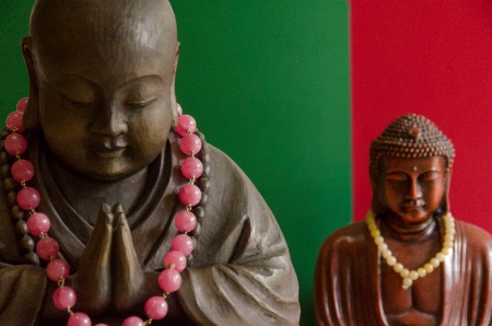
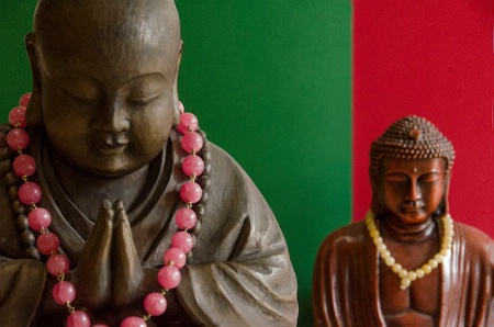
Great idea with the backgrounds! The dynamic balance here comes from the different sizes of the buddhas and their backgrounds. The smaller, less-focused one on the right gives the image depth because that's how we're used to seeing photos with secondary images in the back. The red of his background, on the other hand, jumps forward, giving this image a strong graphic feel, and definitely giving the little guy visual weight for balance. And the pink beads balance the red and frame the main buddha's face. Nice touch. Because the colors don't change exactly between the buddhas makes me pause and wonder where they are—a museum? It's a good pause, keeping me interested in the scene. The indirect sidelight is wonderful. Close cropping is fine and brings my attention to the front buddha's expression rather than to him as just an object, which evokes more mood and feeling, which is always good. I'm glad you kept at least a bit of the lowest pink bead in to complete the circle. My imagination can fill in the rest. There's a tension created with the slightly tilted vertical. I would fix that tilt to give the scene more peace. And speaking of peace, the colors contrast so strongly that they want to steal the show, making the scene dynamic, but not peaceful. A less saturated red (such as a rich burgundy) might soften the mood while keeping your original intention. Keep experimenting!
|
|||||||||||||
|
|
||||||||||||||
| Log in or sign up to respond or interact. | ||||||||||||||