To discuss a photo, sign up as a BetterPhoto member or log in.
Rule 7
|
|||||||||||
|
|
|||||||||||
- Roxie Guilhamet Contact Roxie Guilhamet Roxie Guilhamet's Gallery |
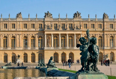
This scene shows well how foreground objects give depth. First, you use the interplay between foreground and background, the most important thing. You have a scene to draw us in, the palace of Versailles. Then, you have something of interest in the immediate foreground—the statue of cherubs. The palace itself would be flat without them. You've increased the sense of depth by including the whole line of statues decreasing in size into the distance. The varying sizes of the people adds even more depth. This is because we know people are basically the same height, so when their size changes this much, our brains see the third dimension to explain the difference. Great example here! The cherubs are in focus, as they need to be. And their size and and placement is good for the overall composition. The color contrast of green against orange makes them stand out as well. Good job remembering to use side light for depth. And the color of the light is lovely. As Rob Sheppard suggested, you could even warm up the building more to bring out the warmth of the afternoon sun. Wide angle lenses show off this technique the best, so I'm glad you used it here. It looks like the building is bowed a bit from your wide angle lens, though, and slightly skewed—easy to do when shooting a building straight-on. The Adaptive Wide-Angle Filter in Photoshop CS6 will easily fix this. Draw in verticals on both sides and horizontals across the building at the top and along the white balcony. That should align things properly.
|
||||||||||
|
|
|||||||||||
|
- Roxie Guilhamet Contact Roxie Guilhamet Roxie Guilhamet's Gallery |
Yes, this second version brings out the warmth of the afternoon sun on the building, giving the image that much more punch. Nice. The building's lines better too. Thanks for redoing it.
|
||||||||||
|
|
|||||||||||
| Log in or sign up to respond or interact. | |||||||||||