|
Jessica Johnston |
vibrant, saturated photos I am tired of my photos looking dull compared to others' I see. I want those photos that the colors are bright and saturated. Any tips on getting these results? I have a canon 20D.
|
|||||||||||||||||||
|
|
||||||||||||||||||||
|
Ariel Lepor |
There are some things which make photos vibrant. Post processing for brightness and saturation correction, proper exposure, proper subject and lighting, sharp focus, use of polarizer filter.
|
|||||||||||||||||||
|
|
||||||||||||||||||||
- Ken Smith Contact Ken Smith Ken Smith's Gallery |
I would have sent you a personal e-mail, but didn't see an e-mail link...if you like, click my contact link and I can give you some ideas. I'd like you to send me a few of your photos, then let me give you some examples of what simple photo edits can do. Ken
|
|||||||||||||||||||
|
|
||||||||||||||||||||
|
doug Nelson |
If you are shooting in RAW, these unedited shots will look a bit dull. If your jpg captures are looking the same, the solution is the same. Don't try to bypass editing your images in a good editing software, Adobe Elements being a good, Photoshop-based example. Get a book on digital editing OR take one of the excellent courses recommended here at BP. Don't be influenced by over-enhanced images, with candy colors that don't resemble anything real. If you still have a film camera, shoot a roll of Provia 100 of your favorite subject matter. Use that as a baseline to decide whether you want further-enhanced colors.
|
|||||||||||||||||||
|
|
||||||||||||||||||||
|
Jessica Johnston |
I have experimented with editing and saturation, but it always tends to make skin look unattractive and blotchy. I see photos that are so bright and crisp looking, and natural. I have used a polarizing filter a little. Does everyone tend to use saturation correction in editing software to achieve these results?
|
|||||||||||||||||||
|
|
||||||||||||||||||||
|
John P. Sandstedt |
Try this. Open an image. Go to Image>Image Rotate>Arbitrary. Rotate as necessary to assure the horizon is horizontal. Then, go crop your image to get rid of any excesses. You're now left with an image that all the Tools will work with. Then, got to Image>Adjust>Auto Levels. Check out what the program gives you. If you like it, fine. If you think there's more to be gained go to Edit>Undo Auto Levels to return to the starting point [after cropping.] Then go to Image>Adjust>Levels. Move the triangle on the left side of the upper Slider Bar to the right til you'e happy. Move the triangle on the right til you're happy. Mive the midtone slider as necessary. This will correct your exposure. If you have Elements 4 or 5, or Photoshop CS2, then go to Image>Adjust>Shadows/Highlights. Move the sliders til you're happy. [Note, you might be happy at all! If so, go to Edit> Undo Shadows/Highlights.] Then, go to Image> Adjust>Brightness/ Contrast. Make adjustments as yo like. Click OK. Then, go to Image>Adjust>Hue and Saturation. Make adjustments that may be warranted. Be aware that the best workflow will force you to follow the different tools on each menu from top to bottom.. You should make very small adjustments and save [to a new file name] often - in case something untoward happens. You can always delete the iterations you don't need. Somewhere along this path you'll achieve the colors you're looking for. But, you may also have a color profile issue. Make sure your monitor is calibrated. Now, save the Final - Master. When it's saved you should now select the size print you want going Image>Image Size>Resize. At this point go to Filter>Sharpen>Unsharp Mask. Start your sharpening at 140%, 1.4 Radius and 0 Threshold [these are starters only, you may need more or less.] And, remember you should sharpen independently for each size print you plane to make.
|
|||||||||||||||||||
|
|
||||||||||||||||||||
|
Bob Cammarata |
Doug N. had a good point in comparing the results of your 20D to the same scene captured with a properly exposed slide film like Provia 100 (or the older Kodachromes like KR-64). These films have a history of reproducing colors very accurately. Often, technique, conditions and/or limitations of equipment are to blame for flat color reproduction. Diffused light (like on a cloudy day) will often result in bright colors looking a little flat. You can tweek the saturation (and brightness) just a hair with your imaging software to punch up those colors but don't get too crazy with it.
|
|||||||||||||||||||
|
|
||||||||||||||||||||
|
W. |
"These films have a history of reproducing colors very accurately." I get the impression the O.P. isn't looking for accurate colors, but rather wants to more or less "Disney-fy" them. That takes editing, of course.
|
|||||||||||||||||||
|
|
||||||||||||||||||||
|
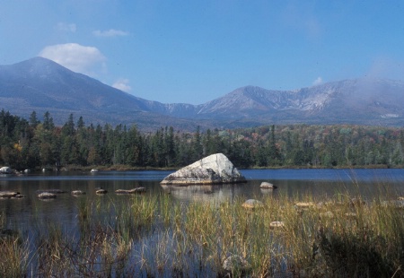
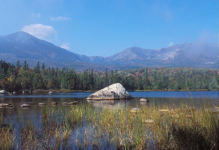
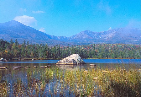
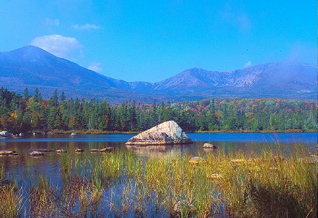
Bob Cammarata |
As I mentioned before, editing can be applied in gradual steps to enhance the beauty that's already there. I use the slide films mentioned earlier and lose some of the "punch" in my bright colors when I scan them. By slightly increasing the brightness and saturation, those bright colors will come back pretty close to my original slides. I've attached four samples to show how minor adjustments can enhance while over-editing will create surreal ("Disney-fied") effects.
|
|||||||||||||||||||
|
|
||||||||||||||||||||
|
This old forum is now archived. Use improved Forum here
Report this Thread |
||||||||||||||||||||