
Jill M. H. |
|
help again !!!
|
|
|
|
A girl's best friend
Jill M. H.
|
|
|
|
A girl's best friend part II
Jill M. H.
|
|
|
|
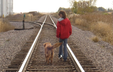
sorry about asking all these questions, but here's another: how does this new photograph look, I really thought the red coat looked good with the color of the dog and what people see when they look at it, let me know what u think?
October 17, 2005
|
|
|
Michelle Ross |
|
Hi Jill . . . these look good . ..maybe need a bit more brightness.. . I would convert these to B&W and then add the red of the coat back in!
October 16, 2005
|
|
|
Bob Cammarata |
|
Jill,
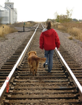
I like the horizontal version better because the girl is looking at her "best friend". This helps to fit in with the title.Good concept and overall composition but the washed-out sky is a bit distracting in both shots.
Have you considered converting it to B&W? Your message would still be apparent but that might help to make the sky less noticeable.
October 16, 2005
|
|
|
Angela K. Wittmer |
|
I like the horozontal one too... I agree with Bob when she is looking at the dog it gives a sense of unity. Also try priting in sepia... I would be curious how that would look. smiles..... Angie
October 17, 2005
|
|
|
David M |
|
Interesting... I like the verticle one myself, the focus is better, better contrast, the trees and building are not cutoff, and I like the tracks starting out up close and appear to go to infinity, the dog is more alert.... and the dog is your best friend, even when you aren't looking!
October 17, 2005
|
|
|
Justin G. |
|
I like this picture. I gave a good look at it and I like it. Two things to knit-pick (I'm sure you were looking for constructive criticism!) would be that the dog and girls hair look a little soft. Possibly focus was slightly off as if there were a split second between the focus and the shutter release. Also would be the girls left shoe. This one is extreme knit-picking but relevant. The relflective tape on her shoe glows and the other leg has the pants over the shoe. Little things to look for on future shoots. The photo conveys a really old feel to it, and the new age reflective shoe throws in a little discrimination. Like Jill mentioned the red coat does stand out nicely. I think selective coloring like Michelle mentioned would be too drastic. Possible lower the saturation to around let's say 15-40% or so. This will give it the "worn out" look like monochrome would but still a hint of color. Personally I think that would be oustanding. Also sepia as Angela says would make the dogs coat a nice color and give the overall "old" feel emphasis. Other than the little knit-picks, great photo Jill. (Oh yeah horizontal, I forgot to say!). Justin
October 17, 2005
|
|
|
Brendan Knell |
|
I also think that the horizontal one is better. Did you figure out how to turn off the date stamp?
October 17, 2005
|
|
|
BetterPhoto Member |
|
Both photographs are good compositionally. The horizontal gives a sense of place. You know where you are in this photograph. The vertical focuses on the subject more and also give a purpose to the image, 'going somewhere'. Both are good photographs and this is a classic example of what two different orientations (horizontal and vertical) can do to the same subject.
Walrath Photographic Imaging
http://home.comcast.net/~flash19901/wsb/html/view.cgi-home.html-.html
October 17, 2005
|
|
|
|
Log in to respond or ask your own question.
|
