|
Matej Hochel |
Requesting Comments on Composition, DOF, etc.
|
||||||||||
|
|
|||||||||||
|
Kris Haskins |
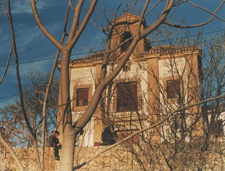
Starting with the colors: I like them. The large tree in the forground does not compete with the church the way it would if it were a different color. In fact I personally think the colors are the strongest aspect of this picture. Because the church is so obviously symetric I don't feel that I'm missing part of the church, except for the center arch which is mostly hidden by a large branch. I might suggest a composition where the center of the building is more visible because of this. I don't like power lines in pictures of very rural looking locals, but this is a personal thing I think. The sky is very good. I don't think a clear blue sky would have added as much to the feel as the wispy clouds do. I'm not going to comment on the people in the photo, because I don't know what to think about them.
|
||||||||||
|
|
|||||||||||
|
John A. Lind |
The color, exposure and vertical placement of the "horizon" line are good. The people add some "life" and a sense of purpose to it. The DOF looks fine in the scan and the sky has a subtle interest with the clouds. Close examination of the DOF requires a look at the negative using a light table and magnification with a loupe. Like Kris, I'm distracted by the tree and other plants blocking the view. Also get the feeling I would like to shift to the left to view the church straight on, or to the right to view it more at an angle. For architecture in general: 1. Pay close attention to the horizontal and vertical lines of the structure, especially the vertical ones. I've found that most people expect vertical lines to remain vertical and parallel to each other unless the view is radically upward (60 degrees or more from dead level). Try to keep the horizon line (often the base of the building) from being dead center vertically unless you have a water reflection symmetry. Make certain a level horizon shows being level in the viewfinder. 2. When shooting the corner of a building showing a front and side, start at about 60 degrees to the front (90 deg. is straight on) and move around until the converging horizontal lines from the front and side look most natural in the viewfinder. If tilting upward starts to noticeably converge the vertical lines, then see if you can move back and use a longer lens (sometimes this is not possible). Otherwise consider a radical perspective by getting very close and looking almost straight up. The other solution to this is shooting more image than you need knowing you will crop to move the horizon line when making the print. If there are people, be patient until those in view are in good locations in the composition. Sometimes this requires great patience. 3. This is a lot to look at when doing architectural photography. Take your time at it. Usually I look at perspective and do rough composition hand held with the lens to be used, then set the tripod in place, mount the camera, level it, and fine tune the composition (checking leveling as the last step). The tripod allows looking at everything about the horizontal and vertical lines carefully and being patient for people to be in decent positions. 4. Don't forget to look for a "picture within a picture" and consider some interesting parts of the architecture in addition to the whole structure. -- John
|
||||||||||
|
|
|||||||||||
|
John A. Lind |
Matej, Is this church near you? Is it something you can easily photograph again? If so, I suggest going back on a decent day at about the same time of day and experimenting with different views and compositions. Then examine all the images afterward for what you do an don't like about each one. This is how I learned to "see" an image in a scene. It's a learned skill very few are born with. After a while you will be able to "see" a finished image and automatically look at small details. Warning: if you practice at this you will never see the world again in the way you once did! :-) -- John
|
||||||||||
|
|
|||||||||||
|
Hermann Graf |
There are simply too many things on the pic: the church, the tree, the wall, the kids sitting on it... separate them and select the object which is of interest for you.
|
||||||||||
|
|
|||||||||||
|
Jeff S. Kennedy |
I really like this shot. The tree adds a nice frame as well as a natural vignette to the church. Unless you are trying to sell a piece of architecture I don't believe you have to always keep the perspective square. The powerlines are regretable but only a minor issue.
|
||||||||||
|
|
|||||||||||
|
Steve A. Stephens |
I took a coure from NYIP and one of the main things they drill into you is "Simplify".....take your shot of the church and the trees, kids, walls....etc...waaaay too busy...albiet nice coloring and tones...but too much is going on...the eye's want to try and take it all in at once..then it gets too busy and you end up dismissing the main point of the picture because it's too busy...so..to coin a phrase..."simplify"...take it down to basics and isolate your main point in the picture...it will be a better pic for you .....
|
||||||||||
|
|
|||||||||||
|
This old forum is now archived. Use improved Forum here
Report this Thread |
|||||||||||