|
Riley R. Asburry |
image opinions
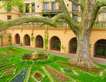
1 - is the color sturation to much? 2 - Which category of the photo contest would this best fit? Thank you for your help :)
|
||||||||||
|
|
|||||||||||
|
Michelle Lea Guinn |
I think it looks fine and I would put it in Elements of Design. mlg~
|
||||||||||
|
|
|||||||||||
|
Justin G. |
Nice shot Riley. The saturation is good and gives it a brighter more pleasant vibe. Keep it like this for a "warm, pleasant" mood, or turn down saturation to ALMOST but not all the way B&W for a "cold, eiry" mood. But I like it how it is. Elements of Design or Travel .justin.
|
||||||||||
|
|
|||||||||||
|
Terry R. Hatfield |
I Think The Saturation Is A Bit Much On The Green,It Would Fit Best In Travel And Place!Great Looking Image Riley!!
|
||||||||||
|
|
|||||||||||
|
Chauncey R. Huffman |
The first question is actually difficult to answer. The problem is that none of us saw the original scene. If the original looked exactly like that, then the saturation is okay. Heres an easy way to see if the sat. is too high. Open curves in PS. click on the dark eyedropper, run the eyedropper of the pic until your info palette gives you a high reading (ideally a CMYK pic would have a reading of C:95 M:95 Y:95 and K:80,) however b/c of the vibrant colors you won't get these readings. Anything close is fine. Then pick the middle eyedropper and find a midtone, somethingl ike the wall of the building or the sidewalk. Lastly use the white eyedropper and click on a very birght highlight. This should grey balance the pic and give it a natural color rendition. If it doesn't work then you chose too high or too low of a value for either highlights, shadows, or midtones. Anyway, it's a good pic, and if you don't want to go though all that trouble maybe just open up Hue/Saturation and pull the saturation down a little.
|
||||||||||
|
|
|||||||||||
|
This old forum is now archived. Use improved Forum here
Report this Thread |
|||||||||||