
x |
|
Old-classic Style shots
I have a client who just requested (out of the blue) that she would like a few shots in a classic old-style look and feel. This was never mentioned before, but that's OK. The wedding is June 25th, so I can think about this a little.I may call her again and get more of an idea, I can't get the image of Marlene Deitrich standing in a doorway with a cigarette, or something. I don't know if that's what she means, but she did mention the lighting and such. I am familiar with the butterfly lighting, but not sure exactly ho wto achieve it. It will be fun, and a new challenge, especially with the pressures of a wedding. But, does anyone have any suggested resources for accomplishing this? I wont have time for elaborate set-ups or anything. It will be fairly quick. The hotel is a pretty old Hollywood hotel where stars used to go, so that might be why she wanted it. And, the decor fits that era. So, it might be fun. In my head, I can envision some things, but they used to pose differently back then, and I have never really had any training doing that. My posing is all pretty recent stuff. Also, the lighting is the main thign I'm worried about, that can make it or break it. I was even thinking about bringing BW MF film for that. Any resources or suggestions?
June 01, 2005
|
|
|
Kerry L. Walker |
|
Jerry, I am sure yor friend No Name can help you out here. Just ask! It would be nice if she would give you a little more info. If she is talking about the posing, I would just suggest researching some old style formal photos of the period she means. For info on butterfly lighting, check out this site.
http://www.vividlight.com/articles/1615.htm
Another way to achieve this pattern with two lights instead of one, is to set the main light up above and to the left (or right) of the subject, with a fill light at about half the power of the main light next to or attached to the camera. This can be done with either studio lights or flash but it is harder to set up with flash. Just have to practice it before hand. Let me know how it goes. If my info is not correct, I am sure Justin will be able to provide all the information you need.
June 01, 2005
|
|
|
Rick Richardson |
|
Jerry, This may not be what your looking for.. but it could be interesting. I've always liked the way "Casablanca" was shot: moody and beautiful. According to sources, cinematographer Arthur Edeson used a style that employed Film Noir and Expressionism. He used a softening gauze filter for Bergman for her famous sad look and with catch lights. He also utilized specific shadows that made a statement. Might be the answer - borrow from old Hollywood cinematographers. Rick.
June 02, 2005
|
|
|
Christopher A. Vedros |
|
Jerry,
An easy way to find photos of classic stars (to get inspiration) is to use the Internet Movie Database. I spend almost as much time on that site as I do here.Here is a link to Marlene Deitrich's page: http://us.imdb.com/name/nm0000017/ There is a link under her photo that says "more photos" that will bring up a gallery of pictures. You can use the search box for other actresses, like Joan Crawford, Joan Fontaine, etc. I think BW MF film wouldn't be a bad idea for this, especially if you have time to work out a lighting scheme and try a test roll first. Did you hear that, Kerry? I recommended film!
June 02, 2005
|
|
|
Kerry L. Walker |
|
Chris, I thought I was going to have to call a bride and tell her I couldn't make to her wedding tomorrow. When I read that I fell out of my chair and hit my head. Then I realized there was nothing there to hurt so I guess I'll make it OK.
June 03, 2005
|
|
|
John A. Lind |
|
Kerry,
You're really looking for Verichrome which Kodak introduced in 1931 to replace Kodak Non Curling film from 1903 (Verichrome, not Verichrome Pan that replaced Verichrome it in 1956). Both Verichrome's are both gone now.The closest to it I've found is Plus-X Pan. Ilford might have something among its slow speed stuff, but I haven't tried enough of it. Look at the values in the classic photographs . . . lots of midtone with a small amount of specular highlight and deep, deep shadow . . . and yet they're not muddy either. Most of them (if not all) were done with hot lights. Regarding "butterfly" lighting . . . it's also called "Paramount" (from Paramount Studios that used it frequently for female star portraiture). See the diagrams that show butterfly on these web pages: http://www.geocities.com/glowluzid/portrait/portrait.html
[scroll down toward the bottom] http://groups.msn.com/Asktheoleproaboutphotography/portraitspage2.msnw
[he mis-labels "Paramount" . . . look at the butterfly] http://www.garageglamour.com/tips/paramt1.pdf
[this is an Acrobat PDF] Ignore the hair and background lights for what you're doing. The thing you'll find in all of these is the key (main) is fontal and elevated . . . its height determines the extent of the butterfly. The fill is below it. You may have to experiment a bit with the height of that one. If you can't get it looking right, drop back to "loop" lighting . . . easiest (IMHO) to set up, relatively failsafe and also used for glamour shooting. Butterfly sometimes just doesn't look right with some subjects (their facial shape or whatever). One of the magnificent things about Verichrome and Verichrome Pan were their very fine grain (consider also the film formats they were used with). Use medium format for it. According to its data sheet, Plus-X is available in 120/220. I sometimes use a modest to medium yellow filter for portraiture. Seems to render more natural looking skin tones. I'd do some with and without one if you can put one on and take it off relatively efficiently (and remember to reset exposure if you're doing it manually). Another classic is Tri-X with its midtone response . . . but it is grainier. Last, but not least . . . the grade paper it's printed on will also affect the look. From what I've seen, a lot of this stuff appears to have been printed on lower to mid-contrast . . . not high contrast. -- John Lind
June 03, 2005
|
|
|
John A. Lind |
|
Jerry,
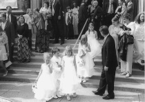
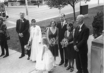
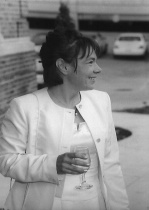
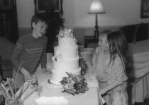
Hopefully it's not too late (saw your other message). Just got some Plus-X back from a cousin's wedding (I was purely a guest) and shot it as I knew the main photog was running color. Scanned a few of the 4x6 proofs done by Qualex on their typical somewhat lower than average contrast material. See if these are close the the type of thing you're looking for . . . put up a few so you could see a range of things done with it. They blew out the highlights slightly in a few of the prints. Each of this is linked to the bigger one that I uploaded.
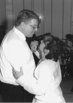
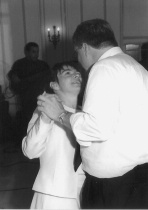
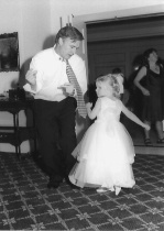
-- John Lind
June 07, 2005
|
|
|
|
Log in to respond or ask your own question.
|
