
Sreedevi Swaminathan |
|
Scanning Techniques
Can anyone give any tips on scanning techniques? I have an Epson 1650 Photo scanner. At first, I was scanning Black and White negs- I was trying to touch up my headshots. And the images came out beautiful, very crisp. But scanning color has rarely worked for me. They always look really grainy, and once I get into PS and increase the magnification, I see it's because there are all these pixels of various different colors intermingled in the image. I'm sure you know what I mean by that.Well, basically, I could spend about an hour through Epson's scanning software changing all the levels, individually tweaking each color, and I'll end up scanning about 5 different versions of the same print, all different colors, densities and contrasts (?). But that doesn't help me much. I notice on this website that all the pictures- at least 95%- are incredibly clear and sharp. I do have my unsharp mask on by the way, but obviously, it's the sharpness that makes all those different pixels of color. And dealing with it on PS is a lot harder. As far as the levels are concerned, I find it's better to get it right when scanning. Any advice at all? Hopefully any of you understand what I'm getting at. I could spend days and days trying to get a print right. I've used levels, scan at 300dpi, unsharp mask, and in PS have gone through levels, unsharp mask, sharpen, color balance, etc. I know this is supposed to be a good scanner, and Epson does have good products in this sense. I just think I really don't get it, and I feel that also I go really far in my manipulations. Also, if anyone knows how to get the Epson scanning window bigger, that may help too. I feel that if I could actually see the image, when I'm changing the levels, I'd be more precise. But the window is so small, it's really difficult to work with. Any help at all would really be appreciated. Thanks- Sreedevi
November 13, 2002
|
|
|
doug Nelson |
|
If this is 35-mm color film you're scanning, scan at the highest true resolution your scanner can do (1200 ppi or 2400 ppi) AND at the highest color bit depth (42-bit?) Try doing your Levels or Curves in PS, THEN to go Image/Image Mode and drop the bit depth to 8-bit. Go to Image/Histogram. You should see a graph with no open gaps that show no information for those tones. The graph should be solid from where the tones begin to where they end. OK so far? Can someone else help with the scanning window problem?
November 13, 2002
|
|
|
Ken Pang |
|
|
|
|
|
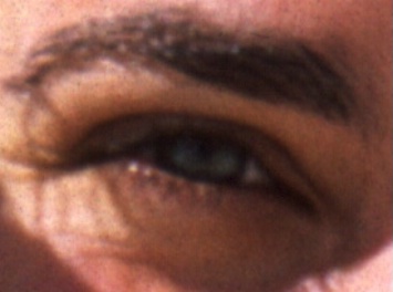
Sarah's eye
Taken from full body portrait and zoomed in to 1:1
Ken Pang
|
|
|
|
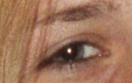
Aggie's eye
Also full body portrait zoomed in to 1:1
Ken Pang
|
|
|
|
I'm wondering if it's film grain you're seeing. I've included two photos here. One is taken using Velvia 50, the other is using NPH 400.You can see the Velvia one has come up perfectly smooth with no grain. But NPH, being a faster film, you can *just* start seeing grain show. I wanted to find one that I used just consumer film instead of professional, because the effect was even more pronounced, but I couldn't find one handy. These negs were scanned at 4000dpi. By the way, unsharp mask will not help you get better photos. It will just make the contrast between the two pixels even more apparent, giving you an even grainier look. You can use soften slightly to blurr the grain a little. If you use photodeluxe instead of PS, you can also use the "remove grain" function.
November 13, 2002
|
|
|
Sreedevi Swaminathan |
|
Doug, thank you- I think you know exactly what I mean, however, I'm not too sure first of all how to read a histogram, and second of all, the picture still looks pretty bad. I scanned it at 1200dpi at 200% using the unsharp mask. I didn't tinker with the levels/curves setting- just kept it at linear. I kind of did a little bit with gamma and exposure.
Now, I have PS6, so I don't know how it works if you have 7, but it only supports 16 bit, although I assume it doesn't make too much of a difference, since it's just for correcting.
Shouldn't the print look different after dropping down to 8-bit? I didn't really see it. And on the histogram, since I don't know how to read it, it did show up as solid on everything except blue, but I'm not completely sure, because the levels were very up and down, and on the blue, it started way down, just a little small bar above and what I believed to be a space, before going into its solid contortions. I'm usually so good with computers, and even though I'm not a beginner on PS, I doubt if even the guys who created it know all the hidden secrets that lie within. Ask me to read a quality control chart and I'll tell you exactly what's going on, but ask me to read a histogram... Is there something else I should have done or something I did wrong. Also, I've tried this both ways, but when adjusting levels and curves for this purpose, do you look at the whole picture or do you zoom in on an area and try to even out the tone when you can see every color?
November 13, 2002
|
|
|
doug Nelson |
|
I've heard it said, can't remember where, that most flatbeds do a compromise job of scanning 35-mm negatives, although they do much better with medium format and 4 x 5. You may be banging against the limits of what this scanner can do.
OK, you're scanning at the highest resolution. 1200 isn't much for 35-mm; 2400 ppi would be better.
Bit depth is confusing. Manufacturers and software people use the full figure (42-bit) and the 1/3 figure(16) interchangeably. 1/3 is because of the three channels of color, R,G,and B. Continue to scan at the highest bit depth.
The histogram divides light intensity into 256 levels. You can also get a readout of intensities for each of the R,G and B colors, although the composite histogram is, to me, more useful. The histogram is a count of how many pixels are present at each of the 256 intensities. It has nothing to do with exactly where in the image the intensities are. I usually look at the whole image. You can see at a glance whether your image is underexposed, overexposed, high key, low key, or whether there are gaps showing no presence of one or more of the 256 itensities. Wayne at scantips.com explains histograms at length and what to do with the levels control.
Lastly, don't sharpen in the scanner. That should be a near last step in Photoshop. See scantips.com on parameters for Unsharp Mask (USM), which is the pro tool forsharpening.
A pro trick for USM sharpening is to change the Image Mode to Lab Color, click on the Lightness Channel, and make the whole LAB view above it visible also by clicking on the eye symbol. Sharpen that lightness channel, using Unsharp Mask (see Wayne's parameter for the 3 settings). Then go to Image/Image Mode and and convert the image back to RGB color.
Your scanner's sharpen function may be one of these meataxe treatments that overdoes it.
Lastly, don't set the scanner to size the image. When you transfer it into PS, it should be 1200 pixels wide, and the size of a 35-mm frame in inches. In PS, do that sizing in Image/Image Size, with Resample turned OFF, and Constrain Proportions turned ON.
Ken may be right about film grain as well. He's dead on right about sharpening too early in the process making the grain even worse.
November 14, 2002
|
|
|
Sreedevi Swaminathan |
|
|
|
|
|

church
bell tower should be white
Sreedevi Swaminathan
|
|
|
|
Wow, Doug, thanks for all the information, although I won't get a chance to work on anything until I get back from school and work tonight. I'm definitely going to try this way, because everything I've heard up until now says to make sure USM is on when scanning, do as much touching up in the pre-scan as possible, keep the pixels to 300dpi (because of printers I guess, though mine can print higher), and to even scan at 900%. I understand about the film grain, but this is happening no matter what I use. I've scanned in images off of Porta 160, and though they're sharper than 400, they still have secondary/subtractive colors speckled throughout. (although on blacker areas it tends to be primary/additive). B&W always looks good. I uploaded this- I basically scanned this as you instructed, except that the first one I did at 1200dpi, changed the curves and levels in ps and saved and closed it, so it doesn't illustrated the problem. This one is what you said, but 300dpi, but I didn't touch it once scanned. Look at the bell tower- it's all white. And the top is supposed to be gold. It's yellow, but I'm always able to correct that at least. If you're able to look closely in the driveway and really throughout the whole print, you'll see, even if I were to remove the grain, it'd still be speckled with odd colors. I did make a print of it, and it's really nice- trees are grainy, but church is nice and road is smooth- 8x10. Tell me if you know why the bell tower isn't pure white. This is what is constantly happening. And again, thank you, you've been so helpful, and I'm going to check out the scanning site and try everything tonight.
November 14, 2002
|
|
|
doug Nelson |
|
Try this too-Go to Start/Settings/ControlPanel/Display/
Settings.
Be sure your monitor is set to the highest quality setting, "Millions of Colors" or 32-bit. Mine reverted to the 256 color setting once, why I don't know.
November 14, 2002
|
|
|
|
Log in to respond or ask your own question.
|
