|
BetterPhotoJim.com - Jim Miotke   Contact Jim Miotke Jim Miotke's Gallery |
Note to Member Gallery Owners Good news! There is a new Member Gallery in the works! We at BetterPhoto are trying to make your Member Galleries look cleaner, more slick, and more personal. Take a look at the following test page and let us know what you think: http://www.betterphoto.com/gallery/member.php?mem=124 Do you like it better? Would you rather keep the old display (with the BetterPhoto filmstrip)? Do you have any requests or suggestions regarding the look of this new Member Gallery? I may not be able to utilize all suggestions, but if you have any thoughts you'd like to share, please post them in this Q&A thread. Thanks for your input!
|
|||||||||||||
|
|
||||||||||||||
|
Kip T. Berger |
I think it is an improvement Jim. Hope to see it implemented!
|
|||||||||||||
|
|
||||||||||||||
|
Jacqueline W. Mills |
Definitely sleeker and more efficient. Thanks!
|
|||||||||||||
|
|
||||||||||||||
|
Diane Dupuis |
I like the new look. The bigger thumbnails are great. The less cluttered top is also great. Am I dreaming or is the URL going to be short like that? If yes it will fit on my business card without someone needing a magnifying glass to read it! I don't see any link to get to the BP homepage. Is that on purpose? The changes are great Jim! Thanks so much!
|
|||||||||||||
|
|
||||||||||||||
|
Dorothy Neumann |
The clean look and the larger thumbnails look really nice. My aging eyeballs would appreciate slightly larger font size on the bio info however.
|
|||||||||||||
|
|
||||||||||||||
|
Marilou Olejniczak |
I like the look! The larger thumbnails are a definite improvement. The whole overall effect is a improvement. Thanks for all the hard work BP does!
|
|||||||||||||
|
|
||||||||||||||
|
Diane Dupuis |
OK - I tried it again and realize the link to BP is at the top (where it is written BP in big letters!) I like that! I agree with Dorothy that the font at the top of the page is a little small...
|
|||||||||||||
|
|
||||||||||||||
- Diane Addonizio Contact Diane Addonizio Diane Addonizio's Gallery |
I like it, Jim !! The larger thumbnails are great!
|
|||||||||||||
|
|
||||||||||||||
|
Mellanie |
Fantastic work! Like the larger thumbnails!
|
|||||||||||||
|
|
||||||||||||||
- Wanda Judd Contact Wanda Judd Wanda Judd's Gallery  |
Count me in as well...I love the larger tumbnails and clean look.
|
|||||||||||||
|
|
||||||||||||||
|
Wally Orlowsky |
I, too, like the fresh, clean look and especially the larger thumbnails. As a "senior citizen" I also would like to see the default font a bit larger (it can be resized in IE, but the largest size is smaller than previously). I think that the link back to the BP home page should be a bit more obvious (a "HOME" button?). We certainly want everyone to find about all the great offerings on this site, no matter how they got to our own galleries. Great improvements!
|
|||||||||||||
|
|
||||||||||||||
|
cj patterson |
This looks great! A very nice improvement!!
|
|||||||||||||
|
|
||||||||||||||
|
Mellanie |
Jim, could you do something about the check box at the bottom of the 'response' pages? Like leave it unchecked and let us actually check it if we want to be notified if someone responds to the thread? I know sometimes I forget to 'uncheck' the box and I also know I have the option to later turn these responses 'off/on'. I just think that if BP leaves these boxes unchecked would be a really nice 'improvement' too! Anyway, just a thought!
|
|||||||||||||
|
|
||||||||||||||
|
James R. Jackson |
Jim, I like it! I like it without the film strip, too. I like the film strip at the home page and other pages, but for the galleries, it is a distraction. Please DO go for it! Jay
|
|||||||||||||
|
|
||||||||||||||
|
BetterPhoto Member |
i agree I like the new look and bigger thumbnails. but the only thing that bugs me is the uncheck and check button and if I go to my member gallergy I have to hit the back button cause I try to go back after working on something it makes me sign in again.but other wise then that I like the new look.one more reguest can we add color to our text black can be soo boring some times!:=)
|
|||||||||||||
|
|
||||||||||||||
|
Andy |
The new look definitely is better. I am also like to see a bigger font for the Bio/Contact section. Another suggestion is to be able to go back to the home page after scrolling all the way down. Maybe adding "Home" before the page numbers. Like "Home 1 2 3 ...". Just a thought.
|
|||||||||||||
|
|
||||||||||||||
|
Jennifer S |
It looks great!!! Can't wait to have it! Thank you!
|
|||||||||||||
|
|
||||||||||||||
|
Fedor G. Pikus |
Larger thumbnails? What's not to like here? Go for it!
|
|||||||||||||
|
|
||||||||||||||
|
Jennifer Brooke Chao |
Looks awesome! Can't wait to see it implemented. Thanks!!
|
|||||||||||||
|
|
||||||||||||||
|
Olga Gabay |
Yes, it looks great!
|
|||||||||||||
|
|
||||||||||||||
|
Jessica Perry |
It is a vast improvement. It looks more like a gallery now.
|
|||||||||||||
|
|
||||||||||||||
|
Joseph M. Harper |
Great improvment.
|
|||||||||||||
|
|
||||||||||||||
|
Donna W. Neal |
Love the larger thumbnails and the clean look Jim!
|
|||||||||||||
|
|
||||||||||||||
|
Jim Damare |
The filmstrip is nice but... The new page is much easier on the eye withouth the extra clutter. It has that "taste great...less filling" kind of thing going for it with the new look.
|
|||||||||||||
|
|
||||||||||||||
|
Kathleen Clemons |
It looks wonderful, Jim. Love the changes.
|
|||||||||||||
|
|
||||||||||||||
|
Lesli Gresholdt |
Can't wait! Looks much better and very professional. I like it a lot. No changes needed!
|
|||||||||||||
|
|
||||||||||||||
|
Marie Fields |
Count me in! Love the new look! Thanks!
|
|||||||||||||
|
|
||||||||||||||
|
Kara L. Hendricks |
I love the larger thumbnails! A huge improvement. Can't wait!!
|
|||||||||||||
|
|
||||||||||||||
|
Janet L. Davis |
Love the look! Thank you!
|
|||||||||||||
|
|
||||||||||||||
|
Paula Showen |
It's perfect! I can't wait to have it! Thanks for all of the work you do for us!
|
|||||||||||||
|
|
||||||||||||||
|
Jennifer Rennison |
Looks simple and clean, love the larger thumbnails! Thanks for all your hard work!
|
|||||||||||||
|
|
||||||||||||||
|
Dennis Handa |
I like the new look-definitely cleaner plus having more images available is good. Dennis Handa www.dhphotoart.com
|
|||||||||||||
|
|
||||||||||||||
|
Vern E. Wahlberg |
AWESOME LOVE IT JIM..!
|
|||||||||||||
|
|
||||||||||||||
|
Kim Helmick |
It looks great! I am very excited about this!
|
|||||||||||||
|
|
||||||||||||||
|
Allan L. Plucinik |
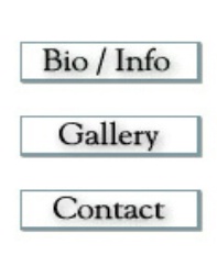
I like the larger thumbnails. But the links for Bio, Gallery, Contact look better the way they are now inside a graphical button or whatever you want to call it. The font size for the text should be bigger.
|
|||||||||||||
|
|
||||||||||||||
|
Bonita M. Fils |
I love the new look Jim! The larger thumbnails are a plus. Thank You!
|
|||||||||||||
|
|
||||||||||||||
|
JAMK Photography |
Looks good!!
|
|||||||||||||
|
|
||||||||||||||
|
Cathy Gregor |
I like the 'new look' better as well! -cathy
|
|||||||||||||
|
|
||||||||||||||
|
Charlene Bayerle |
Love the bigger thumbnails!!! Easier to see. I agree about the font...a little bigger would be great!!! Thanks for the imporvements. Charlene
|
|||||||||||||
|
|
||||||||||||||
|
Carol Dibble |
I like the new look, Jim. how about a black background to make the photos stand out? Just a suggestion. Thanks for such a great web site and forum for us budding photographers. :)
|
|||||||||||||
|
|
||||||||||||||
|
Cathy Gregor |
Defintely better.... I know this is my second response! -cathy
|
|||||||||||||
|
|
||||||||||||||
|
Holli Mc. |
I think that it looks very good and would love to see my work displayed with the bigger thumbnails too.. Thanks for asking about our thoughts on it and wondering how we all feel about it.. I say it's a great improvement!
|
|||||||||||||
|
|
||||||||||||||
|
Jim &. McCullaugh |
Great. I am definitely on board. -Jim
|
|||||||||||||
|
|
||||||||||||||
|
Arthur Rosch |
It's clean and sleek, Jim. I approve. Art
|
|||||||||||||
|
|
||||||||||||||
|
bruce k. bengry |
I think it is an improvement, looks great.
|
|||||||||||||
|
|
||||||||||||||
|
Marja H. Konimäki |
Great work! I like the new look!
|
|||||||||||||
|
|
||||||||||||||
|
Dean Sandifer |
Yes, Here's another vote for the new look. Larger thumbnails is a big plus.
|
|||||||||||||
|
|
||||||||||||||
|
Roseann E. Dreasher |
Change is good! I like the new look too!
|
|||||||||||||
|
|
||||||||||||||
|
Philip Petrou |
Great Look, big improvement!
|
|||||||||||||
|
|
||||||||||||||
|
Allan L. Whitehead |
I'm in total agreement with everyone else, I love the 'new' format. Its cleaner and is truly is much more professional looking. I would suggest you leave the 'checked/unchecked' box as it is. I personally like seeing all the comments from others on entrys that I comment on. If I had to check the box everytime, it would really be a royal 'pain'. Jim, great work, as always, you guys are awesome, please keep it up - Allan
|
|||||||||||||
|
|
||||||||||||||
|
Shirley Pearce |
Although I liked the links on the side, I do like the cleaner look and larger thumbnails. Good Work! Thank you!!
|
|||||||||||||
|
|
||||||||||||||
- Bob Cournoyer Contact Bob Cournoyer Bob Cournoyer's Gallery  |
A+
|
|||||||||||||
|
|
||||||||||||||
|
Katrina M. Scheidler |
Hello I love the new freshness of the look. great job,cant wait.
|
|||||||||||||
|
|
||||||||||||||
|
Darcy Daniels |
I like the increased size of the thumbnails and like the cleaner look without the "filmstrip" along the left side... definately think this is an improvement. I like the suggestion of using a black background. Thanks!
|
|||||||||||||
|
|
||||||||||||||
|
Stacey A. Bates |
Hi Jim, I love the new look, very clean. Also the larger thumbnails are great!! Thanks for a wonderful site. Stacey
|
|||||||||||||
|
|
||||||||||||||
|
Grayce Pedulla Dillon |
I like the larger thumbs. An improvement on an already good site. My only suggestion would be to offer a choice of background colours. I'd like black.
|
|||||||||||||
|
|
||||||||||||||
- Kelly Abernathy Contact Kelly Abernathy Kelly Abernathy's Gallery |
Thanks to all of you for all your hard work! It looks great! -K :)
|
|||||||||||||
|
|
||||||||||||||
|
Allan L. Plucinik |
I definitely do NOT prefer black background. Black is too dark, depressing. I like a bright and positive color. White is bright and positive but still neutral.
|
|||||||||||||
|
|
||||||||||||||
|
Amy N. Cappelli |
Perfect, I love the larger thumbnails!
|
|||||||||||||
|
|
||||||||||||||
|
Christopher W. Holmes |
Jim, Thanks for soliciting our input. I think the new design is a wonderful improvement. Since you asked for suggestions and input, I did have another suggestion--and it might impact the site's revenue so I make this comment understanding that you might not be able to make the change--but would it be possible to eliminate the google advertising on the page for each photo contained in our membership galleries? I'd be inclined to pay a few bucks more a year for my membership gallery in return for a "totally clean" web page for my photos. Just a suggestion and thanks for the great site.
|
|||||||||||||
|
|
||||||||||||||
|
Sharon Day |
I think it looks great!!! I love the larger thumbnails!
|
|||||||||||||
|
|
||||||||||||||
|
Steven Butterworth |
Yes it is definitely a good change. I cannot at the moment think of any improvements. Perhaps 4 pictures per line....... I love this picture of yours "Lavender Waves
|
|||||||||||||
|
|
||||||||||||||
|
Elisabeth A. Gay |
Like the larger thumbnails very much! It looks great - go for it!! Ann Gay
|
|||||||||||||
|
|
||||||||||||||
|
Patricia Marroquin |
Very classy and clean, Jim. I love it! A couple of small suggestions: Have the "Discuss" line change to "Read discussion" if a discussion has already started. On the Gallery page, perhaps place flush right next to "Jim Miotke's Member Gallery" a smaller version of the bio photo to make it even more personalized. A choice of background colors as Grayce suggested is also a nice idea. And a little larger type as others have suggested. Also, have the option to put all 100 photos on the same page or else break it up as you have done on your sample page. Thank you very much for offering a change and soliciting our input. Keep up the great work!
|
|||||||||||||
|
|
||||||||||||||
|
Robin L. Holden, Sr |
I like the new Gallery look but I never liked the white background. I would prefer to see a gray backgound I think it would be better for viewing the photos/images. Also when you click on a thumbnail to view the large image it takes you to the larger view. Would it be possible to add a link to return to the last position in the gallery?
|
|||||||||||||
|
|
||||||||||||||
|
Mark Oxley |
A nice improvment Jim. I like the cleaner look also. Thank you.
|
|||||||||||||
|
|
||||||||||||||
|
Jessica McCollam |
Jim, I too LOVE the larger thumbnails!! I think it would be a great change!:)
|
|||||||||||||
|
|
||||||||||||||
|
Paul C. Gazzanigo |
I like the overall look better, to be sure, it is certainly cleaner, and bigger thumbs are a plus. I would like to see it implemented. *It may add a little something to have a "scaled down" version of the film strip running down the left hand side - not large enough to impinge on the thumbnail size, or to even contain links, but just to add a little design kick, and to keep the gallery pages tied in with the design of the rest of the site ... just a thought. Thanks for continuing to provide a great community! Regards,
|
|||||||||||||
|
|
||||||||||||||
|
Lisa Doyle |
I think a darker background would make the photos look better... If you look at your tiger I think the snow gets washed away because of the white background on the site ... Larger photos are great !!! Nice work :)
|
|||||||||||||
|
|
||||||||||||||
|
Linda M. Walker |
Jim, I agree with all...the larger thumbnails are great and it looks wonderful!
|
|||||||||||||
|
|
||||||||||||||
|
Kimberly C. Roland |
Looks Great! Go for it!
|
|||||||||||||
|
|
||||||||||||||
|
Diane Epstein |
I agree that the option of a black background would be wonderful, so that those who like white can keep it as is, and those who want black will be happy puppies. I have a site of my own with a black background and I think they stand out nicely. I use the betterphoto for all my latest photographs since I am not set up to add them very easily. http://www.astheromansdo.com/gallery/index.htm Let me know what you think. If it were black I would feel more comfortable linking my site to the better photo one. Otherwise I like the new additions very much.
|
|||||||||||||
|
|
||||||||||||||
|
Debbie L. Bruce |
I agree with the majority. I like the cleaner look and larger thumbnails. I can't wait until it gets implemented.
|
|||||||||||||
|
|
||||||||||||||
- Carolyn M. Fletcher Contact Carolyn M. Fletcher Carolyn M. Fletcher's Gallery |
Looks wonderful! I do agree I'd like to see a slightly darker background. Looks great, though!
|
|||||||||||||
|
|
||||||||||||||
|
Cathy Gregor |
I like it! Sorry for another response I'm trying to get myself of email notification!
|
|||||||||||||
|
|
||||||||||||||
|
Cathy Gregor |
I like it! Sorry for another response I'm trying to get myself off email notification!
|
|||||||||||||
|
|
||||||||||||||
|
Laura Raney |
I like it....It's much better Great work.
|
|||||||||||||
|
|
||||||||||||||
|
Mary J. Costa Pearson |
I love the bigger thumbnails!! I look forward to the change.
|
|||||||||||||
|
|
||||||||||||||
|
Monique Bogaerts |
Very nice, an option to shoose the backgroundcolor (black withe) maybe? Otherwise I like the new very much.
|
|||||||||||||
|
|
||||||||||||||
|
Patrick Petronico |
Looks Great! Definately like it.
|
|||||||||||||
|
|
||||||||||||||
brendalafleurphotography.com - Brenda W. LaFleur Contact Brenda W. LaFleur Brenda W. LaFleur's Gallery |
I like it, Jim. The larger thumbnails is a positive. I think you've accomplished your goal to make a cleaner, classier gallery page.
|
|||||||||||||
|
|
||||||||||||||
|
Jerome D. Brown |
I appreciate the clean lines and larger thumbnails. I'm ready to switch.
|
|||||||||||||
|
|
||||||||||||||
|
Karen Bacon |
I think the new version looks great Jim!Thank you for all the hard work you put into this site!
|
|||||||||||||
|
|
||||||||||||||
|
Kathleen N. Nelson |
It's a big improvement, Jim. I like it a lot.
|
|||||||||||||
|
|
||||||||||||||
|
Ahmad Imran |
Definitely a good and newer look. Must go ahead with it. Liked it.
|
|||||||||||||
|
|
||||||||||||||
|
brendalafleurphotography.com - Brenda W. LaFleur Contact Brenda W. LaFleur Brenda W. LaFleur's Gallery |
Sorry....this is just to turn off email notification :)
|
|||||||||||||
|
|
||||||||||||||
|
Monique Bogaerts |
Also for turn off email notification :)
|
|||||||||||||
|
|
||||||||||||||
|
Robert M. Booth |
Looks good. The less cluttered look is nice as are the larger thumbnails. I do agree with the comment of at least one writer that there should be a way to navigate back to the BetterPhoto home page. Unless of course the purpose of this is for when a photographer might be sending a link to his pictures so that it looks more like it could be the individuals own website. Otherwise however, again, I do like it.
|
|||||||||||||
|
|
||||||||||||||
|
Deb Brown |
LIKE THE CHANGES.....LOVE YOUR STIE, AND APPRECIATE THAT YOU CARE ENOUGH TO ASK MEMBER'S OPINION...THANKS A BUNCH!
|
|||||||||||||
|
|
||||||||||||||
|
Marja H. Konimäki |
Great!
|
|||||||||||||
|
|
||||||||||||||
|
Donna Dunbar |
I love this new look it's great, the larger thumbnails are a great improvement. I think this site and those connected with it do a wonderful job, I suggest it to all my photographer friends.
|
|||||||||||||
|
|
||||||||||||||
|
john clayworth |
The larger thumbnails are a real improvement, an option to alter the background colour would be a bonus as I find darker backgrounds more restful to the eyes
|
|||||||||||||
|
|
||||||||||||||
|
Robert M. Booth |
Looked agian, still like it.
|
|||||||||||||
|
|
||||||||||||||
- Svami Gurupremananda Contact Svami Gurupremananda Svami Gurupremananda's Gallery |
I like the clean look; however, I would want the links from "Home to Sign in."
|
|||||||||||||
|
|
||||||||||||||
|
Monique Bogaerts |
Sorry, just can set off email notification.
|
|||||||||||||
|
|
||||||||||||||
|
Patricia Marroquin |
One other suggestion: It would be nice to have an easier URL to give people. Perhaps the way Yahoo Geocities does it, which is: www.geocities.com/membername. Just a suggestion.
|
|||||||||||||
|
|
||||||||||||||
|
Joy Rector |
Like everyone else, Jim, I like it. I like th larger thumbnails. The font at the top could be a tiny bit larger.
|
|||||||||||||
|
|
||||||||||||||
|
Gianna Stadelmyer |
I LOVE the larger thumbnails!!!! And I also like the idea of having a choice of background colors. It would make it even more personal. I think it's a nice clean look, but maybe TOO clean/plain. I think design-wise, it'd be nice to have a little "kick"...like maybe place the title on a filmstrip across the top. It just looks a bit too generic right now with the plain white background, simple, black font, and nothing else. Love the idea and thanks so much for asking for our input:-) That's why I LOVE this web site and just recommended some of the classes and galleries to someone today:-)
|
|||||||||||||
|
|
||||||||||||||
|
Richard L. Hawley |
It's good to incorporate the same design principles into the web pages that we use in our photos! In this case, moving in close and removing distractions. Thank you for getting rid of all the clutter and making the thumbnails larger.
|
|||||||||||||
|
|
||||||||||||||
|
Renee Luba |
I definitely prefer the more classy uncluttered look of this....however, my personal preference is also for a black background. Just my opinion, but I find that most photos look better when viewed on black rather than white.
|
|||||||||||||
|
|
||||||||||||||
|
Renee Luba |
I definitely prefer the more classy uncluttered look of this....however, my personal preference is also for a black background. Just my opinion, but I find that most photos look better when viewed on black rather than white.
|
|||||||||||||
|
|
||||||||||||||
|
Mark Jansen |
Yes, The larger gallery looks much better.. But it would be nice not to lose the film. Or if not that, some kind of graphic, a Camera, Tripod, or some visual related to photography. Maybe, some imagery related to the body of work each photograher like to shoot mostly. Say.. People type symbol if they have people in most of there work. Or maybe Mountains and trees, and lakes. Or maybe something for close-up work. A magnifing glass graghic symbol. Maybe a option to select and choose an image from a catalog provided by Better Photo to add to your gallery.
|
|||||||||||||
|
|
||||||||||||||
|
Steve Hopkins |
Jim - good progress towards revising look of the site. Film strip should go from gallery pages - takes up too much space - just need smaller buttons across the "top" of the gallery page. And takes too long to load, esp. when clicking to see a larger view of photo. Heading looks to bland - needs some color gray & or black or a gradient from dark gray to white.
|
|||||||||||||
|
|
||||||||||||||
|
Diane Epstein |
I agree with Patricia Marroquin's suggestion to have an easier URL to give people. Perhaps the way Yahoo Geocities does it, which is: www.geocities.com/membername. If we had www.betterphoto.com/diane.epstein I would be able to give my address out to so many more people (including business cards) rather than on occassion when I track down the http://www.betterphoto.com/gallery dynoGallDetail.php?cat=&photoID=553379 Also, I agree that the ads on the page really distract from the clean, photographic look that I think we are all striving towards. Otherwise, the new site idea is great, especially if we had a choice between black and white. That would be a dream to have it all. Dreams do come true.
|
|||||||||||||
|
|
||||||||||||||
|
Earl Larden |
Like the sleeker look. Another older retired member asking for larger fonts and less ads. Thank you for your efforts to keep this site the freshest and best site aspiring to help all photographers. Thank you Earl Larden
|
|||||||||||||
|
|
||||||||||||||
|
Jennifer L. Bales |
I like the look of the new page and agree with what others have stated. My suggestion, which is actually only a suggestion for the page where only I can go to change my gallery page: I suggest that there be a link there that can show us what pictures we have put into the contests and when they were entered. I would also like to be able to delete duplicate photos (I added some pictures to my gallery during a class I was taking, and couldnt move them to the classroom sight without reloading them...giving me duplicates.) Otherwise, the new sight is nice. Of course, I would like my gallery better if it were full of YOUR pictures, but that's a whole OTHER story :o) Jen
|
|||||||||||||
|
|
||||||||||||||
|
Bob Cammarata |
I like the new look of BP in general. The new Q&A and Comment format is great! A few things I've noticed though: *Is there still a way to access the "Search Site" link? (The left tool bar now covers it.)
|
|||||||||||||
|
|
||||||||||||||
|
Patty Razonable |
I agree with everyone! Great improvement and larger thumbnail!
|
|||||||||||||
|
|
||||||||||||||
|
Denise M. Prichett |
It looks great!!!!i can't wait for the redesign!
|
|||||||||||||
|
|
||||||||||||||
|
Marsha S. Smith |
Jim, I agree with the majority. I like the bigger thumbnails and would like black background, but will be content with whatever you guys come up with.
|
|||||||||||||
|
|
||||||||||||||
|
Gwyn Jolley |
I could give my response as are most of the responses on this and other issues. . . in a sheeps voice. But will choose to be the wolf...although it is an improvement and it is appreciate as so many have stated. There are many, many things that could be done to enhance the viewing of images on member sites. Color options have been mentioned and quite frankly from a marketing e-commerce background; portfolio or gallery sites generally show better in a black or adarker color. Unless you do a lot of high key people photos (white weddings). In looking at options, you must consider price, what are you able to give in options to us for the price you charge. Being able to catagorize the pages would also be nice. Counters, more customizable options, contact forms, address books for guest comments instead of discussions (since nobody here ever discusses...only comments. Nobody gives feedback, only the commone Nice! or Great!. (either nobody dares give a gentle suggestion or they don't know enough to do so.) Lets face it there are a growing number in competition out there, I have been contacted by several in the past few months, one in the past week...who quite frankly as your competitors....are are offering many more options, much nicer sites, expecially for the more serious minded photographer or artist...and they are quite reasonable. Any improvement should not go without notice...but to be honest...it wasn't enough for me to notice without you telling me what had been improved. There you have it. An honest and forthright answer... Having built a several sights from scratch and fromm Dreamweaver (anyone can do it if they want to learn) what people are looking for are the options of creating their own special place with ease of use and no time. I am prime example...I can make my own...but would rather choose a templated sight to host in order to reduce maintance time (I'd rather be shooting!) Gwyn
|
|||||||||||||
|
|
||||||||||||||
|
Monique Bogaerts |
Could someone help me, I can not unsubcribe from this post... My mailbox is exploding;) Melanie, I do not see the off button
|
|||||||||||||
|
|
||||||||||||||
|
Bobbie Davis |
I love the larger pictures!!!!!! Looks great!
|
|||||||||||||
|
|
||||||||||||||
|
Monique Bogaerts |
Ooops, found it, thanks!
|
|||||||||||||
|
|
||||||||||||||
|
Monique Bogaerts |
Ooops, found it, thanks!
|
|||||||||||||
|
|
||||||||||||||
|
Norman P. Banks |
Hey Jim, I'm definitely for the new look with its larger thumbs and cleaner Page. You have my vote! (smile) Norm ,:-)
|
|||||||||||||
|
|
||||||||||||||
|
Norman P. Banks |
Oh yeah Jim, I almost forgot! If you could do a lightbox type background (black) it would be great! Norm ,:-)
|
|||||||||||||
|
|
||||||||||||||
|
Ed Heaton |
Great job Jim, I like this look much better!
|
|||||||||||||
|
|
||||||||||||||
|
Debra Booth |
Thanks very much, Jim, for your email about the changes you are working on and for the opportunity to provide input. I really like the more minimalist presentation and the larger previews. The font sizes play better with the "Text Size" option in Firefox than with the same option in Internet Explorer, at least with the way my browsers are set up. That's fine with me since I try not to use IE unless I have to. As a person approaching the geriatic stage of life, I am in favor of design choices that would minimize actions that could contribute to repetitive stress injuries. I have spent way too many years on computers, and before that, typewriters, and my fingers, wrists, elbows, and shoulders have not fared well. I use as many keyboard shortcuts as possible to protect myself, but it's not easy to avoid using that mouse all the time. So, here are some changes I would like to at least throw out there for consideration. (Please forgive the long preamble, but I felt it was important to explain the reason behind some of these suggestions.) Okay, here they are now, really... 1. Move the navigation links to be right aligned, such as the "Next x" button. This would place them closer to the scroll bar and make them easier to access. I also don't care for centered text from an aesthetic point of view. 2. Look at some of the usability suggestions from previous Q&A threads. I would be so thrilled if I could click once to open a picture page and add my comment to the top of the discussion on that page without having to scroll or go to yet another page. This would also help users who have slower Internet access, and it would probably cut down on BP's bandwidth requirements. (I realize that this may be out of the range of what you're doing now with the galleries.) 3. I would love to know which category contest photos are entered in without having to go to the category pages to find them. (It would also help me remember where I had submitted one in case I wanted to submit it in another category in another month.) 4. Will there still be an option to display 10 photos on a page? This may be less necessary with the larger thumbprints--the smaller ones could tend to run together--but it is also a way to decrease bandwidth needs. I really am happy with what you are doing with BP, and I hope that my comments sound constructive as that is how I intended them. Thanks again!!
|
|||||||||||||
|
|
||||||||||||||
|
Calgarey Penn |
The proposed changes are positive. It is a cleaner format and offers easier choices to visitors to individual galleries. Do it!
|
|||||||||||||
|
|
||||||||||||||
|
Allan L. Plucinik |
How do I shut off the emails I'm getting every time someone responds to this Question?
|
|||||||||||||
|
|
||||||||||||||
|
Allan L. Plucinik |
How do I shut off the emails I'm getting every time someone responds to this Question?
|
|||||||||||||
|
|
||||||||||||||
|
Jennifer Rennison |
Allan, If you sign in on the left to your member profile page towards the bottom you should see Q&A's that you've responded to and off/on, click on off and it should turn it off.
|
|||||||||||||
|
|
||||||||||||||
|
Randy L. Morgan |
I have designed and still maintain a few web sites for the fire service. I have learned that ease of navigation is key, as well as cleanliness. I have always found your Better Photo web site easy to use, with a pleasant look. I like your new idea for member galleries.
|
|||||||||||||
|
|
||||||||||||||
|
Allan L. Plucinik |
Trying to turn off email notification.
|
|||||||||||||
|
|
||||||||||||||
|
Lisa Doyle |
Also trying to turn off e mail notification :)
|
|||||||||||||
|
|
||||||||||||||
|
Alejandra Reyes |
Wonderful Jim!!! I do agree I'd like to see a slightly darker background, maybe a neutral gray or an option to choose the color.
|
|||||||||||||
|
|
||||||||||||||
|
Allan L. Plucinik |
This is really infuriating! I have signed in and gone to "discussions that I've responded to" but this particular Q&A session is not listed so I don't have the opportunity to turn off email notification. It does list photo discussion that I've responded to and I can turn those off if I want, but this Q&A session is not listed. Also when I respond to this Q&A session I am UNCHECKING the "If you would like to be notified when someone responds to this thread, check this box." But I'm still getting emails.
|
|||||||||||||
|
|
||||||||||||||
|
Maverick Creatives |
That sample is so much better than what is displayed at the moment. There are many free sites available on the web to display pictures and the one you are proposing appears so much more professional. That makes it a worthwhile investment for you loyal following. AND FINALLY,,,,,PEOPLE WILL STOP ASKING ME IF THAT IS MY PICTURE IN THE UPPER CORNER !!!! I'M TIRED OF TELLING THEM NO NO NO,,,,I'M SO MUCH MORE HANDSOME THAN THAT POOR FELLOW. LOL Regards Gary Berger
|
|||||||||||||
|
|
||||||||||||||
|
Harold Kelley |
I really like the look, but I too would like choices of background colors. Still, it is much improved.
|
|||||||||||||
|
|
||||||||||||||
|
Andrea E. Martinez |
I like the new look also, bigger thumbnails...great improvement! go for it!
|
|||||||||||||
|
|
||||||||||||||
|
Thomas |
For sure I like the bigger thumbnails. Is there a possibility of grouping or theme the images? Thank you!
|
|||||||||||||
|
|
||||||||||||||
|
Lyn E. Adams |
I like it! Much better thumbnails!!!
|
|||||||||||||
|
|
||||||||||||||
|
Donna L. Cuic |
WONDERFUL improvement Jim. I think it will be a big hit. I do have ONE suggestion that I have been thinking about emailing to someone, so I was tickled to get your email about this thread and about making suggestions. It would be nice that after you signed in from the front page and was taken to you Member Profile Page and then upload a photo or whatever that you have a link to go back to your member profile page. I don't know if its possible but it surely would be nice. Just a thought.
|
|||||||||||||
|
|
||||||||||||||
|
Donna L. Cuic |
Forgot to mention your photos are awesome. I don't think I could pick a favorite, they are all great. ~Donna
|
|||||||||||||
|
|
||||||||||||||
|
Donna J. Taff |
I like the new way much better, the image's being larger is really nice. Donna Taff
|
|||||||||||||
|
|
||||||||||||||
|
Marta Azevedo |
Yes, I like it better.
|
|||||||||||||
|
|
||||||||||||||
|
Marta Azevedo |
Yes, I like it better.
|
|||||||||||||
|
|
||||||||||||||
|
Darcey S. |
Classy, simplified, bigger thumbnails, great improvement!
|
|||||||||||||
|
|
||||||||||||||
|
Carla Metzler |
I think the new design is a wonderful improvement, to an already wonderful site. Thank you for asking.
|
|||||||||||||
|
|
||||||||||||||
|
Brian L. Anderson |
If the thumbnails are going to be that big, then yes I like the new look!
|
|||||||||||||
|
|
||||||||||||||
|
Mellanie |
I read Donna C.'s response and had something to add....I have found several people who did not know how to upload to their gallery AND to the contest at the same time. So they would enter their daily photo into the contest and then have to sign in and add it (unhide or whatever) to their gallery later. Maybe add somewhere to the website how to do this or better yet, generate an automatic email to the person creating a new gallery. It took me several weeks before I figured out how to do this! Just a suggestion that I had to add! Again, thanks for all the hard work you guys do at BP.com and thanks for asking for our input!
|
|||||||||||||
|
|
||||||||||||||
|
Roseann E. Dreasher |
I hate the ads...forgot to add that. : )
|
|||||||||||||
|
|
||||||||||||||
|
Reed Hull |
Makes me wish I hadn't signed-on with FolioLink.
|
|||||||||||||
|
|
||||||||||||||
|
Ruth A. Parish |
Looks great - keep up the good work. I look forward to when I can implement it - not to rush you though - take whatever time you need.
|
|||||||||||||
|
|
||||||||||||||
- Gary H. Minish Contact Gary H. Minish Gary H. Minish's Gallery |
Thanks for the chance to have some input, Jim! First of all, I like the simpler look. It puts the focus on the gallery thumbnails rather than the site advertising. I also won't have to keep explaining to people that the guy in the right hand corner is not me :-) It is a little stark though and could benefit by merely putting the header text and member statement inside colored bars or other shapes (to give it a graphic element). Larger fonts would help also. If you can easily allow color options then I would suggest black, gray & white. If you can only provide one option then I most certainly prefer black. To me it is classier and most importantly it shows off the photos better. It's also important that the background color stays the same when you click on the thumbnail and go to the expanded version. For useability, I really like one member's suggestion that the hot spots stay on the right side of the page next to the scroll bar. It sure helps keep the mouse action to a minimum. I like where you're headed and sincerely appreciate all the hard work you put into the site! --- Gary
|
|||||||||||||
|
|
||||||||||||||
|
Eileen Gayle |
Excellent new look - above suggestions say all I would. Thanks for all the effort!
|
|||||||||||||
|
|
||||||||||||||
|
Karen Seargeant |
I like the new look, especially the larger thumbnails.
|
|||||||||||||
|
|
||||||||||||||
|
Patricia (Pat) C. Exum |
Jim, I like the new look a lot! I hope everyone else agrees and this can be implemented soon. Thanks for the change!
|
|||||||||||||
|
|
||||||||||||||
|
Patricia (Pat) C. Exum |
Jim, I like the new look a lot! I hope everyone else agrees and this can be implemented soon. Thanks for the change!
|
|||||||||||||
|
|
||||||||||||||
|
Adriel Torres |
Love the new look. Thanks for striving to improve the site. The only suggestion I have is that I would like to see a little more color towards the top of the gallery.
|
|||||||||||||
|
|
||||||||||||||
|
Janice L. Hatfield |
I think it is a little more eyeball friendly. The format looks nicer and I like the bigger photos.
|
|||||||||||||
|
|
||||||||||||||
|
Latief Askari |
I think the new look is great.
|
|||||||||||||
|
|
||||||||||||||
|
Stephen H. White |
I too like the new look. The larger photos are a plus...no pun intended. I do like the idea of adding color as Adriel suggested.
|
|||||||||||||
|
|
||||||||||||||
|
samia s. hendal |
Me also like the new look,good work jim
|
|||||||||||||
|
|
||||||||||||||
|
Anette Linnea Rasmussen |
Looks fine to me. It good to see the site in a new way... Best wishes Linnea
|
|||||||||||||
|
|
||||||||||||||
|
- Mette Vendelboe Allison Contact Mette Vendelboe Allison Mette Vendelboe Allison 's Gallery |
The new look is better, more simple and elegant. It would be good if there was a function so that one could change the font size to match one's eye sight. Mette
|
|||||||||||||
|
|
||||||||||||||
|
Sharon Naude |
Really a nice improvement, looking forward to seeing it happen, love your site Jim, keep up the good work. Best Wishes Sharon South Africa
|
|||||||||||||
|
|
||||||||||||||
|
bob cornelison |
I like the larger thumbnails! Looks like most of us want the new look! ~:O)
|
|||||||||||||
|
|
||||||||||||||
|
Patricia A. Kuniega |
Love the clean, new look and larger thumbnails of the Member Galleries! I also like the shortened bio pages. Since web design is part of what I do for a living, I have just a few suggestions which relate more to navigation than layout and don't all pertain to the member galleries themselves. 1) It would be great if the option for being notified of a response on a thread was off by default. You would only click if you wanted to be included in the discussion. Since most of us respond to hundreds of photos in a week, this is a lot less clicks per day and one less thing to remember to do! 2) All those back-clicks from the photo discussion thread to the contest pages add up. It would be great if you could provide a more ergonimically-friendly way to get back to the contest. 3) The new layout of the Q&A discussion pages is great. I like having the author's name off to the left. However, I'm not crazy about where it's placed in the new photo discussion threads. I think having it appear just under the discussion rather than right after it, with no break would be easier to read and help pick out names from the thread. That's it for my 2 cents. I've seen a few generations of this website already and each time it gets better and better! Thanks for asking the users what they think!
|
|||||||||||||
|
|
||||||||||||||
|
Sherrye Nozaki |
I like it very much. The emphasis is on the photos not words on the side which can be distracting. However, one problem I have with the current web site is every time I want to change something in my gallery I have to keep signing in. For some reason I can just sign in once and make changes or do multiple things. For example if I make a change to the photo order, then view my gallery and then want to then make a change to something else I have to sign in again. Smile:)
|
|||||||||||||
|
|
||||||||||||||
|
John Cullen |
Looks like the weight of opinion is _for_ the new look, so I'll just add my (euro)cent's worth of vote and agree, it's a _significant_ improvement!
|
|||||||||||||
|
|
||||||||||||||
|
Patricia (Pat) C. Exum |
Sorry for the second entry, I forgot to uncheck the box to be notified of all answers.
|
|||||||||||||
|
|
||||||||||||||
|
Paul Michko |
It looks great to me also. I say it is quite an impovement.
|
|||||||||||||
|
|
||||||||||||||
|
Diane Dupuis |
Sherrye - once you've changed the order of your photos it brings you to your newly re-ordered gallery. All you have to do is hit the back button to get back to the member admin page - instead of signing in again. I would prefer it the notification box was unchecked! You can see by all the e-mails here that people keep forgetting to uncheck it - and seem compelled to keep writing a comment! In the e-mail you get telling you that there has been activity on this Q&A - down at the bottom of that e-mail there (usually but not always) is a link to stop notifications. Click on it - and then click on the stop notifications button when it brings you to BP. If that doesnt't work - in everyone's gallery right after you sign in is the list of all the photos and Q&A's that you've ever discussed. The Q&A's are all the way down at the bottom. This one should also be there. Click on the off button to turn it off. If you comment again and hit the don't notify me button it doesn't change anything because you've already asked before to be notified. Also - just in case for those who don't know - and it took me months to figure this one out so I totally agree with informing new gallery members on how to do this with their "Welcome to BP" e-mail - you can enter a photo to the contest and your gallery all at once through your Member gallery admin - upload photo section. It is quite a time saver. I would also appreciate an option of background colors if that is a possibility. I definitely would appreciate reducing the number of clicks and scrolls - especially when commenting on photos - would love to be able to fill in my comment at the top of the page rather than the bottom... And after commenting having to hit back so many times is not very user friendly. I would like to be able to get back to the page where I found the photo in one easy click... Having a short and easy URL to get to my bp gallery would be great. How come sometimes you see the date someone uploaded the picture right under it where the discussion is - and sometimes you don't? Today's POTD is one example. Would love to know why that is. Last but not least - I truly truly appreciate the opportunity to give our feedback before these changes. Thanks so much Jim for offering us this fantastic home away from home. We truly appreciate all that you and your colleagues at BP do!!
|
|||||||||||||
|
|
||||||||||||||
|
Ed Wenger |
My vote is for the new format. Looks great.
|
|||||||||||||
|
|
||||||||||||||
|
Datha Y. Thompson |
LOVE IT.. LOVE IT.. LOVE IT!!!!!
|
|||||||||||||
|
|
||||||||||||||
|
Steve Hopkins |
Get rid of that auto ck mark! I forgot to uncheck it yesterday when I responded to new site plans and received 70 responses today! Let the user ck the box if we want to follow thread...
|
|||||||||||||
|
|
||||||||||||||
|
MaryJune OLeary |
I would like to see a few things remain the same as the old page. I like the old look of the bio/info, gallery, and contact tabs as well as keeping them on the right of the screen.
|
|||||||||||||
|
|
||||||||||||||
|
This old forum is now archived. Use improved Forum here
Report this Thread |
||||||||||||||