
Kris Haskins |
|
A three part portrait
|
|
|
|
Profile
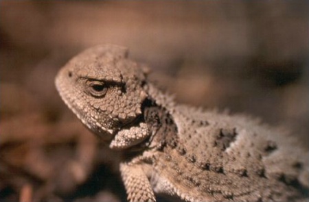
Horny Toad Portrait, Part 3. What do you like about this photo? What is 'bad'?
Kris Haskins
|
|
|
|
Shy
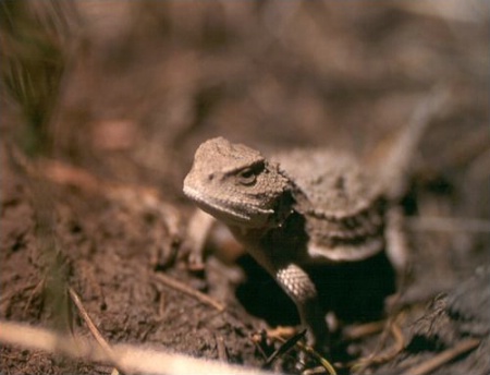
Horny Toad Portrait, Part 2. At first I thought this was the weakest of the series, but now I'm not so sure. I like the countour which flows down his body from his head.
Kris Haskins
|
|
|
|
Introduction
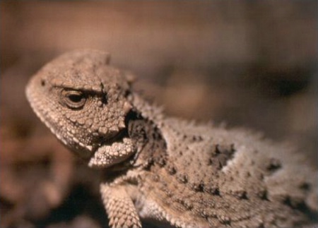
Horny Toad Portrait, Part 1. This was the first encounter with my new friend. I made four exposures of him, I tossed the one of him from behind because it wasn't as interesting. What about these? Are they interesting?
Kris Haskins
|
|
|
|
This is my three part portrait session of a horny toad I found in the Linoln National Forest on my last trip. I scanned it from the slide with a flatbed adapter with works only marginally well. For some reason it cast a warm color to the picture. Eventually I am going to rescan these with a proper scanner, so I haven't taken the color cast out.
Anyway... I would like to know what you think of these images, and the collection as a whole.
June 20, 2001
|
|
|
John A. Lind |
|
Kris,
I see you're crawling around on the ground again! Excellent perspective at the toad's level (a toad's-eye view?). Also like how you capture the likeness of the toad in spite of the background being very close in color. (This is difficult to do; the toad is supposed to blend in for camouflaged self-protection.)Photo #1:
Excellent composition. A little more DOF would have the back ridge completely in focus, but you got the critical focus where it needs to be; on the eye. Photo #2:
Interesting perspective; almost humorous; looks as if the toad is giving your lens a critical inspection. As with #1 it has critical focus where it needs to be, on the eye. In this one, the DOF tapering off down the back looks OK. Photo #3:
Also an interesting perspective with a sense of motion as if the toad is lumbering along (reminiscent of the 1950's Japanese sci-fi monster movies). As with the first two, critical focus looks good (on the eye). The centered head composition isn't as strong as it might be if you had shifted to the right a little and placed the head more toward the left of the frame. BTW, you have excellent, visually pleasing bokeh in the out of focus background. -- John
June 22, 2001
|
|
|
Kris Haskins |
|
|
|
|
|
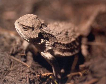
Shy - better cropping
This is the same photo as the original 'shy' only cropped a tad more tightly on the left. Do you think it helped?
Kris Haskins
|
|
|
|
Thank you for your response John. I'm uploading a cropped version of #3, which I think looks better.
This is the first multi-image set I've done; do these photos work together? Or should I choose one to display and file the others? What should I be looking for when making more of these multi-image sets (of any subject)?
June 25, 2001
|
|
|
Gail Hammer |
|
I really like Photo A alot! I love that the background is out of focus. I think the photograph is very strong and works best alone. Gail
June 27, 2001
|
|
|
|
Log in to respond or ask your own question.
|
