To discuss a photo, sign up as a BetterPhoto member or log in.
Spice Up Your Daily Joe
|
|||||||||||
|
|
|||||||||||
|
Debbie E. Payne |
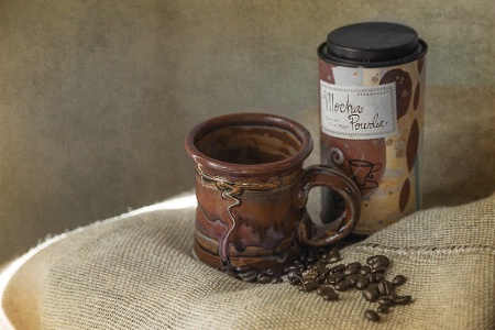
This was at the "Coffee Shoot" I went to on Friday. Lots of fun and good ideas. The other image I applied a Hue change to and added a bit of texture.
|
||||||||||
|
|
|||||||||||
|
Stephen Shoff |
Very nice, Debbie. I prefer the second version. I think the colors are better and the texture adds to the mood.
|
||||||||||
|
|
|||||||||||
- Michael Kelly Contact Michael Kelly Michael Kelly's Gallery |
I think the second one is better too. The texture takes away that negative space feeling on the left in the first one. I like the colors in the cup on the first shot though so I would be inclined to bring it into the second shot. Other than that personal preference it looks good to go to me.
|
||||||||||
|
|
|||||||||||
|
Debbie E. Payne |
Thanks, Stephen and Mike. I like doing this kind of shooting and already have most of the equipment to do it barring a couple of items not to expensive. The negative space leaves room for any text I may want to put into it at some point in time. So Mike, you are saying that you would like to see a textured version of the top image with the original colors?
|
||||||||||
|
|
|||||||||||
|
Dale Hardin |
I like the texture on the second one but the colors on the products of the first and the color of the cloth on the second. Well done, Debbie. One thing caught my eye right away and that was the sliver of sunlight. I know you probably used it to separate the foreground/background, but would like to have seen more of it. If that was not possible, then a glow on the background to achieve the effect.
|
||||||||||
|
|
|||||||||||
|
- Michael Kelly Contact Michael Kelly Michael Kelly's Gallery |
Yes the second image with only the cup and perhaps the package as they are in the first image.
|
||||||||||
|
|
|||||||||||
|
Elaine Hessler |
Mmmmm, coffee... Second one for me-Mike said exactly what I was having trouble articulating. I like the texture if you are going to have the space there-I prefer the second picture. But I think the yellowish vignette in the bottom left corner has a little too much yellow for me. If you weren't going to put any words in, I am wondering what the first photo would look like with space on the left cropped off. There is a hair or fiber in the coffee beans. This makes me want to get a cup 'o Joe! Very pretty.
|
||||||||||
|
|
|||||||||||
|
Teresa H. Hunt |
I like the second one better as well. I also like the coloring of it as it goes with the coffee theme. Though I am curious to see the original colors Mike suggested.
|
||||||||||
|
|
|||||||||||
|
Jeff E Jensen |
Yup, I agree, the second one works for me as well.
|
||||||||||
|
|
|||||||||||
|
Peter W. Marks |
The second one for me too Debbie. But would rather have a good cup of strong Columbian- no milk, no cream, no sugar, no sweetener, no steam, just strong very dark coffee. But I guess this is a photography thread not a gourmet one, so ignore my comments.
|
||||||||||
|
|
|||||||||||
|
Beth Spencer |
I agree with Mike! I am up at 5am on my second day of vacation, drinking my first cup of coffee! Not sure what is wrong with sleeping but it is not happening this morning! Debbie, I really like your composition and the texture is a great addition!
|
||||||||||
|
|
|||||||||||
|
lisa anderson |
I like the colours of the cups in the first two best, but agree that the 2nd shot works best. This shot is making me enjoy my own coffee more right now :)
|
||||||||||
|
|
|||||||||||
| Log in or sign up to respond or interact. | |||||||||||