
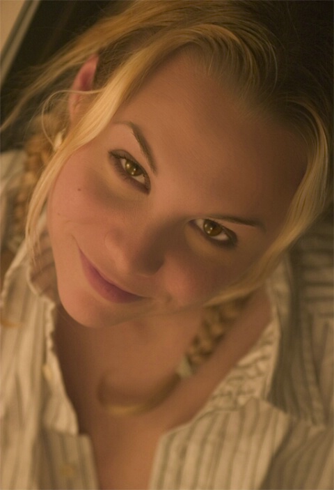
Mandy
Uploaded: October 31, 2004
1/60 sec, f3.2 ISO 400 - 1 soft light boz
Dave Tilley October 31, 2004 0
Great shot. I noticed, however, a lack of contrast. The images appears somewhat flat with a strong yellow cast.I edited the image to show a comparison. First, I used the Levels to create a corrected white balance. Then, I used the Selective color tool to draw back some yello, and balance the reds and blues respectively.
Just one man's opinion. #184039
Rob Hambly October 31, 2004 0
Thanks for your comment Dave - You're right, this image does appear flat after downloading - The original is actually warmer than this, which was the effect I was going for - Nice Lunar eclipse photos be the way - I entered one myself yesterday.RH #881068
Protacio Serna October 31, 2004 0
Hi there...Rob...sorry to interrupt here, you said that you used one soft box, but there are three catch lights in her eyes. Did you use something to bounce for fill lights?Lighting after adjustments looks good...great job Dave...actually the problem was the light temperature, or white balance setting.
It is her head position what I think looks strange to me. Many times is better to tilt the camera than asking the subject to move her head.
The pose is good at first glance...but after seeing it a little bit longer my neck start to feel…I don’t know….strange?
See you guys
PSerna #881151
Rob Hambly October 31, 2004 0
You got me - Soft box you can buy at IKEA ;-)Regards to neck - my advice, don't look at it too long...
RH #881170
Danielle M. Danford October 31, 2004 0
How much was the soft box from ikea I cant find it?? #881187Rob Hambly October 31, 2004 0
http://www.ikea-usa.com/webapp/wcs/stores/servlet/ProductDisplay?catalogId=10101&storeId=12&productId=33226&langId=-1&parentCats=10111*10270This was actually just an impromtu shot taken last night - No real thoughts were put into it.
Happy Halloween :-)
RH #881201
Protacio Serna October 31, 2004 0
:D ...got it Rob. #881203Protacio Serna October 31, 2004 0
Now I can see where the three catchlights came from.PSerna #881207
Darren Smith October 31, 2004 0
Personally, I like the original over Dave's edited version.It has a nice warmth to it, and as for the pose, I like it. I think is a beautiful portrait and shows of the gorgeous model beautifully. Great work Dave. #881516
Rob Hambly October 31, 2004 0
Ddiolch 'ch Darren!#881667
Mandy Hambly October 31, 2004 0
I have to agree with Darren -- Rob's original is warmer and easier to look at. That and my hair is not gold and my lips are not purple ...Mandy #881670
Sign up for an interactive online photography course to get critiques on your photos.
Discussions by Category: You can view photo discussions on various themes in the Community > Photo Discussions section of the site.
BetterPhoto Websites: If you see an orange website link directly under the photographer's name, it's totally okay. It's not spam. The reason: BetterPhoto is the one that offers these personal photography websites. We are supporting our clients with those links.
Unavailable EXIF: If there is no other information but 'Unavailable' in the EXIF (meaning no EXIF data exists with the photo), the 'Unavailable' blurb is not displayed. If there is any info, it shows. Many photos have the EXIF stripped out when people modify the image and resave it, before uploading.
The following truth is one of the core philosophies of BetterPhoto:
I hear, I forget.
I see, I remember.
I do, I understand.
You learn by doing. Take your next online photography class.
Copyright for this photo belongs solely to Rob Hambly.
Images may not be copied, downloaded, or used in any way without the expressed, written permission of the photographer.
Log in to follow or message this photographer or report this photo.
I already have an account!