
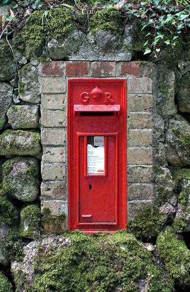
Red Post Box
Uploaded: June 25, 2006
Lens: Minolta AF DT ZOOM 18-70mm
Focal Length: 28mm
ISO: 100
Aperture: F4.5
Shutter: 1/8
Exposure Compensation: -0.7
Location: Penzance, Cornwall, UK
Exif: FNumber: , ExposureBiasValue: , ExposureTime: , Flash: , ISO: , WhiteBalance:
Andrew JM Davies June 25, 2006
Please may I have your comments? #471848Brendan Knell June 25, 2006
Andrew, I really like this! I like how it's centered(something I rarely like!). I agree with Curtis about saturating this a little. Also, it looks a little soft, so try sharpening a little. Overall, a really good pic! #2950385Andrew JM Davies June 28, 2006
Thanks for the responses. I have increased the satuation within PS a little but any more lost me detail in the red of the letterbox. A brighter day would have worked a lot better than the overcast day that it was.Regards,
Andrew #2960749
Ann Kittelsen July 02, 2006
Great shot, I like it centered as well and I normally try not to center. I like the colors, the contrast of the bright red against the more subdued colors of the rest. #2979135Carol Teal July 02, 2006
Andrew, I really like this too. I love the rocks and moss and the bright red of the mailbox. I think the comp worked well for this shot. #2979344Andrew JM Davies July 03, 2006
It's funny that we are always told not to center a composition but as pointed out above by Brendan, no other composition could have worked with images like this.Regards,
Andrew #2982473
Peter W. Marks July 05, 2006
As I responded to another of your shots- Anything in my home-land Cornwall is fine by me.Sign up for an interactive online photography course to get critiques on your photos.
Discussions by Category: You can view photo discussions on various themes in the Community > Photo Discussions section of the site.
BetterPhoto Websites: If you see an orange website link directly under the photographer's name, it's totally okay. It's not spam. The reason: BetterPhoto is the one that offers these personal photography websites. We are supporting our clients with those links.
Unavailable EXIF: If there is no other information but 'Unavailable' in the EXIF (meaning no EXIF data exists with the photo), the 'Unavailable' blurb is not displayed. If there is any info, it shows. Many photos have the EXIF stripped out when people modify the image and resave it, before uploading.
The following truth is one of the core philosophies of BetterPhoto:
I hear, I forget.
I see, I remember.
I do, I understand.
You learn by doing. Take your next online photography class.

Copyright for this photo belongs solely to Andrew JM Davies.
Images may not be copied, downloaded, or used in any way without the expressed, written permission of the photographer.
Log in to follow or message this photographer or report this photo.
I already have an account!