
Untitled
Uploaded: September 11, 2012
Exif: F Number: 13, Exposure Bias Value: -0.67, ExposureTime: 10/2000 seconds, Flash: did not fire., ISO: 200, White balance: Manual white balance, FocalLength: 36.00 mm, Model: NIKON D5100
Elaine Hessler September 11, 2012 0
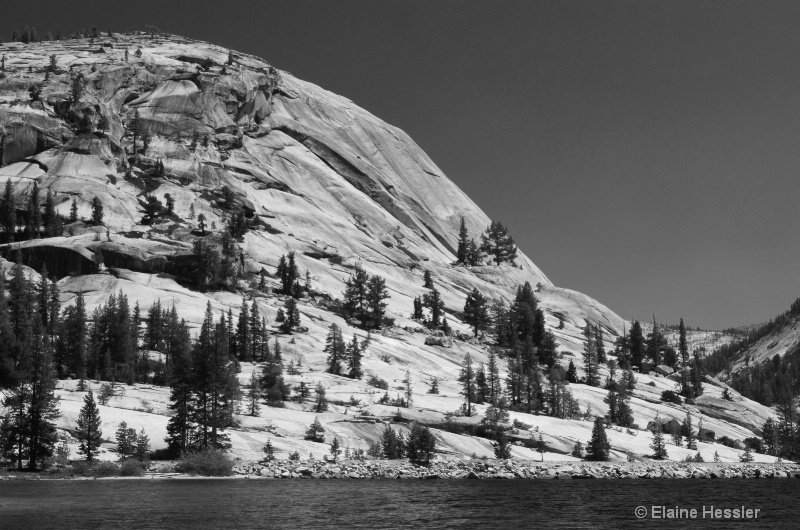
Ok guys-I am intrigued by all the B/W shots, so here's my try. Let me know what you think!BTW, thanks for the edits on "Leah", it is much better and got an EP! Yea! #1485828
Debbie E. Payne September 11, 2012 0
Elaine - I knew that "Leah" would get an EP. It was such a fresh and joyous shot. I like making images into black and white sometimes. I think this one works. Look for images with clouds and I think you will come up with even more drama. Where was this taken? #10318643Elaine Hessler September 11, 2012 0
That is a great idea! This was in Yosemite. #10318702Jeff E Jensen September 11, 2012 0
This is pretty good, Elaine. I think it could use a little more contrast and perhaps a levels adjustment. I like the composition, almost a ying/yang going on. #10318793Dale Hardin September 12, 2012 0
Jeff hit the nose right on the head. Needs a levels adjust, not much, just check out your histogram and adjust to utilize all the data.To really make this image work, would suggest replacing the sky with some clouds and then lightening the water to reflect that addition. #10318921
Carla Capra Anderson September 12, 2012 0
The landscape is like a work of art. I enjoy the graceful upward and curving lines of the mtn and trees. My first thought was that the mountain could use a bit more space above it, more sky. I've done limited b/w and will suggest trying Jeff and Dale's adjustments. #10319646lisa anderson September 12, 2012 0
I really like this Elaine. Congrats on your EP for it! #10320218Anthony L. Mancuso September 13, 2012 0
Very nice Elaine....looking forward to the edits...Peter W. Marks September 13, 2012 0
Ok Elaine, please tell us which B&W conversion you used for this image. Was it converted in-camera; desaturation; gray-scale conversion; lab color conversion; channel conversion; or lastly you can shell out a hundred bucks plus to purchase Nik Silver Effex Pro. I asked this some months ago but no one responded and I am curious as to who knows what I am talking :o) about. #10321880Elaine Hessler September 14, 2012 0
Hi Peter! I am a little confused why you are asking because I don't really know much about this and the different effects. I played around with the different B/W conversion settings in PSE, and I stuck with the setting that was most pleasing to me, which was "scenic landscape". I think. You have your choice of infrared effect, newspaper, portraits, urban/snapshots, and vivid landscapes. They all have different settings of red, green, blue, and contrast. And you can tweak them to how you like, too. The scenic landscape gave me what looked best to me. Here's the original. #10321959Elaine Hessler September 14, 2012 0
Nope, here it is-tired and going to bed. #10321961Dale Hardin September 14, 2012 0
Elaine, in PSE you also have the "remove color" command, hue/saturation "desaturation" command and the gradient map. My favorite is the gradient map. You also have a convert to greyscale. :o) #10322047Jeff E Jensen September 14, 2012 0
Dale - You should send her a tutorial on the gradient map method. That's usually a good way to get strong results. #10322513Elaine Hessler September 15, 2012 0
Sorry this took so long. I did move the right and left sliders in and moved the middle slider to the right to give a little more contrast.I am not yet ready to do sky replacements. That is definitely something I'll work on in the future.
Let me know if you see a difference. #10324344
Peter W. Marks September 16, 2012 0
Elaine, I don't usually make suggestions of how I think images might be improved but just leave it to the others and then either agree or say nothing(which means I don't agree!). But, with your image I would like to see a bit wider tonal range to bring out the white in the snow, not that I am the one to tell you how to do it! . #10324405Elaine Hessler September 16, 2012 0
Not at all! This is what I like about this group-an honest opinion, so I am glad you feel comfortable saying what you think.Maybe I did this wrong, but I moved the sliders inward (left and right sliders)-is this what I needed to do to increase the tonal range? Maybe I need to move them inward a little more. By the way, this is rock, not snow, but I am not sure it matters. Will try again.
Thanks for looking at this image again and your constructive criticism! Keep it coming:)
#10325135
Peter W. Marks September 16, 2012 0
Elaine, I took a screen grab of your original color image and did the following in PSE9Click on
Image > Enhance>Convert to Black and white.
Then select the 'Scenic landscape' from the drop down menu where you will see to the right four sliders, red, green, blue and contrast. Slide the 'contrast' one over to the right a bit until you get the whiteness in the snow that you like.
There are probably other methods and I am not suggesting my settings are other than just a suggestion of where you might start. Playing around with he three color channels will possibly give better results so give it a go. #10325328
Elaine Hessler September 17, 2012 0
Ok-I did increase the contrast, but this is stone, not snow, so it shouldn't be white. I hope you can see an improvement-I didn't want to overdo it. Thanks! #10326921Stephen Shoff September 18, 2012 0
To be a little more specific on location, Debbie, this is Tenaya Lake. It is in Yosemite Park, but not in the Yosemite Valley itself. It is on Highway 120 crossing the mountains near the crest of the Sierra and Olmstead Point where the boulder picture was taken.There are a few things you could have tried on this, Elaine, depending on your own personal preferences. Many would have darkened the sky (using the blue slider). For myself, I would have done that, along with trying a strong dose of high-pass filtering to try to sharpen it more and/or using unsharp mask. To me it looks a bit soft which I think weakens this image abit and might be part of the suggestions to increase contrast. If you like the slightly soft appearance, you might want to try one of the conversion effects that simulate an older, grainy film-based look.
I don't use PSE, so I'll leave the comments on what is available (gradients, hue/saturation, etc) to the others. For myself, working in Photoshop CS4, I use either the B&W conversion layer (works using a set of about 7 color slider rather than the 3 mentioned for PSE for a higher degree of control, or the Hue/saturation/greyscale tab in Adobe Camera Raw. I evaluated in-camera conversions when I first got my Canon 5D Mark II, but decided I had more flexibility with computer-based conversions. Still, in-camera is quite satisfactory if you want to get from camera to print most directly. By the time I started to do B&W, most articles I was reading were teaching newer techniques and tools (i.e., CS4 B&W Layer or ACR 5.+ with its Hue/Saturation Grayscale tab) than Channels and Gradients, so I never learned them. I also use Nik Silver Efex Pro, sometimes for the conversion itself but often I just scroll through the presets to get an idea of what is possible and optimal an then manually duplicate it in CS4. Product like Nik, as well as those "effects" that you've listed for PSE provide more than just conversion from color to shades of gray. They provide additional, builtin contast, "structure" (which seems to be CS4 "overlay" blend layer) and other effects that are difficult to do manually.
#10327216
Teresa H. Hunt September 19, 2012 0
This looks like something out of a movie. Actually it reminds me of White Christmas with Bing Crosby and Danny Kay for some reason. :)I think your last edit is a bit dark . . . #10328506
Beth Spencer September 19, 2012 0
Congratulations on your EP!! I like the second edit the best. I think the last one is a bit dark, however I think the black and white was an excellent choice in this case. #10328549Daniella Puente November 16, 2012 0
Like very much your convertion to BW on this one, neat capture! #10421264Sign up for an interactive online photography course to get critiques on your photos.
Discussions by Category: You can view photo discussions on various themes in the Community > Photo Discussions section of the site.
BetterPhoto Websites: If you see an orange website link directly under the photographer's name, it's totally okay. It's not spam. The reason: BetterPhoto is the one that offers these personal photography websites. We are supporting our clients with those links.
Unavailable EXIF: If there is no other information but 'Unavailable' in the EXIF (meaning no EXIF data exists with the photo), the 'Unavailable' blurb is not displayed. If there is any info, it shows. Many photos have the EXIF stripped out when people modify the image and resave it, before uploading.
The following truth is one of the core philosophies of BetterPhoto:
I hear, I forget.
I see, I remember.
I do, I understand.
You learn by doing. Take your next online photography class.

Copyright for this photo belongs solely to Elaine Hessler.
Images may not be copied, downloaded, or used in any way without the expressed, written permission of the photographer.
Log in to follow or message this photographer or report this photo.
I already have an account!