Untitled
Uploaded: November 15, 2011
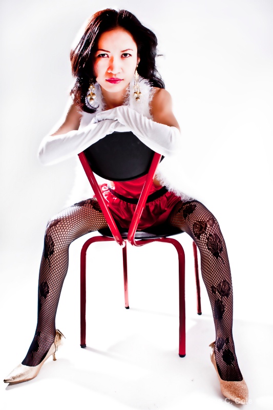
Exif: F Number: 2.8, Exposure Bias Value: 2.00, ExposureTime: 1/250 seconds, Flash: fired, compulsory flash mode, ISO: 200, White balance: Auto white balance, FocalLength: 24.00 mm, Model: Canon EOS 40D
Dale Hardin November 16, 2011
Hi Sue. So glad to see you back in the fold. Missed you. I like both the boldness and the simplicity of this pose and the treatment.Do have bit of a concern with the harshness though because the highlights are so bright that it appears her waist is chopped off. Perhaps a reduction of the highlights is in order. #1423474
Teresa H. Hunt November 16, 2011
I agree with Dale on the harsh lighting. Her waist does look funny.For some reason though this just doesn't work for me. But I think it's mostly due to the harsh light. #9808044
Michael Kelly November 16, 2011
Hi sue welcome back. I know very little about this type of photography but I like how the lens you chose emphasizes the face.I do have some concerns including the harsh light already mentioned. There also appears to be some clone work on the left from where the chair rail meets her arm down to the leg and the very red tones on the face could be reduced some by selectively reducing the red channel. #9808066
Rita K. Connell November 16, 2011
Hi sue, glad you are back.this one is not working for me. I believe the hardness of the highlights is a problem. but for me because of the way it appears...its like her upper body is larger than her middle and then her legs become large again. its like here middle isn't porportion with the rest of here body is that because the highlight wash out the details. #9808270
Jeff E Jensen November 16, 2011
Yup, the harsh light is my issue with this as well. I'm not seeing the cloning issues that Mike pointed out. #9808778Peter W. Marks November 16, 2011
Hi Sue! There seems to be a consensus that the lady's waist needs fixing. As for the lighting, I think that is a matter of taste and what the image is 'saying' to the viewer. That posture and straight-on gaze challenges us to have an opinion.Carla Capra Anderson November 16, 2011
Hi Sue;Sue C. Cole November 16, 2011
Thank you all for your feedback. I was also concerned with the highlight, harshness but I was also trying to make a bold "I may be small, but I'm not nieve" statement. I do tend to blow out my images because I do like that kind of photography so I do go over the top at times...and from the concenses with this one it's toss and redue. I did have another photograph of Thip with the same pose with less exposure...tell me what do you think? #9810766Sue C. Cole November 16, 2011
BTW Peter...LOL I love you favorite saying...I may have to borrow that.:)Beth Spencer November 16, 2011
I really do not have anything to add, I think her waist may look funny due to the white boa, covering part of it and then it blends with the background. #9810838Michael Kelly November 16, 2011
This is much better Sue. I do think it is very bold statement so you succeeded well with that. The area I thought was a clone must have been the white boa. Still think there is a touch to much red in her face especially in the shadow of her hair. Not bad and if you like it it is fine - if not a selection of the face and a slight reduction of the red channel saturation should bring it in a little. #9810945Dale Hardin November 16, 2011
Now that you've shown the other image I can see the boa on the first shot. I think the first one makes a better statement but it needs to have the blown highlights addressed so that the boa can be seen at it's edge. #9811181Rita K. Connell November 18, 2011
I am with dale #9816217Carla Capra Anderson November 18, 2011
I'm with Dale and Rita.Sue C. Cole November 18, 2011
Thank you again...I am just learning PScs5 so I will take it back and try to do the edits you have all suggested. Learning a new tool for me is not easy.:) #9817219Debbie E. Payne November 18, 2011
Sue, don't know how I missed this. I have been nursing a cold the past couple of days and hope it goes away soon. Missed my trip to San Francisco would rather be miserable at hone.I like the intensity and the more direct pose of the first shot but think the waist needs perhaps more than you can do post-processing. The second one seems flat because it isnt' all white. I would have a clue how to tell you to do high-key because it isn't in my repertoire. Guess I'm just a "Landscape girl". I always enjoy seeing people's portraits, though, so keep those high key shots coming in! #9817930
Sign up for an interactive online photography course to get critiques on your photos.
Discussions by Category: You can view photo discussions on various themes in the Community > Photo Discussions section of the site.
BetterPhoto Websites: If you see an orange website link directly under the photographer's name, it's totally okay. It's not spam. The reason: BetterPhoto is the one that offers these personal photography websites. We are supporting our clients with those links.
Unavailable EXIF: If there is no other information but 'Unavailable' in the EXIF (meaning no EXIF data exists with the photo), the 'Unavailable' blurb is not displayed. If there is any info, it shows. Many photos have the EXIF stripped out when people modify the image and resave it, before uploading.
The following truth is one of the core philosophies of BetterPhoto:
I hear, I forget.
I see, I remember.
I do, I understand.
You learn by doing. Take your next online photography class.
Copyright for this photo belongs solely to Sue C. Cole.
Images may not be copied, downloaded, or used in any way without the expressed, written permission of the photographer.
Log in to follow or message this photographer or report this photo.
I already have an account!