Our daughter Betsy

© Peter W. Marks

Our daughter Betsy

Uploaded: February 25, 2011

Description

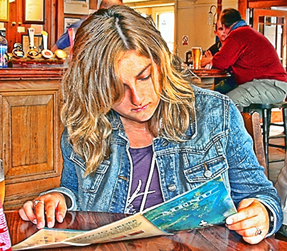
A reworking of a conventional image taken at the Swan Hotel, Wadebridge, Cornwall in 2007.
using Topaz Adjust HDR action.


Exif: F Number: 7.1, Exposure Bias Value: 1.67, ExposureTime: 3/10 seconds, Flash: fired, compulsory flash mode, ISO: 200, White balance: Auto white balance, FocalLength: 30.00 mm, Model: Canon EOS 20D

Comments

Dale Hardin February 26, 2011

Hi Peter. So glad to see your entries again and to hear your input. Missed you.

This is a nice candid with a very good diagonal composition. The square crop works very well and I love the reflections in the table as well as location atmosphere in the background.

Not really sure what you were going after with the treatment so it's very hard to comment there. It did result in quite a bit of blown areas, and without knowing how it was done, any effort to clear them at this stage damages your result.

At the very least I would recommend cloning out the drink, glass and can, in the lower left. A minor distraction that does not help the image and with it's removal, can improve the shot .

Excellent texture throughout as well. Nice job. #1356414

Michael Kelly level-classic February 26, 2011

Peter great to have you back with a post.

I agree with Dale on the very nice composition and overall atmosphere of this shot. I also like the reflections and agree on the tiny bit of can and glass removal.

I don't see the "blown" areas as being that bad or a real problem in this shot. To me the only problem area is the window to the right of her head and does not bother me that much. Best solution for me would have been to change the angle just slightly while shooting so that her head blocks the window.

I have a personal dislike for this type of filtering and most frequently think that it degrades rather than enhances a photo with rare exception and almost never use these techniques myself so I will leave comments on that area to those that like and use these techniques. #9263065

Peter W. Marks February 26, 2011

Well gentlemen, I thank you both for the time you spent on this image.
Dale- I can't disagree with the suggestion to crop out the beer glass etc, I can go with that. As for the 'blown areas' I would not be able to deny that they exist to a degree but ce la vie and I can't remember ever being bothered by similar things on other folks images. I suppose I have this somewhat 'oh, what the heck!, attitude to such things when I can be thinking about the person,the place, the taste of that Sharps Doom Bar bitter ale that Btesy was drinking.
You ask what I was after with the treatment so I must have failed I guess as I was hoping it might be seen as Norman Rockwell-esque! Pretty girl studying the menu; guys on bar stools deep in conversation; variety of beer pumps on bar counter, and coloring that suggests a painting rather than a photograph.

Mike- and thank you too. I would be really interested to hear your thinking behind the dislike for the above style of image. Of course it doesn't look realistic and obviously is not intended to, but then neither does a monochrome image, as little in life is just black, white and shades of grey but these are often accepted as fine art.
However I am quite happy to accept that one man's meat is another man's poison.
I will try to upload the original RAW image.

#9263168

Peter W. Marks February 26, 2011

RAW image with just brightness adjustment.
#9263180

Michael Kelly level-classic February 26, 2011

Peter this is a personal style and preference issue more than anything else. I think most shots using texture and filters look like they use textures and filters and I enjoy a more natural look. Very seldom do I see a shot where I believe they are an improvement over a well exposed and photographed scene although again I think there are artistic exceptions. Many of the Phellos do use these techniques and like them so again this is a personal issue for me rather than a more general comment on these types of treatments. One of the first things that I almost always think is what was wrong with the shot that made someone decide to give it an "artistic" treatment. Not of course always the case.

All of this is a overall comment and not directed to this particular shot or your use of the artistic interpretation here. I do not have any add on filters or software personally and don't think I will be acquiring any. Of course I am in the middle on this because there are people that think all shots should be as they come from the camera and I am not that extreme, as I do beleve a bit of post processing can improve most shots especially if you are shooting RAW. #9263279

Christie R. Bielss February 26, 2011

I like the composition of the cropped image. It eliminates most of the, shall we say, distracting parts in the picture. I do like filters, textures and whatnot, but I'm not loving this particular one. It has a bit too much yellow for me. It's particularly bothersome, for me, in her hair and skin. Maybe by lowering the yellow tint, it will give more of the Norman Rockwell type feel to this. What a great job you did on capturing her and the others in the pub without any appearing to notice! #9263373

Joan E. Hoffman February 26, 2011

Hmmm... so far, I guess I am the only one that appreciates the Saturday Post feel to this. I used to pore over his (Norman Rockwell's) images as a child.... appreciating every nuance in his wonderful artwork. I actually really like this image... it takes a relatively bland shot and elevates it into a form of art (at least to me it does).

I do appreciate a well taken shot, as well, and love it when I don't have to make many adjustments. However, I am not very talented at achieving that in camera... wish my ratio were much more positive than what it is. I am still very self conscious with a camera... and tend to not think first, and edit later.

One of the most significant parts of the Freeman Patterson "Ideas" segment (see club discussions)... is his discussion of one of his "teachers"... who insisted on using a tripod, and analysing every pixel from left to right, top to bottom, before taking the shot. He mentions that it was two years before he got the courage to remove his camera from the tripod. Shoot got off topic sorry.

Peter, I like the shot! #9263397

Aimee C. Eisaman February 26, 2011

And just in case you didn't know what you were looking at it says MENU right on the front! LOL I just thought that was funny! As for the filter....I'm not a huge fan now that I have seen the original image. I don't see anything wrong with the filter, but I would prefer it natural for this shot. What you decide to stick with is up to you of course. I do like the crop....works very well! :~) #9263414

Dale Hardin February 26, 2011

After seeing the original shot, I'm even more impressed with your crop, Peter. I don't think you could have done it any better.

I now understand the look you were going after. It's one I like very much as you might remember, I did an entire image with my grandson in that genre. It's just that the filter you used wasn't enough to accomplish that look.

On the discussion of the blown areas, you mention that "you" aren't bothered by similar things on other folks images. But that's the whole point of this club Peter. To assist each other in recognizing these issues and helping to find ways to correct them.

Just as I have become more and more aware of content and story line due to your assistance, it works for technical issues also. :o) #9263807

Stephen Shoff February 26, 2011

Joan -- I only just now got a chance to check in on the Phello's gallery, so I only just saw this. Yes, I see and appreciate the Rockwell-esque interpretation, and reacted to it as such.

I'm going to agree with Christie. Certainly too much yellow, and the skin tones/textures haven't come out well at all.

But I have no problem with going past photo-realistic images. It not only has validity in its own right (if that is what the artist and/or the market will bear), I had a couple of occassions recently where I think applying an effect actually improved the picture -- in the same way sometimes a B&W can be better than the original color. By getting the detail out of the way so the imagination can go to work. #9263859

Joan E. Hoffman February 27, 2011

Yes, I agree that the yellow overtones should be corrected. Overall, however, the image just appeals to me. Its definetly a different genre but still works well for me. #9264637

Peter W. Marks February 27, 2011

And now to keep Joan and Christie and Stephen, happy I shall un-yellow it and wait for someone else to say it has too much cyan, or too much magenta or ........!
And I have removed the glass and the Sarcen's Malt Vinegar bottle to please Dale. I understand what you are saying Dale about critiquing 'blown' areas to help others in the club but as you acknowledge I did say 'I' don't bother myself over other folks blown areas, and so just leave it to others to suggest the corrections. I do infact always take a look at the histogram in my CS2 of my own images and are well aware of those big spikey bits at the right hand side and a little yellow warning icon with its exclamation point but I just smile at it and say to myself 'Here's one for you Dale old buddy. :0)
But now, being ever so serious, I truly commend you Dale on the way you have expanded your repertoire of image genres over these past few months. You surly started thinking out of the box.
#9264711

Stephen Shoff February 27, 2011

I'm happy. #9264771

Debbie E. Payne February 28, 2011

Peter - Okay, I'll say it...I like your original submit the best sans beer pitcher and soda can. Good work getting rid of the lady in white behind her. Sometimes to keep something we like we have to go beyond the natural. #9266682

Carla Capra Anderson February 28, 2011

Hi Peter;
This image seems familiar and I'm sure I commented on it in the main BP thread. I liked the image then because of the texture/filter etc used. It gave it a nice feel, look and blended to the atmosphere of the cafe. I must say that I appreciate the removal of the item in the lower left portion of the image. I also, enjoy it without so much yellow. It is wonderful to see your post, thread and an 'edit'. Whew whoo, Peter's back!
;) CC #9266878

Susan M. Reynolds level-addict February 28, 2011

I liked your first post over the orignal photo, but the second edit is even better. I happen to like the filter effect used, it looks almost like a colored pencil drawing. Also the crop is nice too. #9266990

Aimee C. Eisaman March 01, 2011

I do like your changes, but miss the warmth of the yellow a bit. The removal of those items mentioned works very well! :~) #9267502

Christie R. Bielss March 01, 2011

I really like the removal of the items. It really gives it that "Saturday Evening Post" feeling. I think you removed a bit too much yellow in order to pacify us though. Somewhere inbetween the 2 was what I was thinking - but who can decipher the mind of a redhead, eh Peter. ;) #9267710

Peter W. Marks March 01, 2011

Thank you my friends, all your comments are much appreciated.
Yes Carla, you saw the first image on the contest entries early last week when it did gain a EFP and of course that is as far as it will go as the judges' attenntions have now been irrevocably drawn to my blown windows, the beer glass and vinegar bottle, the yellow and my daughter's skin. But you have made plenty of very nice comments too, so perhaps I will stay in the club for at least another week. :0)
The Rockwell-esq thing I was going for in the first image was inspired by a copy of 'Norman Rockwell's America' I purchased from Borders back in the fall. This is a very large 13x11 edition printed in China and although I have forgotten the exact price it was on clearance and was about $10 and has several hundred reproductions including 129 full color pages of Saturday Evening Post magazine covers. The commentaries on these images do infact frequently draw the reader's attention to tiny details that were deliberately drawn by Rockwell to half disappear off the page. No accident there; it encourages the viewer to think 'what's that?" and thus think about the contents of the painting rather than just how perfectly it was executed. Now don't get me wrong; of course his composition, tone values, subject choices, image content, story-telling etc are what gave him all those front covers on the major magazine all the way from his first cover in 1916 to his last in 1963. But the whole raison d'etre of his illustrations is the story. Bet Dale remembers "Rosie the Riveter' from 1943 What a set of biceps Rosie had in this pure wartime propganda piece to illustrate women's place in the war-effort!
So my point is what I know I have banged on about in the past, and that is for me, the content details and possible story in an image is what floats my boat; but I am happy to leave the technical stuff to my elder (Hi Dale!) and betters, the rest of you guys. Again, many thanks

#9267761

Beth Spencer March 02, 2011

I like the edits you made. I think the filter works in this picture. #9269933

To discuss, first log in or sign up (buttons are at top center of page).

Get Constructive Critiques

Sign up for an interactive online photography course to get critiques on your photos.


Did You Know?

Discussions by Category: You can view photo discussions on various themes in the Community > Photo Discussions section of the site.

BetterPhoto Websites: If you see an orange website link directly under the photographer's name, it's totally okay. It's not spam. The reason: BetterPhoto is the one that offers these personal photography websites. We are supporting our clients with those links.

Unavailable EXIF: If there is no other information but 'Unavailable' in the EXIF (meaning no EXIF data exists with the photo), the 'Unavailable' blurb is not displayed. If there is any info, it shows. Many photos have the EXIF stripped out when people modify the image and resave it, before uploading.


The following truth is one of the core philosophies of BetterPhoto:

I hear, I forget.
I see, I remember.
I do, I understand.

You learn by doing. Take your next online photography class.


Copyright for this photo belongs solely to Peter W. Marks.
Images may not be copied, downloaded, or used in any way without the expressed, written permission of the photographer.
Log in to follow or message this photographer or report this photo.