To discuss a photo, sign up as a BetterPhoto member or log in.
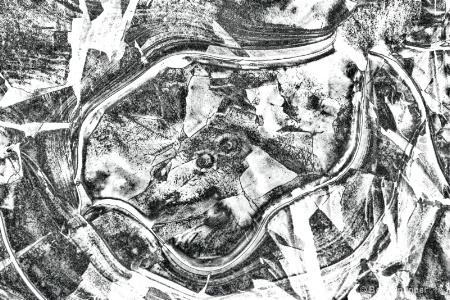
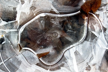
Nature's Ice Design
|
||||||||||||||||||||
|
|
||||||||||||||||||||
- Michael Kelly Contact Michael Kelly Michael Kelly's Gallery |
This is very cool Beth. A true abstract where we could be looking at a lot of different things. To me it looks like an aerial photo of an industrial complex or volcanic island. It looks just a bit flat to me with all grays and whites. I would make a black and center slider adjustment in levels to give it a bit more punch. It is possible the whites may need to be toned down in raw too, but hard to tell for sure.
|
|||||||||||||||||||
|
|
||||||||||||||||||||
|
Peter W. Marks |
beth, I would be interested to see Mike's suggestion. Have to say my attention is riveted on those two 'owl eyes' staring out from the center.
|
|||||||||||||||||||
|
|
||||||||||||||||||||
|
Stephen Shoff |
Very nice Beth. My reaction was how well this did as a low-contrast image. I'll be interested to see Mike's suggestion. A variation might be interesting, too, to apply Mike's suggestion just to the "owl's eyes" (or wolf's face) in the center just to create a more obvious anchor point. Although the fascination of abstracts is often their subtlety.
|
|||||||||||||||||||
|
|
||||||||||||||||||||
|
Dale Hardin |
Beth, this is one image that I would really like to see the original. I like the abstract but am not too fond of the treatment. It just seems a bit, for the want of a better word, dull.
|
|||||||||||||||||||
|
|
||||||||||||||||||||
|
Elaine Hessler |
This is really neat Beth. I'd like to see the original too, just out of curiosity. There are so many interesting shapes in this one. Sort of like Rorschach ink blot...
|
|||||||||||||||||||
|
|
||||||||||||||||||||
|
Jeff E Jensen |
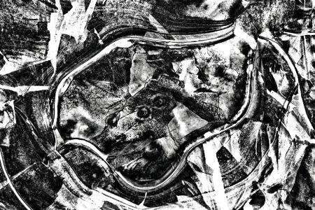
Well, you've gotten some good suggestions on this, Beth. Can't wait to see what you do with it.
|
|||||||||||||||||||
|
|
||||||||||||||||||||
|
Beth Spencer |
|
|||||||||||||||||||
|
|
||||||||||||||||||||
| Log in or sign up to respond or interact. | ||||||||||||||||||||