To discuss a photo, sign up as a BetterPhoto member or log in.
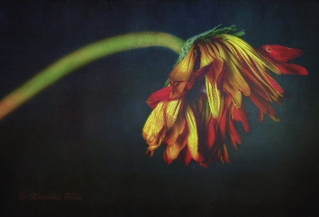
Still beautiful
|
||||||||||||||
|
|
||||||||||||||
|
Richard Lynch |
Natasha, I like it. Minimalist, and texturally interesting. As a viewer, I can see this being more dynamic and eye-grabbing, however. The message that even ruins/decay can be beautiful comes across more clearly (one of the reasons I am in Romania is exactly that...some of the most beautiful ruin here that I have ever seen...). I think I might have gone a little less heavy on the effect, enhanced the contrast, or masked the effect over the flower itself to let some of that color and contrast pour out. I am betting you can do much more with the original than I can do with the example, as I can't just erase the effect, but have a look at the adjustment I made. I'd be interested in what you think. Richard
|
|||||||||||||
|
|
||||||||||||||
- Natasha Pliss Contact Natasha Pliss Natasha Pliss's Gallery |
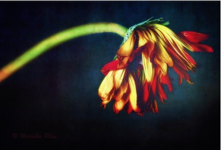
Thank you very much for your valuable input. I thought about this image a lot before submitting it and wasn’t completely satisfied with the results. My message was: it’s subdued, quiet, moody, not full of life anymore but still beautiful in its hopelessness. But you are right: more contrast or light might give it much more interest. Your version looks a little too harsh to my taste but certainly very striking. Here is my new version. Thank you.
|
|||||||||||||
|
|
||||||||||||||
|
Richard Lynch |
Natasha, You have the distinct advantage of working from the original... I really think you improved this with the change. You didn't need to overwhelm with the contrast adjustment (I tend to go heavy on contrast generally -- my personal preference). I think you cleared up the subject enough, and the rest of the effect is still there. By the way, that is the perfect way to receive feedback. Take it when you agree (at least to some extent), and apply what you agree with in your vision. Nice job. Richard
|
|||||||||||||
|
|
||||||||||||||
| Log in or sign up to respond or interact. | ||||||||||||||