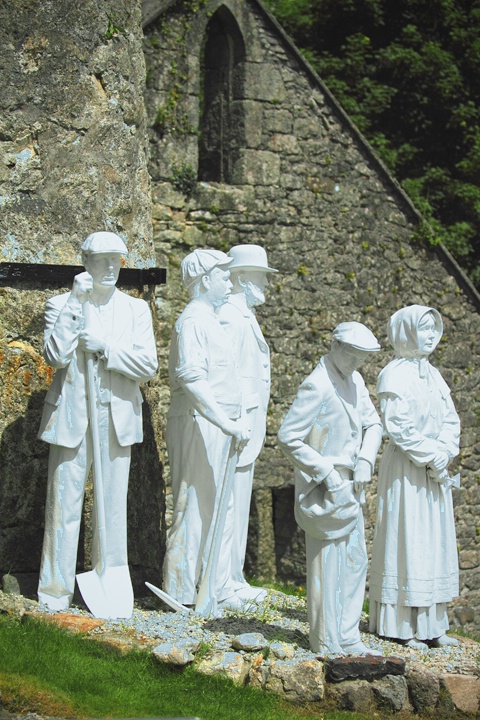
China clay miners statues
Uploaded: May 11, 2011
The statues represent 19th century workers at the Wheal Martyn clay works in Cornwall. China clay is still mined here but the original buildings and equipment etc are now part of the Wheal Martyn China Clay Museum.
Exif: F Number: 4, Exposure Bias Value: 0.00, ExposureTime: 1/4000 seconds, Flash: did not fire, compulsory flash mode, ISO: 200, White balance: Manual white balance, FocalLength: 70.00 mm, Model: Canon EOS 50D
Beth Spencer May 11, 2011
I like the angles in this shot. The statues are quite interesting and you did a great job of not letting the white be blown out.Teresa H. Hunt May 11, 2011
This is a cool shot. I too like the angle and think the statues are really interesting.I'm impressed you didn't blow out the whites . . . I sure would have. :)
Do the statues have a blue hue or is that just me? #9400467
Michael Kelly May 11, 2011
Peter interesting seeing the statues, but a number of problems with the shot.I respectfully disagree on the prior posts and believe the blue/white is blown out considerably. Suggest a 60% or so recovery in RAW. It won't bring all the detail in but will help a lot. WB looks to be to off on the cool side a bit. I would really like to see some room on the right for the majority to look into as they are facing to the right, which would be a better comp. I like the roof line, but since the window is crowded anyway perhaps an 8X10 format taking off the top and a bit on the left and adding to the right might work well, if you have the space. Depending on the actual color of the statues (which look very blue/cyan and may be their true color) lowering the saturation of those two channels might be in order if they are supposed to be white. Finally I would open the shadows just a little. #9400518
Anthony L. Mancuso May 12, 2011
I like the contrast of the white statues against the stone building Peter...looks like an interesting place to visit...WLTSMS. #9401253Peter W. Marks May 12, 2011
If you could see my face now you would see a wonderful example of really bad color balance! I have what you photogs call 'a color balance problem' but is just me blushing with embarassment! Yesterday I made some six different copies of the China clay miners image trying to get the blown, bright white of the statues adjusted. Each copy covered a whole range of color casts but none was anywhere near right so I intended to upload the direct from the RAW image version, blown highlights and all and just sit back and wait for suggestions. However, as you saw, I inadvertantly uploaded the 'blue' version but didn't check what I had done. Not a pretty sight!Rita K. Connell May 12, 2011
I posted last night but I don't see it. I won't repeat what I said exceptI had noticed the people having a blue cast also. I thought the crop was alittle to tight on the right where they were looking or going. I thought you could use a little dodging on the guy with the shovel and one next to him around thier chest area to bring out the details more.
was this picture taken as a raw on jeg? #9401320
Peter W. Marks May 12, 2011
I tried to upload the unadjusted (except for size) file but it hasn't appeared so will try again. BP's server is sometimes so perverse that even after waiting several minutes an image will fail to appear but then when one uploads again both will appear. I never used to have this problem when I used a slate and a piece of chalk!#9401336
Michael Kelly May 12, 2011
Peter I apologize. You are correct in that I forget that not all of the editing software is the same and some of the processes and tools may not be included in the versions that some members have. One of the difficulties of trying to make suggestions on line.The recovery and fill sliders probably were not included n CS2. Essentially they are RAW versions of the shadow/highlight adjustment in PS proper. Like all RAW adjustments they just let you get away with more adjustment without causing other problems.
Overall I think your unadjusted image looks much better than the first post. I will try a screen grab as soon as I get a chance and see if I can give you some suggestions only including tools you have.
I know an upgrade to the current version of CS would be very expensive, but you might consider the current version of PSE which I think you can get for around $80 if you shop. I saw it at Costco here for $79 a few weeks back. I believe it is probably better than CS2 at least in the RAW editor and may have some other upgrades in the PS portion also above the CS2 level. I always recommend near the current version of CS if you can afford it as this is the "professional" standard, but PSE will do almost everything CS will. Sometimes PSE is not as quick or convenient doing some tasks and has a few limitations as I found out when recommending 16 bit processing but it is very good, especially for the price difference. #9401422
Peter W. Marks May 12, 2011
Thanks everybody. Rita,I think you mean 'burn' not 'dodge' as we would attempting to bring out detail. Unfortunately that doesn't work on a Tiff or Jpeg image but Mike is going to see what can be done with the image.#9401447
Rita K. Connell May 12, 2011
you are right pete I always say it backward thats my dyslexia mind only comfort I get is it use to be alot worst as a young girl.I really like your last posting I think the detail is much nicer. and it really makes statues stands out. #9401508
Michael Kelly May 12, 2011
Peter the WB is not bad at all in the original. The secret to this edit is to do a good selection on the statues as they and the BG need separate edits.You will need to save the selection once done or if you have "add mask to selection option" you can do that from your original mask. Here again I am not sure of your CS2 or PSE limits on masks.
For the illustration purposes here I just did a rough quick select tool selection but this can be more accurate and refined from what I show.
OK I did warm it slightly. From the jpg I get with a screen capture I can only give the + or - settings which is not what you see working with the original RAW. These were +4 on temp and +7 on tint. You can convert the full RAW to jpg and open the jpg in the RAW editor to duplicate this if you need to.
I then opened in the PS editor. I selected the statues then applied the selection as a mask so only the statues would be affected and did a 20% shadow and a 10% highlights adjustment.
I made sure the selection was again active and did a levels adjustment on the statues only sliders at 14 .96 255.
Reverse the selection and mask out the statues so you do a selective levels adjustment to the BG only sliders at 0 1.28 202.
Stamp the image ctrl shift alt E all together. You will get a new copy of the shot. Do this with the top lawyer in your layers stack selected in order to have all your prior edits included. You may now use the other tools such as burn. Do another shadows highlights adjustment to taste. I did a little burning on the shovel, path, and statues with the burn tool set a 6% and highlights. I did some color saturation with the sponge tool set at saturate 25% on the front grass, BG tree, and some BG rock areas.
The second shot is the crop with the right extended slightly. I cheated here as I used context fill to add the area on the right. You would need to do this with a clone as you don't have this in CS2.
I always emphasize these illustration edits are quick and dirty and should be adjusted to your own taste. I sometimes do more than I would on a real edit just so you can clearly see the effects. On this one it is not bad but the selection should have more care applied to it. I spent a lot more time writing this than the edits took. #9401599
Carla Capra Anderson May 12, 2011
Hi Peter;Rita K. Connell May 12, 2011
mike edit really took care of all the problem I really like the added space. #9402158Peter W. Marks May 13, 2011
I very much like what you did Mike; many thanks for all the time you put in on these suggestions. I need to try it for myself so will print ot out so that I can follow it step by step.Aimee C. Eisaman May 13, 2011
I think this is a really interesting shot. Those statues look so life like and detailed and that shows up even more when you tone down the hightlights as Mike has shown. I wonder if they were modeled after real people or if it was just an imagined scene? I hope you are able to get results like Mikes because they turned out really nice. :~) #9402515Rita K. Connell May 13, 2011
pete I have a dictionary practically glued to my hand and you have no idea how many words I have to retype I have come a long ways during my adulthood. but I find I use just the opposite words alot of time I will tell you go right every time when I mean left....so I probably have something else with a fancy name with my dyslexia that I don't know. I will probably find out what its called because I have granddaughter and grandson that is having the same problems. I admire your daughter its not a easy thing to over come. #9402724Susan M. Reynolds May 17, 2011
What a great photo of the stark white precisely detailed group of statue people against the rugged gray brick building.Susan M. Reynolds May 17, 2011
P.S. Rita...So many times people are labelled with what ever...like dyslexia. My son was diagnosed with dyslexia and we spent a fortune on special tutors, but so many like him had other gifts in which they excel incredibly beyond those who are just "normal" So we nurtured the things he was best at...which turned out he was incredibly talented with musical instruments of all kinds and great at sports. There's no shame in a label and I use dictionary.com all the time! It's pinned to my tool bar! :) #9408348Peter W. Marks May 17, 2011
Many thanks to all of you for your interest in this image. We will be back in Cornwall in a few weeks time and will revisit the museum. This time I shall pay some attention to exposing for these statues, not the overall scene. (Note to myself)- study page 103 of owner's manual, use spot metering, not evaluative and take exposure for just the statues, lock in place with that little button, top right corner of Canon 50D, then recompose image and shoot. (or of course for a few bucks I could buy the museum guide which already has all the pictures!)Peter W. Marks May 17, 2011
I forgot to mention that the second image was straight from the camera with just a piece cropped off the bottom which showed the roadway with seriously anachronistic yellow traffic striping. No attempt has been made at PP adjustments. #9408678Susan M. Reynolds May 17, 2011
Even though you can't see the fine detail in this last shot it's very good. I like how it shows more of the story behind the statues ~Michael Kelly May 17, 2011
Peter bright white anything is notoriously hard to capture. Getting things to look white with any detail at all seems next to impossible at times. Just a word of warning if you use the method you described your shot will be underexposed and the statues will be gray not white. The camera meter makes the exposure for the metered area a neutral gray tone and the BG here is so dark it will look black. Try your method above and add exposure compensation or do the reverse and use center weighted metering and subtract exposure compensation. This is also an ideal situation for HDR as the subjects don't move so set up on a tripod and go to manual and make a range of exposures to combine using HDR. IF you don't want to try HDR that is OK but try a large range of exposures anyway in order to bracket your shots and find one that is ideal to work with.#9408885
Peter W. Marks May 17, 2011
I take your point re the 18% gray tone Mike, thanks friend.As I mentioned above, I only showed this unaltered image to give you folks some idea of the location and buildings but I have now taken a look at the histogram which to my eyes looks pretty balanced and not indicating any blown highlights. Any thought though about the overall image would be of interest. #9409279
Rita K. Connell May 17, 2011
thanks susan for your kind words it hasn't been a fun road. the worst was when I was a child in elementary I was the b........t of everyone jokes my parents were way to poor to get me special help. I was in my early 30's before I got a real handle on it. #9409549Jeff E Jensen May 17, 2011
Hmm, could have sworn I had commented on this one. . . .Compositionally, I actually like the last image that shows more of their environment and tells more of a story. #9409556
Michael Kelly May 18, 2011
Peter I think this one has a lot of interest. The elemental shapes - jagged roof line and chimney cylinder - along with the sky and statues make this shot. It is fun and interesting. #9410472Sign up for an interactive online photography course to get critiques on your photos.
Discussions by Category: You can view photo discussions on various themes in the Community > Photo Discussions section of the site.
BetterPhoto Websites: If you see an orange website link directly under the photographer's name, it's totally okay. It's not spam. The reason: BetterPhoto is the one that offers these personal photography websites. We are supporting our clients with those links.
Unavailable EXIF: If there is no other information but 'Unavailable' in the EXIF (meaning no EXIF data exists with the photo), the 'Unavailable' blurb is not displayed. If there is any info, it shows. Many photos have the EXIF stripped out when people modify the image and resave it, before uploading.
The following truth is one of the core philosophies of BetterPhoto:
I hear, I forget.
I see, I remember.
I do, I understand.
You learn by doing. Take your next online photography class.
Copyright for this photo belongs solely to Peter W. Marks.
Images may not be copied, downloaded, or used in any way without the expressed, written permission of the photographer.
Log in to follow or message this photographer or report this photo.
I already have an account!