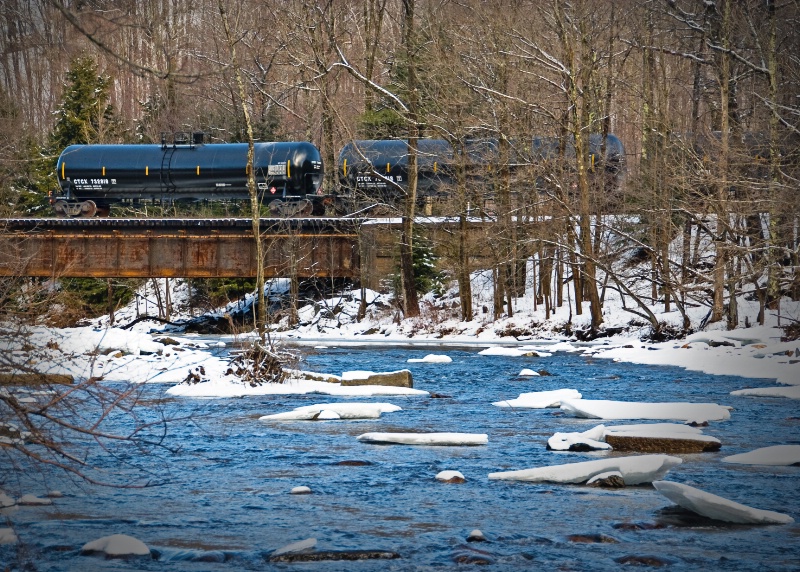
Over the River and Through the Woods

Uploaded: January 20, 2010
Nikkor 18-200mm @ 95mm
1/160 sec @f5.3 ISO 125
Exif: F Number: 5.3, Exposure Bias Value: 0.67, ExposureTime: 1/160 seconds, Flash: did not fire., ISO: 125, White balance: Manual white balance, FocalLength: 95.00 mm, Model: NIKON D80
Debbra Bailey January 20, 2010
Tony, I love the color of the water :) And the composition is great - the "cars" being towards the left offset the ice chunks that go down to the right. And I like the vingette! Was that on purpose? #1229112Jeanine M. Bailey January 20, 2010
Tony I really like everything about this!!! :) I don't see anything that I would change!! :) #8316655Joan E. Hoffman January 20, 2010
Either do I!!! Love how the train co-ordinates with the water! and the question begs.... where did you find a train with NO graffite?Seriously, great image Tony! Not a thing I could suggest to change. #8317232
Jeff E Jensen January 20, 2010
I love this Tony! Just out of curiosity, what does it look like flipped? (Horizontally) <--- That was for Peter :o) #8317436Anthony L. Mancuso January 20, 2010
It looks like this flipped Jeff. if you didn't specify horizontal I just might have tried it vertcial.. #8317561Jeff E Jensen January 20, 2010
I think I actually like it better this way. #8317582Anthony L. Mancuso January 20, 2010
I'm on the fence but leaning toward the original, lets see what the others have to say... #8317636
Michael Kelly
 January 20, 2010
Debbra Bailey January 21, 2010
I am too much for a realist to like flips very often! I liked it the way it was :) And Mike is right - hard to flip letters! #8318605Teresa H. Hunt January 21, 2010
Great shot Tony. I have to admit I like the flipped version better. But the writing is a problem . . . .The color of the water is amazing! #8319223
Debbie E. Payne January 21, 2010
Leave it alone, Tony. I, too love the color of the water and the fact that it nearly "matches" the cars. I would've liked to have seen a clearer view of the first car but of course that's not happening from where you took the shot. A good storytelling image and I like the title. #8319370Debbie E. Payne January 21, 2010
Leave it alone, Tony. I, too love the color of the water and the fact that it nearly "matches" the cars. I would've liked to have seen a clearer view of the first car but of course that's not happening from where you took the shot. A good storytelling image and I like the title. #8319371Debbie E. Payne January 21, 2010
Sorry-- That was NOT a senior moment! The network cut out on me at the exact moment I was sending and thought I hadn't sent it. (Not the normal excuse, huh???) #8319372Dale Hardin January 21, 2010
A little late on this but, except for the text problem, the flipped version is a better composition, IMHO, because of the leading line of the river starting on the left which is a more natural approach for Western readers. #8319475Jeff E Jensen January 21, 2010
Y'all must have better eyes than me because I can't read the text either way. I'm sticking to my guns, I like composition of the flipped version better. #8319854Aimee C. Eisaman January 26, 2010
I think you made the right choice as I like the unflipped better myself! Congrats on your EP! :~) #8332808Anthony L. Mancuso January 26, 2010
Thanks Aimee :-) #8332841Sign up for an interactive online photography course to get critiques on your photos.
Discussions by Category: You can view photo discussions on various themes in the Community > Photo Discussions section of the site.
BetterPhoto Websites: If you see an orange website link directly under the photographer's name, it's totally okay. It's not spam. The reason: BetterPhoto is the one that offers these personal photography websites. We are supporting our clients with those links.
Unavailable EXIF: If there is no other information but 'Unavailable' in the EXIF (meaning no EXIF data exists with the photo), the 'Unavailable' blurb is not displayed. If there is any info, it shows. Many photos have the EXIF stripped out when people modify the image and resave it, before uploading.
The following truth is one of the core philosophies of BetterPhoto:
I hear, I forget.
I see, I remember.
I do, I understand.
You learn by doing. Take your next online photography class.
Copyright for this photo belongs solely to Anthony L. Mancuso.
Images may not be copied, downloaded, or used in any way without the expressed, written permission of the photographer.
Log in to follow or message this photographer or report this photo.

I already have an account!

