A LITTLE MOUNTAIN TOWN WITH A LOT OF HISTORY

© Debbie E. Payne

A LITTLE MOUNTAIN TOWN WITH A LOT OF HISTORY

Uploaded: October 20, 2009

Description

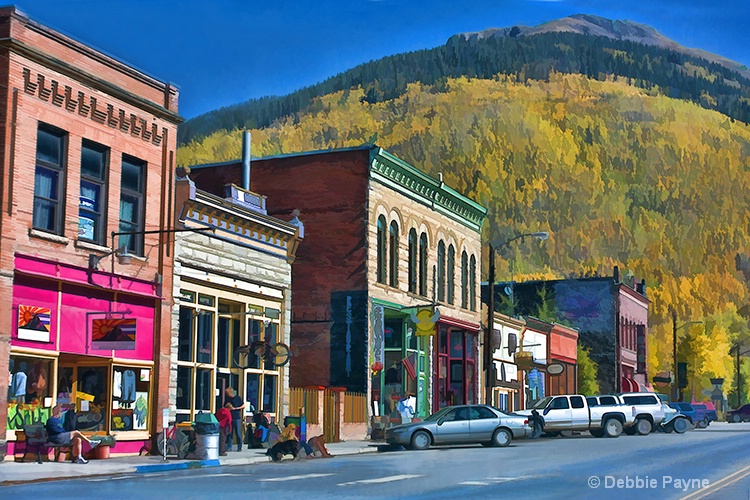
This was our destination a couple of weekends ago in our annual search for "fall color". Ouray, Colorado is a very inaccessible place because it is nested between steep rocky cliffs on two sides, but the difficulty in getting here kept a lot of people away so our stay was enjoyable and the town was colorful in more ways than one!

Exif: F Number: 10, Exposure Bias Value: 0.00, ExposureTime: 1/100 seconds, Flash: did not fire, compulsory flash mode, ISO: 200, White balance: Auto white balance, FocalLength: 40.00 mm, Model: Canon EOS 40D

Comments

Anthony L. Mancuso October 20, 2009

Like the color and comp here Deb but I am going to pull a Dale and recommend fixing the tilt...try the fix lens distortion tool.. #1194667

Vicki Snow October 21, 2009

Deb...I'm jealous....I have been here so many times...my favorite city in Colorado...I never found it to be "very inaccesible"...unless maybe you were riding a bicycle....the Million Dollar Highway takes you right there....giving you the most spectacular views you will ever see ...The colors are fabulous, the treatment is not for me only because of the unique buildings and detail you loose...TILT??? what tilt? LOL...(silly flat landers) #8055786

Debbie E. Payne October 21, 2009

Thank you. Vicki for confirming my issues with the tilt. People who live on nice, flat ground never get this: it's called hills and steep upgrades!! I straightened the buildings but there is not much we can do about POV's of shooting "uphill" on a steeply sloped street. Glad you understand. I guess I could try it from the original again. I just kind of liked this treatment because the colors didn't seem very good on the original.

I meant inconvenient to get to for those Denverites out on daytrips. LIke you, I really loved this little town and want to go back some day. #8055867

Vicki Snow October 21, 2009

Deb...have you tried the topaz detail yet?...It's pretty amazing...you can selectively use it on the buildings I'm thinking...I also wanted to share with you a plug in to remove wires...it's called wire pilot...havent tried it yet but it looks easy enough to use (I was thinking about ur last post on here) Ya I'm not getting the tilt thing....so dont change it....ITS NOT TILTED!!! Even the CS Zoo is full of steep hills giving you a fabulous workout...heehee #8055927

Aimee C. Eisaman October 21, 2009

I love the treatment on this Debbie...you are taking ordinary shots and making them into works of art. Not that I'm saying your shots are all that ordinary...Okay....I'll just shut up now! LOL I understand the hill issue living in Western PA. It seems most natural to me in this view and I do see that you lined it up with that center building. To make it perfect you would have to take a huge shot and then lose most of it to correct. I'm not saying it can't be done though. I'm sure it can. Okay....gonna shut up again! I'm lost today! LOL! :~) #8056090

Debbie E. Payne October 21, 2009

So, I guess my question to Anthony is "Where do you live?" and is it "flat" or "hilly"? Thank you as always for your comments. #8056188

Ellen H. Robertson level-classic October 21, 2009

Debbie this is lovely, the town is more colorful than the trees. Really like the treatment #8056279

Anthony L. Mancuso October 21, 2009

I live in norhtern CT on the MA border Deb...although it is hilly, you westerners would probably consider the hills little more than bumps.. #8056285

Teresa H. Hunt October 21, 2009

My first thought was correct the tilt too. But when I looked at it closely I think it's straight. I think because the first building looks like it's leaning into the photo gives the illusion of a tilt. Maybe if you crop a sliver off the left edge so you don't see the side of the building.

Though I like this effect I'm not crazy about it on this photo. That first building looks like it's hot pink. Is it a pink building?

I love the mountain in the background. I live in Oregon where we have hills and mountains . . . but it's nothing compared to what you have in Colorado. I love Colorado . . . would love to go back and visit there again someday. #8056351

Debbie E. Payne October 21, 2009

What beautiful country you live in! I want to one day get to that neck of the woods in the autumn but you probably are right about your hills being bumps. Lots easier to climb. #8056490

Dale Hardin October 21, 2009

what a beautiful little town. I like your POV and the treatment you gave. Would like to see the original too, in order to see how it looks since I'll probably never get there.

As you mentioned, it is not tilted of course, but the lens distortion makes it appear so. As Tony mentioned, this is very easily fixed in PhotoShop using the camera lens correction tool. It would make a great improvement to do do.

Even though I like the effect you used, it could still use a little edge definition and the high pass filter should fill the bill here. #8056503

Susan M. Reynolds level-addict October 21, 2009

What a lovely, colorful little town, with the fall colored hills in the BG! Won't even mention the 't' word since it's been covered and recovered ~ lol.
I,too, would like to see the original if you don't mind posting it and if you try a Topaz filter it could make a big difference to the original as someone else also mentioned.
We are hoping to make a trip up to Apple Hill soon to get some fall color and a bushel of some of the best apples around!
And Vicki, What is Wire Pilot - another thing to google I guess! #8056709

Michael Kelly level-deluxe October 21, 2009

I like his one a lot! It has a beautiful Norman Rockwell feel to it and I love the colors. I think what I like best is the PROV and the real feeling of perspective achieved in the shot. #8057151

Debbie E. Payne October 21, 2009

Glad you like it, Michael. I think I might even like this little town more than Crested Butte, CO and that is saying a lot because CB is also a wonderful place to take photos but it has changed over the last couple of years as rich investors have come in, bought property and have pushed the locals out because they can't afford to live there anymore. Very sad. #8057165

Debbie E. Payne October 21, 2009

I redid the original and brightened it up and saturated it up more. When I tried the TopazDetail I was not seeing much difference in what I had done and what it did so I just reverted to my own fix on the original. I still think I like the Topaz Buz Sim the best. #8057267

Debbie E. Payne October 21, 2009

And one more...I thought the original was just too sharp and took it back into a Topaz Buzz Sim faded to 50% opacity. Now which is better, lst, 2nd or 3rd? #8057291

Dale Hardin October 21, 2009

Debbie, this is one of those shots that can take a lot of specialty filtering and still come out looking good.

However, the real thing that is needed is to correct that lens distortion because it almost negates whatever effect you offer.

That aside, between one and three is simply an opinion choice not technical choice. Number one has a softer gentler feel about it, and number three has a bolder, sharper look. Both compliment the image.

If you want to combine the two, apply the Topaz spifify filter first and then the buzz filter for sharper and bolder colors while still retaining the simplified detail appearance. #8057403

Susan M. Reynolds level-addict October 22, 2009

I'm for the first and third. Both have their own special appeal. Or we could take DS and combine the two! Are you up for another post! lol #8057445

Sharon October 22, 2009

I really like the 1st one the best! The composition & colors are very nice! It looks like a painting & I wouldn't change it a bit! I would like to see the original :) #8060313

Michael Kelly level-deluxe October 22, 2009

The new posts are very nice too, but I am still a fan of your original post. #8060532

Debbie E. Payne October 22, 2009

Susan I'm thinking 1st and third as well. I need to learn how to "play" with the perspective tool, but because there isn't much crop room to play with I am thinking I may not have enough of a picture if I do the perspective tool thing.

Michael - And so am I ! Sometimes the first try is the best. And by the way Michael, congratulations on"Purity". It is gorgeous and deserves to go futrher!

I have just had wine with dinner so I am finding out that I simply can't type right now so I think I will shut up and go do something like watch some escapist TV and call it a night. #8060673

Rita K. Connell level-classic October 22, 2009

as the late comer .... I really like the first post best, then the third. I agree some times we just need to leave it alone. great job I am looking forward in a couple of years when our daughter and her family goes back to CS. #8061884

Dale Hardin October 22, 2009

Debbie, that "perspective tool" is a piece of cake on this shot.

Use the "filter/correct camera distortion" tool. You will see lots of sliders and a grid that shows you when the lines are straight.

On this image move the "vertical perspective" slider to the left to -11 and the "edge extension scale" slider (the bottom one) to the right to 104 and click OK. Done.

NOTE: these numbers are based on the size image you've posted on Phellos but they should be the same on a larger file as well.

The only part of your image you will lose is that triangle of tilt in the upper left of the image. Give it a try. You'll like it. :o) #8061928

Aimee C. Eisaman October 25, 2009

Glad to see this one with an EP! :~) Congrats! #8072419

Debbie E. Payne October 25, 2009

Thank you, Aimee. The more I look at it the more I remember that glorious weekend. #8072594

To discuss, first log in or sign up (buttons are at top center of page).

Get Constructive Critiques

Sign up for an interactive online photography course to get critiques on your photos.


Did You Know?

Discussions by Category: You can view photo discussions on various themes in the Community > Photo Discussions section of the site.

BetterPhoto Websites: If you see an orange website link directly under the photographer's name, it's totally okay. It's not spam. The reason: BetterPhoto is the one that offers these personal photography websites. We are supporting our clients with those links.

Unavailable EXIF: If there is no other information but 'Unavailable' in the EXIF (meaning no EXIF data exists with the photo), the 'Unavailable' blurb is not displayed. If there is any info, it shows. Many photos have the EXIF stripped out when people modify the image and resave it, before uploading.


The following truth is one of the core philosophies of BetterPhoto:

I hear, I forget.
I see, I remember.
I do, I understand.

You learn by doing. Take your next online photography class.


BetterPhoto.com Editor's Pick


Copyright for this photo belongs solely to Debbie E. Payne.
Images may not be copied, downloaded, or used in any way without the expressed, written permission of the photographer.
Log in to follow or message this photographer or report this photo.