
Hands
Uploaded: February 02, 2007
Roxie Guilhamet
 February 09, 2007
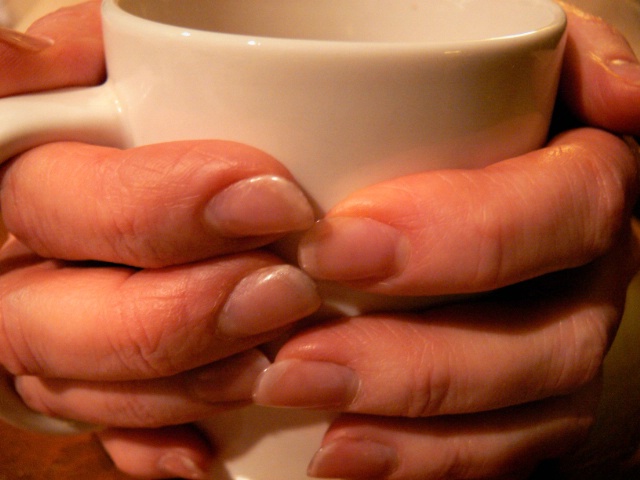
I also agree with Rob that the glowing orange fingers don’t look natural and I like Rob’s adjustment better. I tried it myself and found that it’s tricky to make them look natural without going too blue—and in severe need of a warm cup! One reason it’s difficult is that the left side is slightly overexposed, which pegged the red channel (hold down option/alt in Levels, as you would do when adjusting your black and white points, and you’ll see the red patches.) You’ll also see your histogram goes all the way to the right edge. That’s why there’s an unnatural red glow.
Richard, what color is the coffee cup really—white or beige? That will give you a clue when you color correct. I clicked on it to color correct which turned it white, but the fingers look right; if it’s really beige, it’s easy to mask out the color correction on the cup. I also took the saturation down a notch.
The negative space in the top left corner right along the thumb is a bit distracting; if you darken it, be sure to blend it well so that it’s not obvious. The other corners don’t bother me. I’d leave them alone, especially the bottom left so that you can still see the mug handle.
Visual tension is good for some things, but for a warm, comforting pose your hands need room to breathe. You can back off a tad next time to fit in the rest of the thumbs, pinkies and back rim of the cup.
#3930087
Roxie Guilhamet
February 09, 2007
Roxie Guilhamet
February 10, 2007
1. It’s good that you thought about WB, that helps a lot; but, not all tungsten lights are the same so you often still need to tweak it in the PS darkroom.
2. The best test for whether an image needs color correction or not is how it looks. White and black can be fine, but what about middle gray?
3. Pick a place that *should* be middle gray and click on it with the middle eye-dropper (I got all sorts of colors too—try clicking around the shadow inside the rim on the cup’s upper left). Click around until you find a spot that makes the colors look close to natural, then tweak it using the layer’s opacity slider.
4. Red pegged on the right means it’s overexposed for red, your camera sensor couldn’t take any more red information on the highlights so you got a full blast of red rather than a smooth transition. But it’s not totally blown out white (the other colors still have detail). This explains why your fingers are glowing orange brightest where the light was hitting them the most (the middle finger on our left has an oval hot spot, for example). That doesn’t override color correction; you still need to do it. Desaturating helps too. #3932933
Sign up for an interactive online photography course to get critiques on your photos.
Discussions by Category: You can view photo discussions on various themes in the Community > Photo Discussions section of the site.
BetterPhoto Websites: If you see an orange website link directly under the photographer's name, it's totally okay. It's not spam. The reason: BetterPhoto is the one that offers these personal photography websites. We are supporting our clients with those links.
Unavailable EXIF: If there is no other information but 'Unavailable' in the EXIF (meaning no EXIF data exists with the photo), the 'Unavailable' blurb is not displayed. If there is any info, it shows. Many photos have the EXIF stripped out when people modify the image and resave it, before uploading.
The following truth is one of the core philosophies of BetterPhoto:
I hear, I forget.
I see, I remember.
I do, I understand.
You learn by doing. Take your next online photography class.
Copyright for this photo belongs solely to Richard L. Hawley.
Images may not be copied, downloaded, or used in any way without the expressed, written permission of the photographer.
Log in to follow or message this photographer or report this photo.