
Earth Tones
Uploaded: April 23, 2014 20:41:53 | Entered: April 23, 2014 20:41:53
Sony RX-100
Shutter Speed: 1/400.00 F-stop: f/4.0
Focal Length: 10.40
Exif: F Number: 4, Exposure Bias Value: 0.00, ExposureTime: 1/400 seconds, Flash: did not fire, compulsory flash mode, ISO: 1600, White balance: Auto white balance, FocalLength: 10.40 mm, Model: DSC-RX100
Colette M. Metcalf April 24, 2014
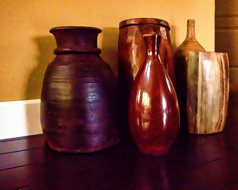
Nice image, Dale!! #1570968Peter W. Marks April 24, 2014
Good morning Dale. This still-life isn't working for me as well as many of your previous ones. The white skirting board in Brit-speak, ('baseboard' for you colonials) points to but leaves me pondering as to what I should be looking at in the strong reflections on the shiny flask object and then my eyes wandered off to the even brighter vase on the far right. Then I have to figuratively drag them back to what for me is the most interesting object in this group; the dark brown pot. Even its position, slightly away from the rest of the objects serves to emphasise its warmth and sensual curves.Joy Rector April 24, 2014
love the comp and color #11029402Dale Hardin April 24, 2014
Collete and Joy, thanks so much for the nice comment. #11029455Dale Hardin April 24, 2014
Thanks Peter for the well thought out critique. Took this at our son's house with my point and shoot. They are moving and had set these aside to be packed by the mover.Since this one turned out a bit blurry, I concentrated more on shape than sharpness and detail. Will post another that is better in that regard, but in my opinion is not as interesting a composition.
In this shot I wanted to show the warmth of the wall and with the baseboard (we used to call them mop boards) as an accent, used the floor and hall as an L shaped border to coral the pottery.
#11029457
Susan Williams April 24, 2014
I love the alternate view of this image, Dale because of all the interesting features. Not only can one see the window light in the reflections, but one can see the windows themselves. I also like the shadows and the lines, which are not overpowering.The vases do seem to bend back a little. I'm not sure about that, but I'd try to pull the tops forward a little to see about that.
Very artistic - I think this would make a beautiful print to remind them of moving day - a big day! #11029468
Dale Hardin April 24, 2014
Thank you Susan. The angle is due to the fact that I set the camera on the floor to avoid movement. Since it is a point and shoot, I was having trouble holding it steady and with seeing the image in the viewer with the camera that low.On my regular camera I have a tilting LCD but not on this one. I'll check and see if I have any shots taken from a higher angle 'cause don't know any way to "pull the tops" forward other than a perspective adjustment, which I think would be unrealistic. #11029472
Dale Hardin April 24, 2014
Susan, here is a shot from a slightly higher angle. #11029479Susan Williams April 24, 2014
I like the alternate angle better - it's a more intimate perspective.Also, I don't consider the angle a "flaw" - you have some artistic license here and it's a wonderful image.
Admirable shot with a point 'n shoot, for sure.
(I use the skew tool to slightly tug. Sometimes it works, and sometimes it doesn't.) #11029480
Stephen Shoff April 24, 2014
As Peter commented, this still-life isn't working for me.What stands out to me in the original post is the over-processed noise reduction look to it. My guess is that you intended that. Since this is a still-life, and interpretive intent is totally at the discretion of the creator, all I can comment on is that that is an interesting approach and it certainly caught my attention. #11029520
Dale Hardin April 24, 2014
I agree on the angle, Susan, but I couldn't hold the camera steady there, hence the other view.Stephen, thanks for the honest appraisal. You are right that the noise reduction played a major roll here and is the reason for the soft image. As well as the fact that I couldn't hold the camera steady at that angle.
So, I guess if I caught your attention it worked. Thanks. #11029547
Kalena Randall April 25, 2014
Dale, glad to see you are having some fun with still life!I like the space in the first one, but the white "skirting" (for the Brit) and base board for the rest of us is a bit of a distraction. The other shots have a tight feel to me. I do like the warmth of all of them. To me, that makes them inviting.
I agree with Stephen's comment that the interpretive intent is totally at the discretion of the creator. But all of photography is that way!
I enjoyed these! #11030047
Dale Hardin April 25, 2014
Thanks Kalena. This was one of those opportunities when the scene was there for the taking. If I had to set up this group it would not have come out at nice. :o) #11030170Peter W. Marks April 25, 2014
Dale mentioned that what I know as a 'skirting board" and others as a 'baseboard' he knew as a 'mop board'. The origin of that name was because this board prevented a wet floor mop from damaging the wall covering. Pretty logical really; and being a very old geezer Dale would have seen this in use in his family's little old house on the prairie. Right Dale?Dale Hardin April 25, 2014
Quite right, Peter. The floor we were mopping in our little ranch house in Washington was made of 1x6 tongue and groove pine that was bowed in the center because of the wet mopping and subsequent drying.However, most of the flooring was linoleum over a 2x6 tongue and groove. And when I turned 17 we finally got indoor plumbing. #11030195
Elaine Hessler April 27, 2014
I like the first one the best, and I do like the filter you used on this picture. It works really well on those vases-makes them look like they are part of a painting. The colors are beautiful.Something is throwing me off on the left side-I don't know if it is the sharp lines of the wall, baseboard, or floor. I think there is too much detail in this area that doesn't match the rest of the picture. I think it is worth working on still. #11031615
Dale Hardin April 27, 2014
Thanks Elaine. I think I know what is bothering you (and others) on this image. How's this? #11031843Elaine Hessler April 27, 2014
Yes, much better-I like it! #11032188Dale Hardin April 27, 2014
I aims to please. :o) #11032352Sign up for an interactive online photography course to get critiques on your photos.
Discussions by Category: You can view photo discussions on various themes in the Community > Photo Discussions section of the site.
BetterPhoto Websites: If you see an orange website link directly under the photographer's name, it's totally okay. It's not spam. The reason: BetterPhoto is the one that offers these personal photography websites. We are supporting our clients with those links.
Unavailable EXIF: If there is no other information but 'Unavailable' in the EXIF (meaning no EXIF data exists with the photo), the 'Unavailable' blurb is not displayed. If there is any info, it shows. Many photos have the EXIF stripped out when people modify the image and resave it, before uploading.
The following truth is one of the core philosophies of BetterPhoto:
I hear, I forget.
I see, I remember.
I do, I understand.
You learn by doing. Take your next online photography class.
Copyright for this photo belongs solely to Dale Hardin.
Images may not be copied, downloaded, or used in any way without the expressed, written permission of the photographer.
Log in to follow or message this photographer or report this photo.
I already have an account!