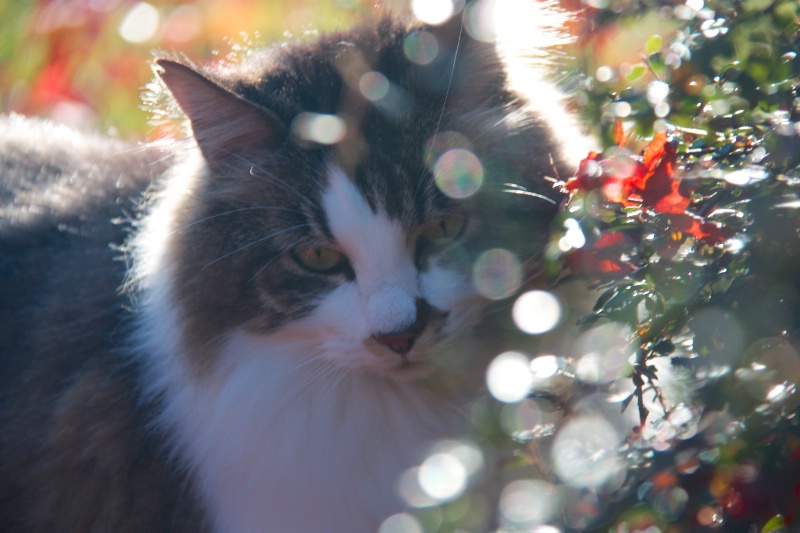
Dougie in fall

Uploaded: November 27, 2013
Exif: Exposure Bias Value: 0.00, ExposureTime: 1/25 seconds, Flash: did not fire, compulsory flash mode, ISO: 100, FocalLength: 200.00 mm, Model: Canon EOS DIGITAL REBEL XSi
Michael Kelly
 November 28, 2013
Jeff E Jensen November 28, 2013
I agree with Mike's assessment, not the strongest image as it is. #10908996Beth Spencer November 28, 2013
Very cute cat, but I agree too much of the face is in the bright area and competing for the main focus. #10909005Peter W. Marks November 28, 2013
Not working me either Lisa I'm afraid and I'm a two-moggie person. #10909020lisa anderson November 28, 2013
Thanks for the comments. Does anyone have any ideas for something I could try with editing? I did lighten up his eyes but not enough.Peter W. Marks November 28, 2013
"Moggie" is the Brit slang for a cat, particularly non-pedigree ones; rather in the way that mongrel dogs are referred to as 'mutts". I have a short haired calico and a short haired dark tabby hence I am a two-moggie person!. I was surprised when I came over here that even adults refer to cats as "kitties", Back in the UK no person over about 7yrs old would use that expression.Stephen Shoff November 28, 2013
I suppose, Lisa, that you were wanting the soft focus effect for the cat, but that is part of what's not working for me. It looks like you took this picture through something. You might try a little more contrast and sharpening on the cat's face. That might help your primary subject compete with the highlights. #10909075
Rita K. Connell
 November 29, 2013
lisa anderson November 29, 2013
Hi everyone, thanks very much for the feedback. I discovered an artist names Emanuele Luzzati last week, and now I want to make whimsical art like he does. That's what I was going for here...although my judgement is always clouded with my cats. I did try an edit (I use photoshop CS6). The picture actually looks way darker on betterphoto than on my screen.
Rita K. Connell
 November 29, 2013
Susan Williams November 30, 2013
This is a bold experiment, Lisa, and I applaud you for trying something new. You're a good sport, too. I wonder what the edited version would look like in B&W with some tweaks to make the eyes, nose and mouth stand out (but not shout). I know there's artwork present, but I'm not sure how to get there except keep playing with "what if." This is the type of image that makes the Topaz bundle so much fun. #10911420Dale Hardin November 30, 2013
This is a cute shot, Lisa and I like the lens flare. I agree it is on the dull side, but there is an easy fix.Remember, you can duplicate some adjustments to enhance their results. For instance, try this.
Create a Levels layer and use the auto adjust.
create another levels layer and apply a 100% screen blend.
Apply another levels layer and apply a linear dodge blend.
Finally use the shadows/highlights tool on the resulting image to open the shadows.
I can email you the result if you like. #10911697
lisa anderson November 30, 2013
Hi Kalena-I did two blackandwhite verions for you. Dale-do you think I should try those adjustments from the orignal post or the edit? #10911732Susan Williams November 30, 2013
I really like the B&W, Lisa (and the one without the colored eyes best). I wouldn't describe it as whimsical, but it is very artistic to my eye. I think it could be brightened/lightened a little more or perhaps the contrast adjusted slightly. Nice work! Of course, Dale always knows best and I'd love to see what he suggests on the color version so you get the whimsy you wanted. #10911746Dale Hardin November 30, 2013
Lisa, the suggestions were based on the original posted image. #10911784Beth Spencer December 02, 2013
I like the last version the best, I wonder what more saturation to the eyes would do? #10913634Sign up for an interactive online photography course to get critiques on your photos.
Discussions by Category: You can view photo discussions on various themes in the Community > Photo Discussions section of the site.
BetterPhoto Websites: If you see an orange website link directly under the photographer's name, it's totally okay. It's not spam. The reason: BetterPhoto is the one that offers these personal photography websites. We are supporting our clients with those links.
Unavailable EXIF: If there is no other information but 'Unavailable' in the EXIF (meaning no EXIF data exists with the photo), the 'Unavailable' blurb is not displayed. If there is any info, it shows. Many photos have the EXIF stripped out when people modify the image and resave it, before uploading.
The following truth is one of the core philosophies of BetterPhoto:
I hear, I forget.
I see, I remember.
I do, I understand.
You learn by doing. Take your next online photography class.
Copyright for this photo belongs solely to lisa anderson.
Images may not be copied, downloaded, or used in any way without the expressed, written permission of the photographer.
Log in to follow or message this photographer or report this photo.

I already have an account!
