
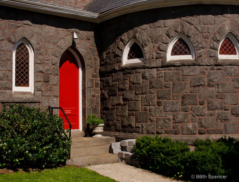
Prince of Peace, Episcopal church, Gettysburg, Pa.
Uploaded: June 10, 2012 20:10:27
Canon 40D, tamron 18-270mm lens, f/16, 1/320, ISO 400
Rita K. Connell
 June 11, 2012
Michael Kelly
June 11, 2012
I find that in spite of the bright red door the shot has an overall dark and moody feel. Lightening it up and opening the shadows would help that. I also selectively reduced the red channel on the door. Here is a quick example of what I have in mind. #10176328
Rita K. Connell
June 15, 2012
Sign up for an interactive online photography course to get critiques on your photos.
Discussions by Category: You can view photo discussions on various themes in the Community > Photo Discussions section of the site.
BetterPhoto Websites: If you see an orange website link directly under the photographer's name, it's totally okay. It's not spam. The reason: BetterPhoto is the one that offers these personal photography websites. We are supporting our clients with those links.
Unavailable EXIF: If there is no other information but 'Unavailable' in the EXIF (meaning no EXIF data exists with the photo), the 'Unavailable' blurb is not displayed. If there is any info, it shows. Many photos have the EXIF stripped out when people modify the image and resave it, before uploading.
The following truth is one of the core philosophies of BetterPhoto:
I hear, I forget.
I see, I remember.
I do, I understand.
You learn by doing. Take your next online photography class.

Copyright for this photo belongs solely to Beth Spencer.
Images may not be copied, downloaded, or used in any way without the expressed, written permission of the photographer.
Log in to follow or message this photographer or report this photo.