To discuss a photo, sign up as a BetterPhoto member or log in.
wedding
|
|||||||||||
|
|
|||||||||||
- Michael Kelly Contact Michael Kelly Michael Kelly's Gallery |
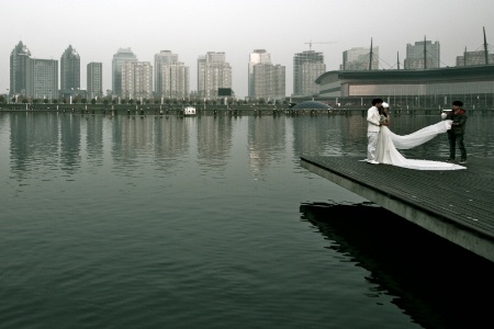
Lisa I hope you don't feel that I am picking on you with this comment. One of the most important areas of photography is to find and emphasize a subject. This is a combination of many things such as POV (point of view), contrast, DOF, apparent subject size, etc. In your last couple entries the subject is pretty lost on me. This is better than the last because from your title the people on the dock are the subject here, but there are simply to many competing elements in the shot to see the people on the dock as the true subject without the title. If you note their apparent size is the same as the BG buildings. They also don't seem to be in better focus than the BG and are just to small a portion of the shot in general as well as being to far to the edge of the frame. I am not going to make suggestions for this shot as I think that the people are just to small to have a crop or other post production edit help much. Just look when you are shooting and try to make combinations that bring a subject clearly to the viewer. One of the best tricks I used to tell my students is that when in doubt get closer. Use a longer lens or your feet to accomplish this.
|
||||||||||
|
|
|||||||||||
|
lisa anderson |
Hello Michael, thanks for your comments; I'm here to learn :) I agree the focus in this shot is not good, but my biggest issue with it is the colour, which I don't like and don't know how to fix... I do like photos with lots of space, and I like how the couple is poised beside all that water, but I see your point about their size in relation to the buildings.
|
||||||||||
|
|
|||||||||||
|
- Michael Kelly Contact Michael Kelly Michael Kelly's Gallery |
Lisa there are a number of ways to fix color in PS. The most common problem is white balance. You can fix this by opening in camera RAW and using the WB tool eyedropper (next to the hand) to click on a white area of the shot (the man's shoulder for instance) you will see this moves the color temperature slider and the tint slider. You can pick other white areas and click them to see minor differences in this adjustment. You can also move these sliders to change the color to taste. The color temperature slider moves to the right to make things warmer and to the left to make things cooler. Tint is pretty self explanatory just move it back and forth to see the result. Generally I zero the tint slider when I make adjustments. There are other methods that can do similar adjustments but this is one of the easiest especially if you have any known white area in the shot.
|
||||||||||
|
|
|||||||||||
|
Stephen Shoff |
I thought the tonalitiesand gradients of the urban background was quite pleasing and complimentary to your composition, Lisa. It avoided competing with your primary subject.
|
||||||||||
|
|
|||||||||||
|
Aimee C. Eisaman |
I kinda like the teal feel to this one as far as color goes. Does give that urban feel, but as with Mike I think the placement of the couple and POV here make it difficult to decide between a cityscape and a wedding photo. I too like environmental portraits, but this being a portrait could be lost. If a crop were possible placing the couple on the right third may help with this, but you would have to lose some of the buildings on the left side to do this. :~)
|
||||||||||
|
|
|||||||||||
|
Dale Hardin |
This is a very interesting photo and one that breaks the normal "rules" while still remaining interesting. There are of course technical issues that Mike has addressed very well. As Aimee mentioned, the compositional issue could be solved by a simple crop while still maintaining your desire for an environmental type image. Give this a try. Use the 4x6 horizontal format and start with you lower right corner exactly where bottom on the dock meets the right side. Then expand your crop until the grooms head is precisely at the rule of thirds upper right crossing point.
|
||||||||||
|
|
|||||||||||
|
Peter W. Marks |
Hi Lisa. While enjoying my afternoon cup of Earl Grey tea I have been both perusing the image and thinking about the various comments. I fully understand what the others have said but now find myself thinking about this in a different way. Consider this: If a photograph is taken to represent accurately what a person is looking at, then whilst it might be that one would think "what a pity I can't walk across there to better see what is happening", that is not necessarily the reality of the situation. So, here, a 500mm lens could render a closeup of the expression on the groom's face and it might give us an excellant image of a smiling (or frowning) husband-to-be. However in Lisa's image we have a thought-provoking image that is even more so precisely because we cannot see any small detail. I find myself wondering whether this is an actual marriage ceremony; or perhaps just an advertising shoot; so in effect I am totaly intrigued beyond what a carefully composed shot might give and think of this in the way I would a street scene not a posed portrait. But you know I am going to ask; "where is this Lisa"?
|
||||||||||
|
|
|||||||||||
|
Beth Spencer |
I have to agree this is an interesting shot, but the couple gets lost in it. I think Mike has given you some good advice.
|
||||||||||
|
|
|||||||||||
- Rita K. Connell Contact Rita K. Connell Rita K. Connell's Gallery |
Lisa I like the color and agree a very interesting shot. I think the 4x6 crop will make this into a stronger image. can't wait to see if we are right!
|
||||||||||
|
|
|||||||||||
|
Teresa H. Hunt |
I also think this is a very interesting shot. I actually like it. Though I do agree that the couple gets lost. I don't really see this as a portrait shot, but more of street photography. And that being said, I like the placement of the couple in the frame. I think a crop to make the couple a little more prominent is a good idea. As for the color, I kinda like the funky coloring . . . adds to the industrial look and feel of the photo. I will anxiously await your edits as I think this photo is very interesting. :)
|
||||||||||
|
|
|||||||||||
|
lisa anderson |
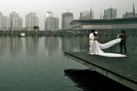
Peter, your comments always make me smile :) This is in China, 5 minutes from my house. I was out taking pictures with my friends (we're working on a 'water' theme, as one friend wants to do all four elements) and we came across several people getting wedding photos, which is normal here. But then we came across more and more people getting wedding pictures to the point where they were simply everywhere. The we noticed the tour buses...tour buses full of people getting wedding shots. Pairs and pairs of grooms and brides...a tad surreal. The main reason this shot s so zoomed out is because I broke my 18-55 lens in Nepal during rainy season. They weren't kidding. It was rainy! So I only have my wide-angle. Here is the crop suggestion-thanks, Dale-I like it better.
|
||||||||||
|
|
|||||||||||
| Log in or sign up to respond or interact. | |||||||||||