To discuss a photo, sign up as a BetterPhoto member or log in.
Companions
|
||||||||||||||
|
|
||||||||||||||
|
Elaine Hessler |
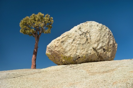
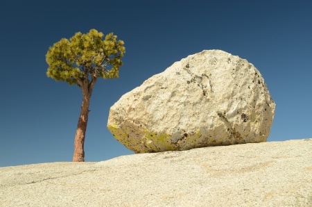
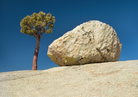
This photo was taken at Yosemite last month. I edited this in PSE and I think I finally have the layers/masks figured out. I decreased the exposure of the stone and rock only to bring out the detail, and used a cooling filter on the tree and sky (my WB was off again). I also sharpened. I am considering blowing this up and framing it, but would love input before investing in this. BTW, I used a polarizer-this is why the sky is so blue. Not sure if the shadows on the trunk are an issue... I've included the original. Have a blast in DC everyone! I hope to see you in PA next fall!
|
|||||||||||||
|
|
||||||||||||||
|
Jeff E Jensen |
Ya done good!
|
|||||||||||||
|
|
||||||||||||||
|
Stephen Shoff |
Great image. I like the simplicity. Color tones are good. You might be cropped a little tight. If you have room, a little more space on the left and bottom would improve the perspective and convey the the sense that the boulder and tree are perched on top of a higher dome. But if not, its good as is.
|
|||||||||||||
|
|
||||||||||||||
|
lisa anderson |
Elaine, I like this so much! I like the shadows on the trunk, but to be very nitpicky, the lighter shadows on my computer screen contrast a little better with the sky than the darker shadows. I think this would look great blown up. Nice work!
|
|||||||||||||
|
|
||||||||||||||
|
Beth Spencer |
I think you did a great job on this one! I love the simplicity of the shot, but you have also captured great detail. Your edit is awesome!!
|
|||||||||||||
|
|
||||||||||||||
- Michael Kelly Contact Michael Kelly Michael Kelly's Gallery |
Excellent! I think this will look great on your wall. The simplicity is wonderful and I think the tones look good. I agree with the slight increase in space mentioned by Stephen, but since you showed the original I don't think you have any more in the shot and don't think it is a big problem as it works very well as shown.
|
|||||||||||||
|
|
||||||||||||||
|
Aimee C. Eisaman |
The simplicity of this image is what makes it so awesome...wonderful find and capture. I think the shadows on the tree are fine and really do hope you have this printed because it is very cool! :~) I agree about the space esp. if you are going to frame it.
|
|||||||||||||
|
|
||||||||||||||
|
Elaine Hessler |
Thanks everyone for the input. I didn't crop this at all, so no space left to add. HOWEVER, for some reason, I think with PSE I can add space on the edges. If anyone is familiar with this, let me know. I'll investigate this weekend....
|
|||||||||||||
|
|
||||||||||||||
|
Peter W. Marks |
Ok Elaine, "simplicity" has been used four times so I am going to have to find something different. So, let's see? I really like this "minimilist" image. How's that!
|
|||||||||||||
|
|
||||||||||||||
|
Teresa H. Hunt |
I really like this image. However, having never seen this location I can't get a real good feel for the scale. But either way I really like this one :)
|
|||||||||||||
|
|
||||||||||||||
simplydivinephotography.com - Susan M. Reynolds Contact Susan M. Reynolds Susan M. Reynolds's Gallery |
It is cool and like the deep color captured by using your polorizer. You can add canvas on any side you want in PS, you'd just have to clone in the matching colors to cover the blank parts of the canvas if you want to give it the feeling of being atop a higher dome as Stephen mentioned.
|
|||||||||||||
|
|
||||||||||||||
|
Elaine Hessler |
|
|||||||||||||
|
|
||||||||||||||
| Log in or sign up to respond or interact. | ||||||||||||||